Kalliope Nexus
Analytics
Description
The Kalliope Analytics module collects all data collected from CDRs (Call Detail Records) in order to offer a detailed analysis of the use of company telephone resources. The reports that are offered were born from the need to offer a simple, fast and intuitive method to understand what the call trends were within your company.
This module allows you to have:
professional, yet intuitive reports
accurate and effective charts
clear and comprehensive dashboards
customizable reports
exportable data tables
Structure
The module is structured into two main sub-modules, both of which have sections. The first sub-module collects data from the CDR and processes it, while the second does so for data from the Call Center. In both cases, the structure of the sections is very similar, with an initial dashboard and then the various report sections. The data that are collected are then processed and made available to the various report groups (CDR or Call Center) in the different sections into which they are divided.
VoIP report CDR
Dashboard
Charts
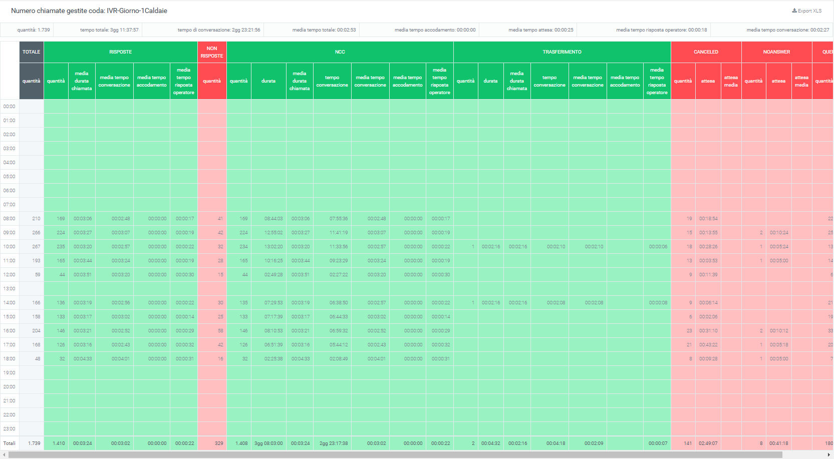
The data collected in this section are contained in “Voip -> CDR” and concern the calls passing through the telephone exchange.
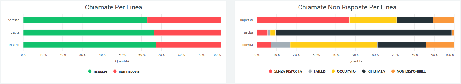
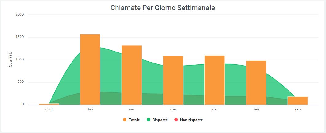
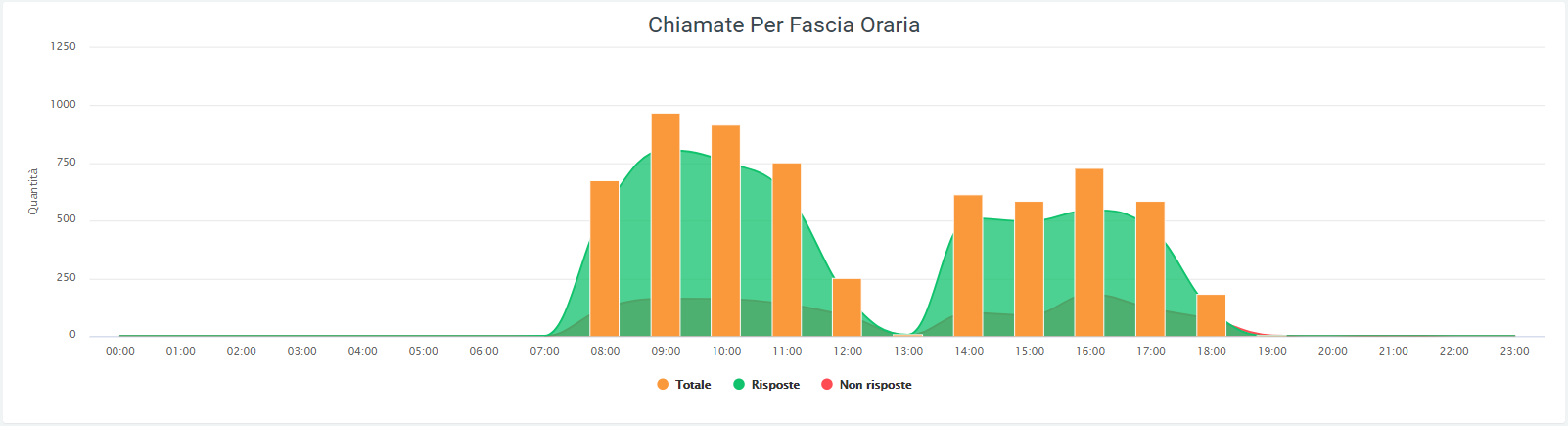
The Dashboard page displays graphs showing call trends within the affected telephone exchanges. You can view the number and duration of incoming, outgoing, and internal calls, also showing how many calls were answered and how many were not. To highlight specific portions of a graph, simply press on it and scroll by the portion of interest.
The data can be broken down:
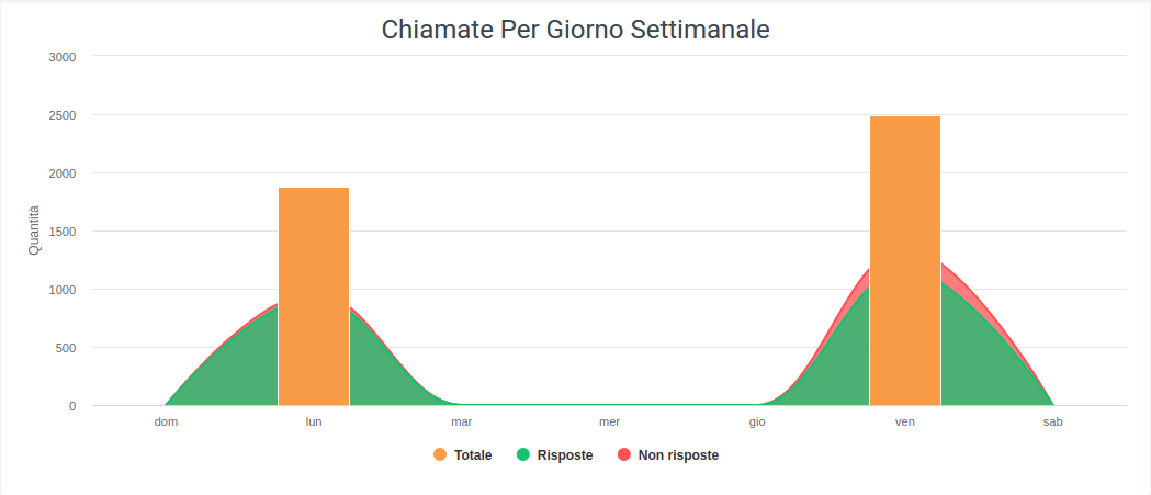
By daily breakdown: the amount of calls received in a day
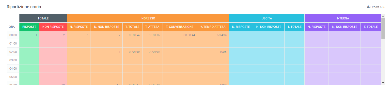
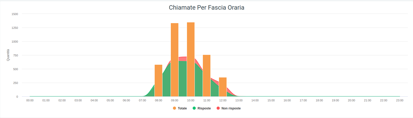
By hourly breakdown: the duration of calls for each day of the period entered, number of calls by time of day, duration in seconds by time of day
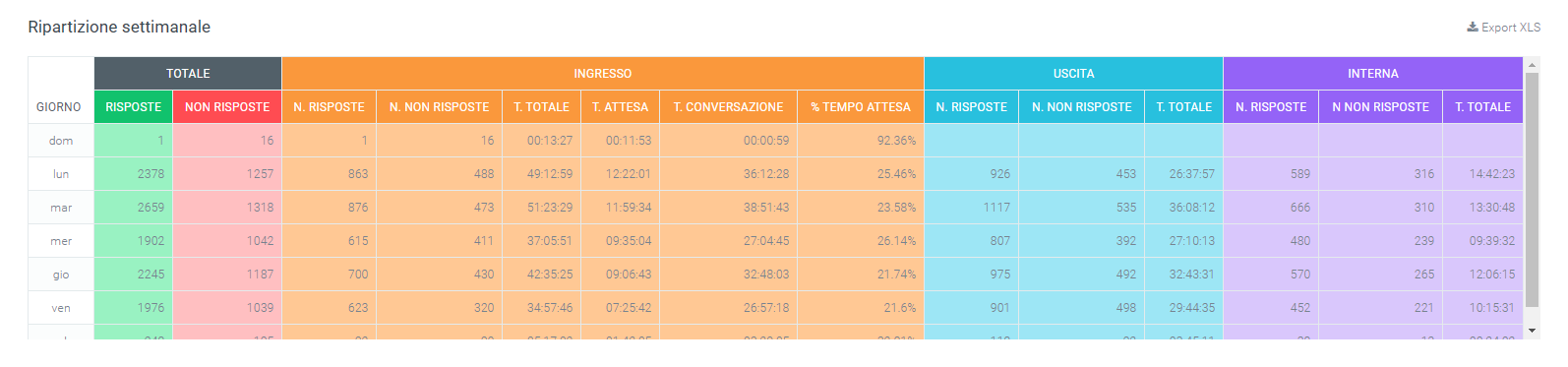
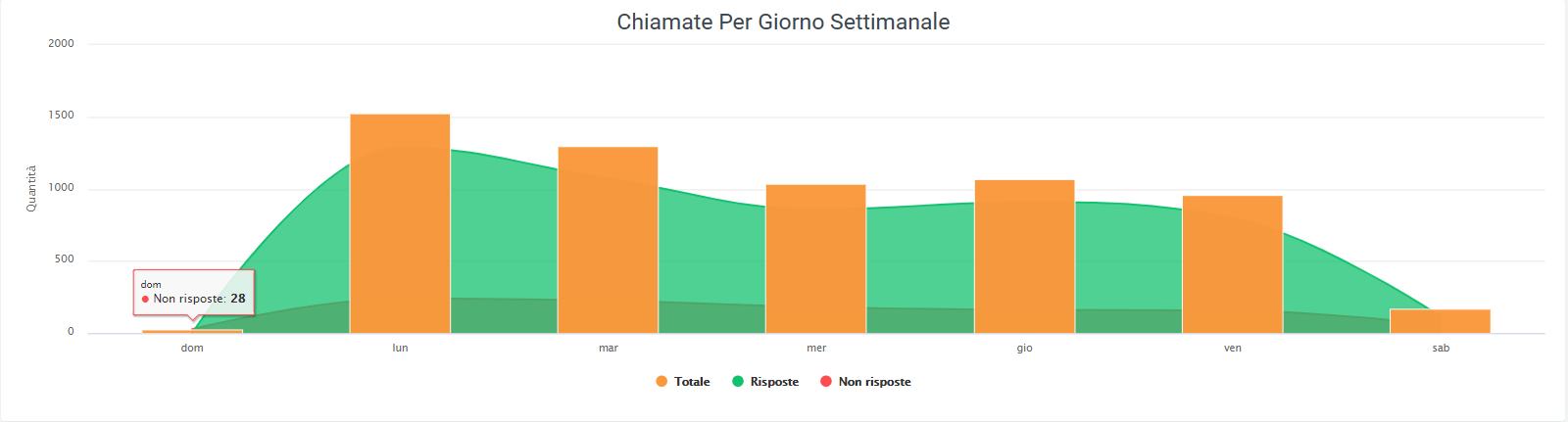
By weekday breakdown: the call quantity for each day of the week and duration in seconds of calls according to the day of the week
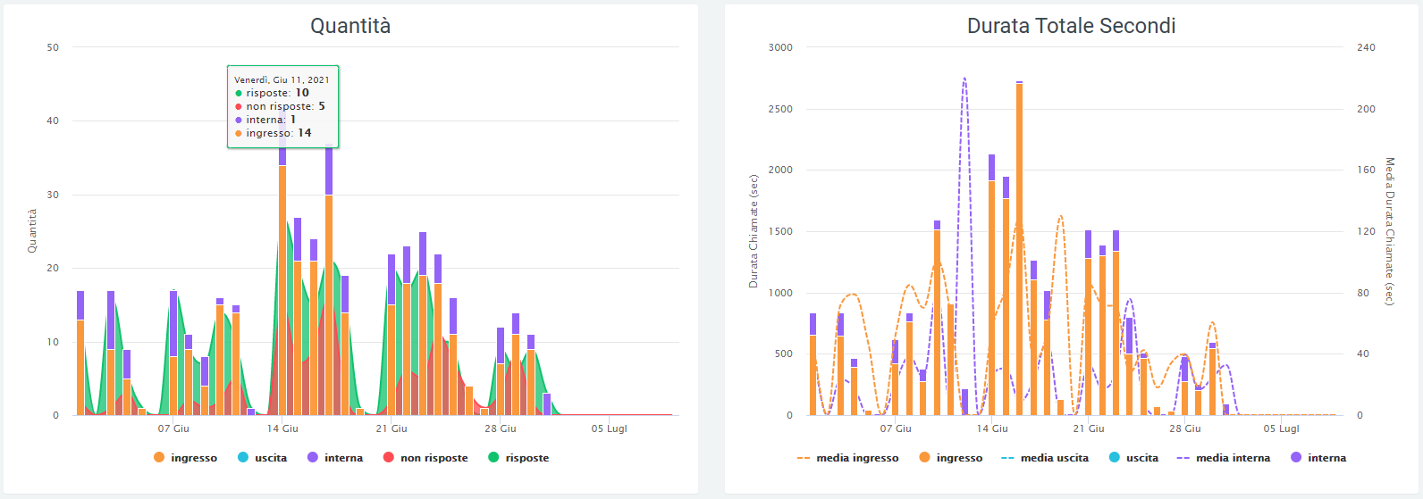
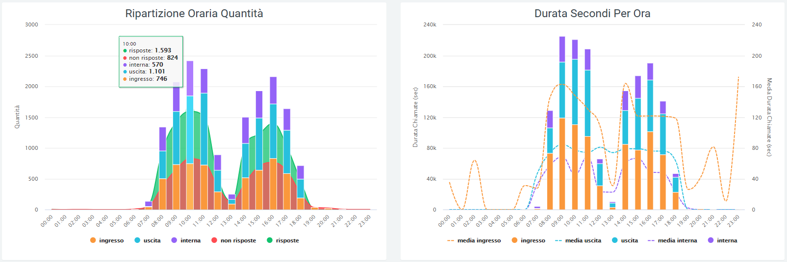
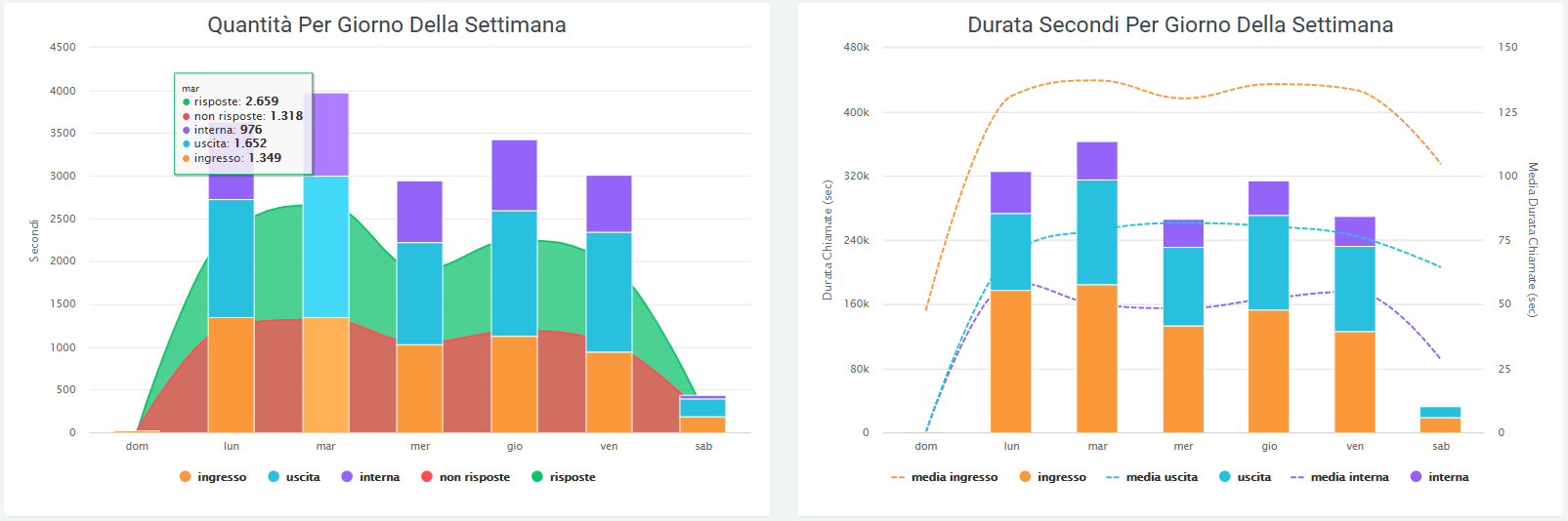
By scrolling over the graphs with the mouse, it is possible to observe the precise values of amount of total, answered and unanswered calls (as shown in the figure above).
The data in the graphs, shown in the legend, can be removed from the display by clicking on the colored dot next to the name. To view them again, simply click on them again.
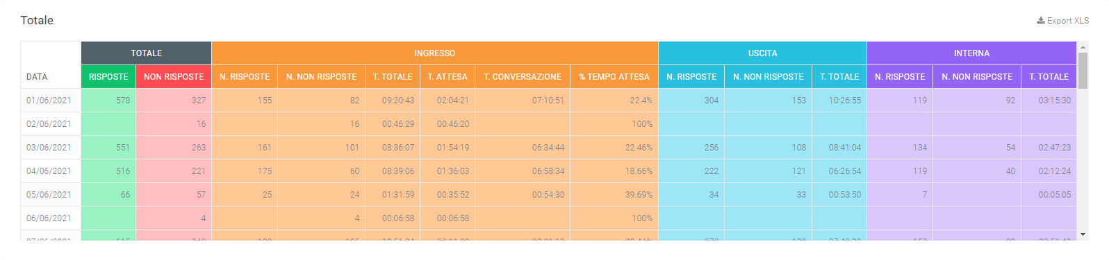
The same data can be found tabulated below the last graph, broken down by incoming, outgoing, and internal calls (include both calls made and received by an operator), each broken down into:
Total calls
Answered calls
Unanswered calls
Total duration of all calls
Average call duration

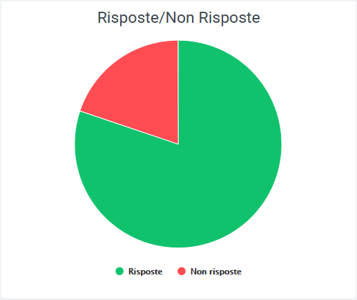
Pie charts
Below the tables are pie charts depicting the number of incoming, outgoing and internal calls, divided into “answered” and “unanswered.” For the latter, there is a further breakdown with the reasons for non-response, which can be: unanswered, failed, busy, declined, unavailable.
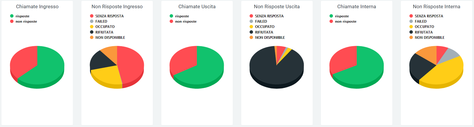
The same data are also represented in a horizontal band graph. Again, scrolling over it with the mouse will display the quantities and percentages. Again, scrolling over it with the mouse will display the quantities and percentages.
Tables
All the data represented in the previously illustrated graphs can be found broken down within dedicated tables. Each table has the option of being downloaded as an excel file by clicking on the “Export XLS” label in the upper right corner of the table. For each breakdown (daily, hourly, or weekly) the table shows the number of answered and unanswered calls broken down by incoming, outgoing, and internal calls. In addition to this, the total call time is reported for internal and outgoing calls, and for incoming calls:
The total call times
The total hold time
The total talk time
The percentage of hold time to total time
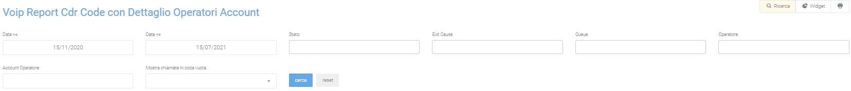
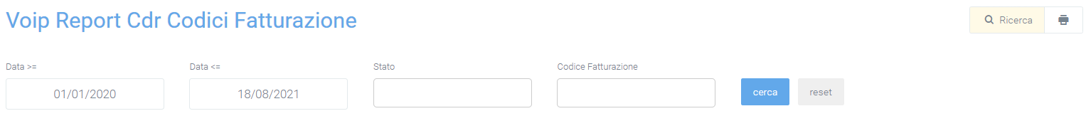
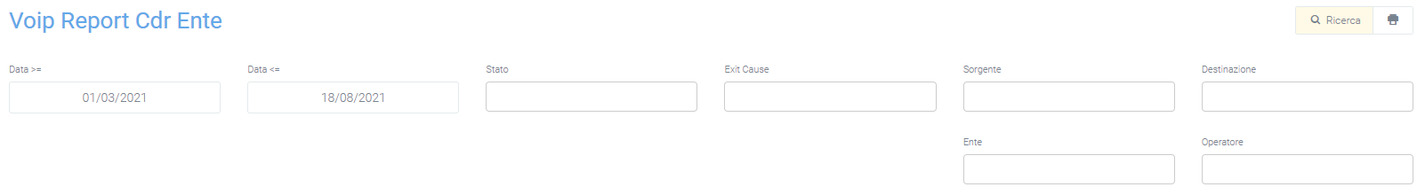
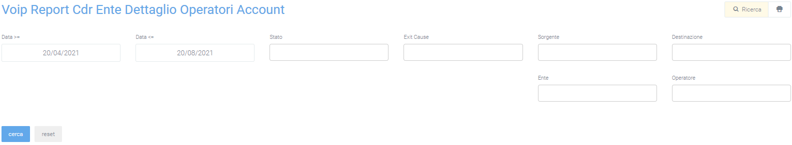
Filters
This facade can be changed by activating filters by clicking on the “Search” button in the upper right corner, with which you can select:
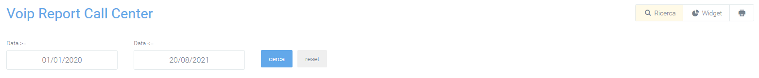
A time interval in which call progress is displayed, setting a start date by “Date >=” and an end date by “Date <=.”
Data source
Call destination
Call status
Billing code
Gateway name
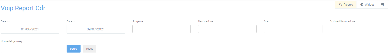
Once the filter fields are filled in as desired, press on the “search” button in light blue to save and display the screen with the activated filters, otherwise press on “reset.”
Widget
For explanation on creating, organizing and managing Widgets, visit:
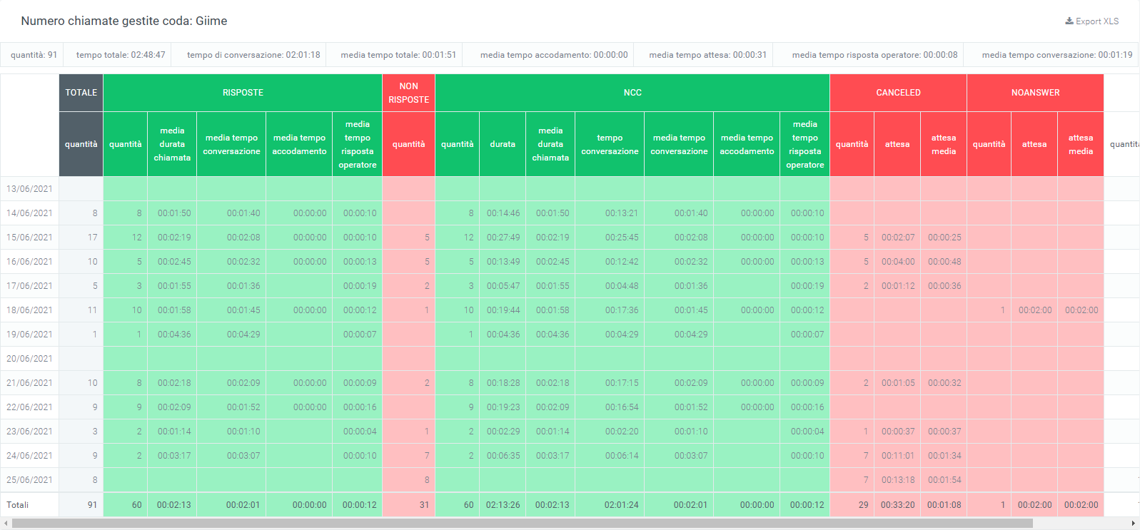
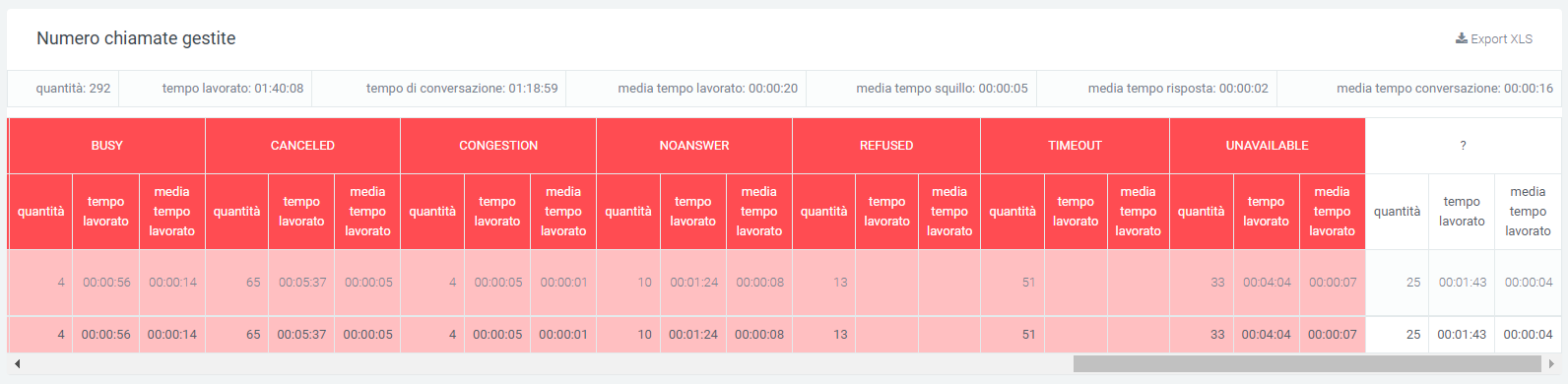
Report queue (operator, date, time, trend)
In the “Report Queue” section, under the “Voip report CDR” form, through the table and graphs the call trends are represented.
Charts
Three types of graphs can be displayed in this report: the first pie chart contains information on the number of answered and unanswered calls. If no queue is entered in the filters, the graph will refer to all queues.
In addition to the pie chart, there are two graphs that contain data on answered, unanswered, and total calls divided by days of the week and by time slot.
This allows for immediate analysis on call trends.
Tables
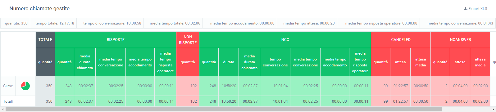
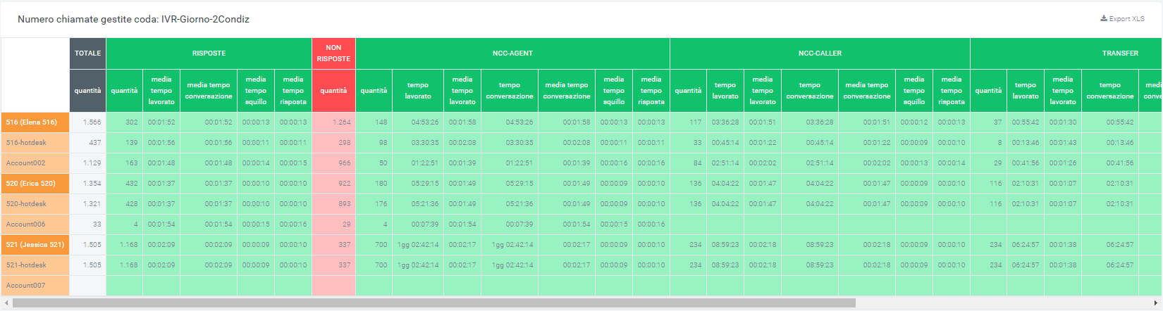
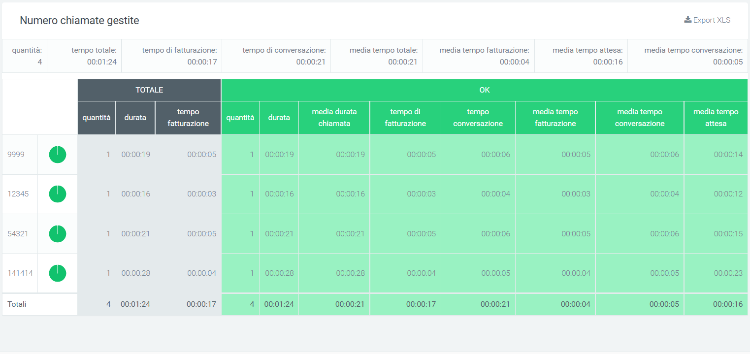
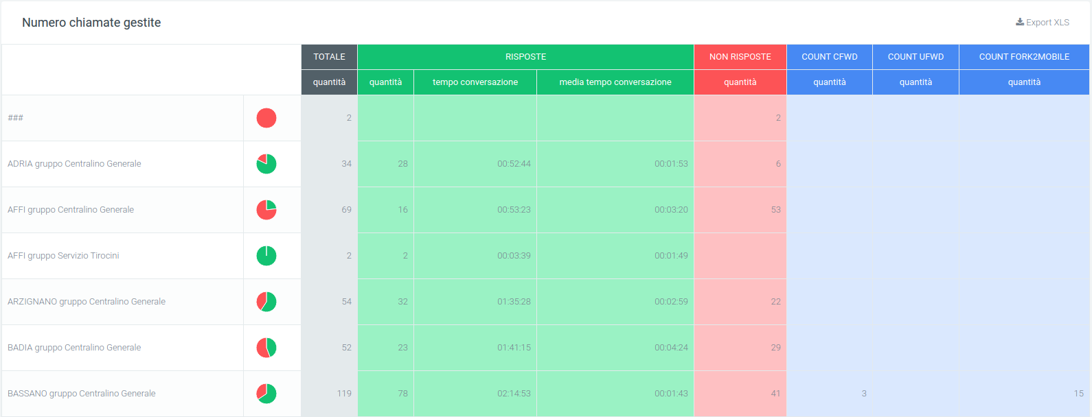
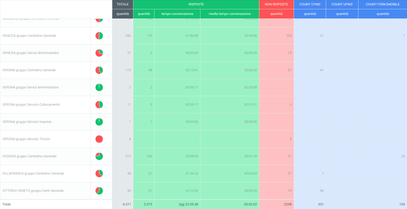
Below all the graphs shown above, there is a table called “Number of Calls Handled” where all the data regarding calls broken down by queue are collected. Before the tabulated data, under the title, there are a series of values showing the total amount of calls, total call time, total talk time, average talk time, average queuing time, average hold time, average time for operator response, and average talk time. It is also possible to export the table to excel format using the button at the top right of the table, “Export XLS.”

In the table, each row belongs to a queue so that the same information can be compared on different queues. Next to the name of each, there is a pie chart representing answered and unanswered calls from the relevant queue. After the pie chart, several more detailed pieces of information follow: the total number of calls received by the queue, the number of answered and unanswered calls, the trend of those answered with their times, NCC calls, calls that have been transferred, calls that have been cancelled, and calls that have not been answered, all accompanied by qualitative information regarding the times taken.
Finally, the lower part of the table shows the totals for each column.
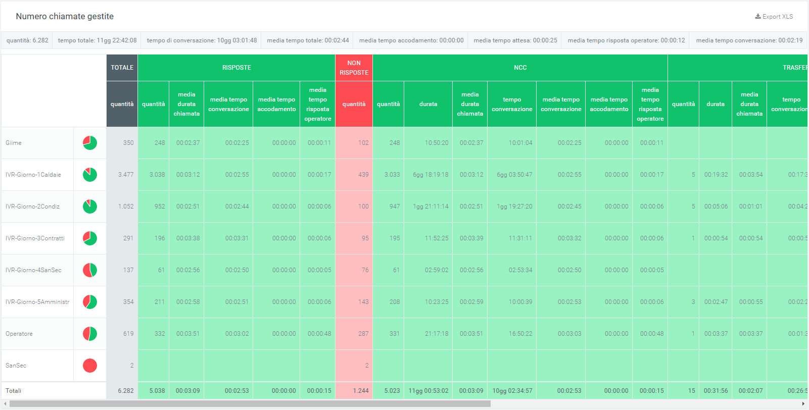
In case a filter is entered on the queues, only one queue will be displayed in the table.
Filters
There is also a mask that groups filters that can be used to improve the analysis of the desired data. To activate the filters, click on the “search” button in the upper right corner. A mask will open with:
Start and end date
The status of the calls
The exit causes
The queues
Ability to show calls in empty queue
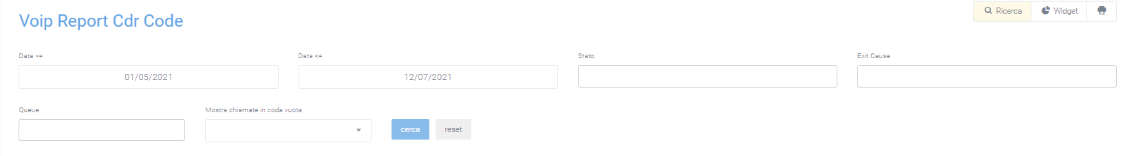
Once you have selected the desired filters, click search to perform the search. You can also add a widget with the appropriate button and print the information on the screen.
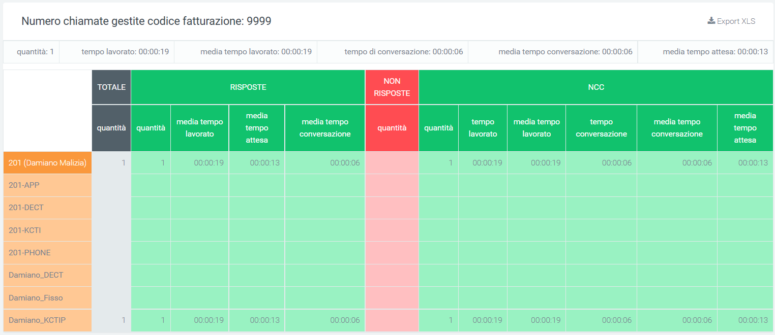
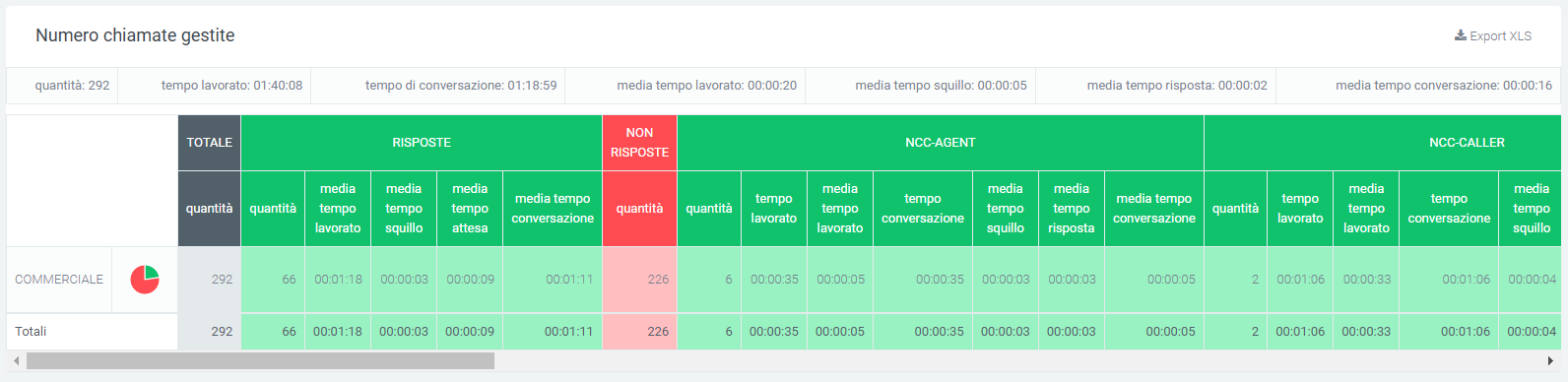
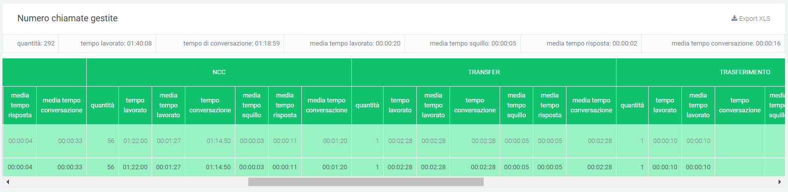
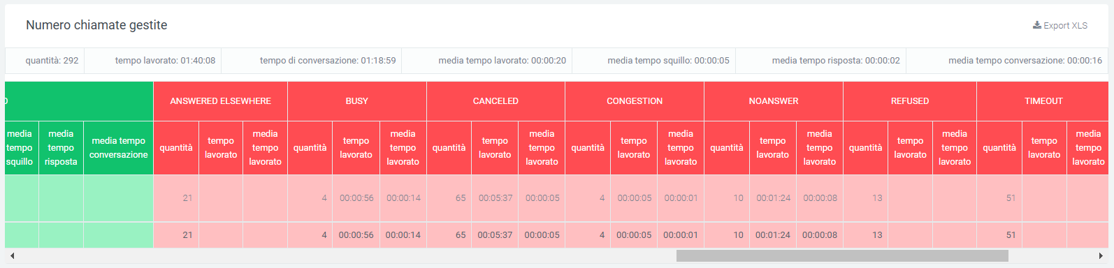
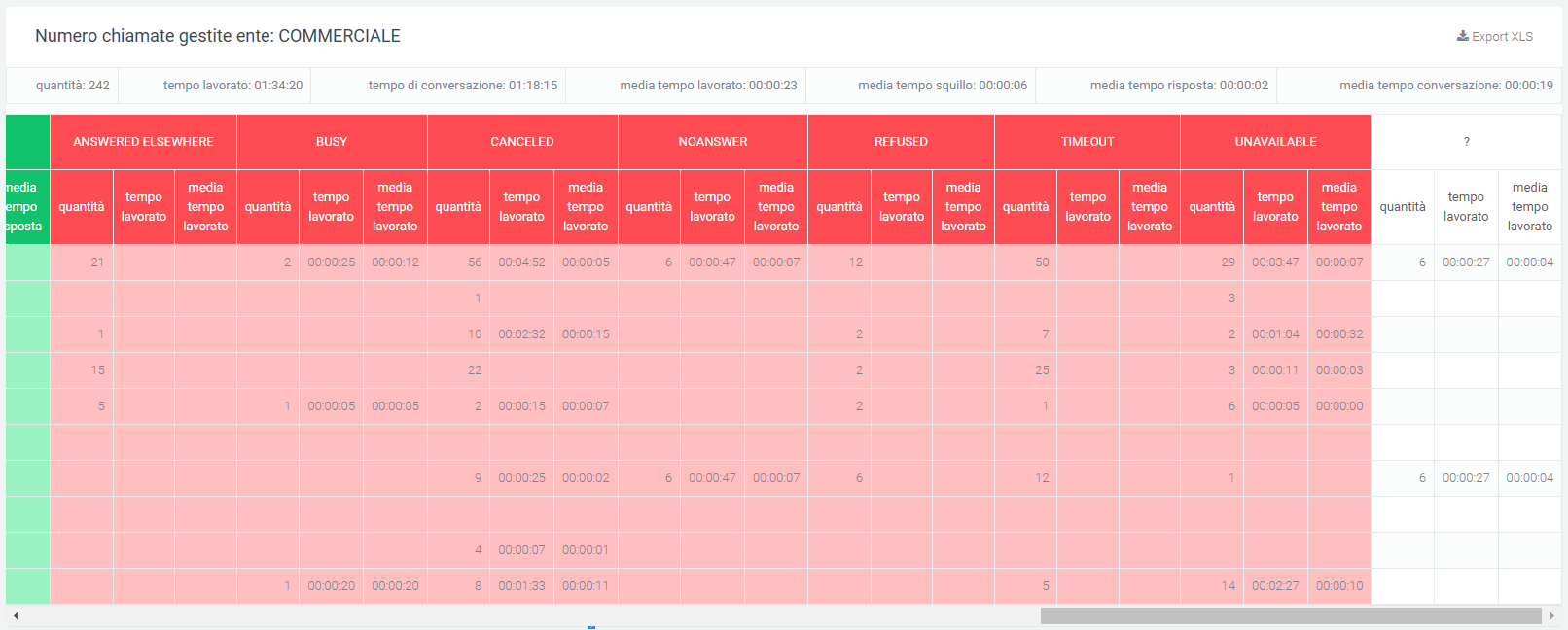
Queue operators report
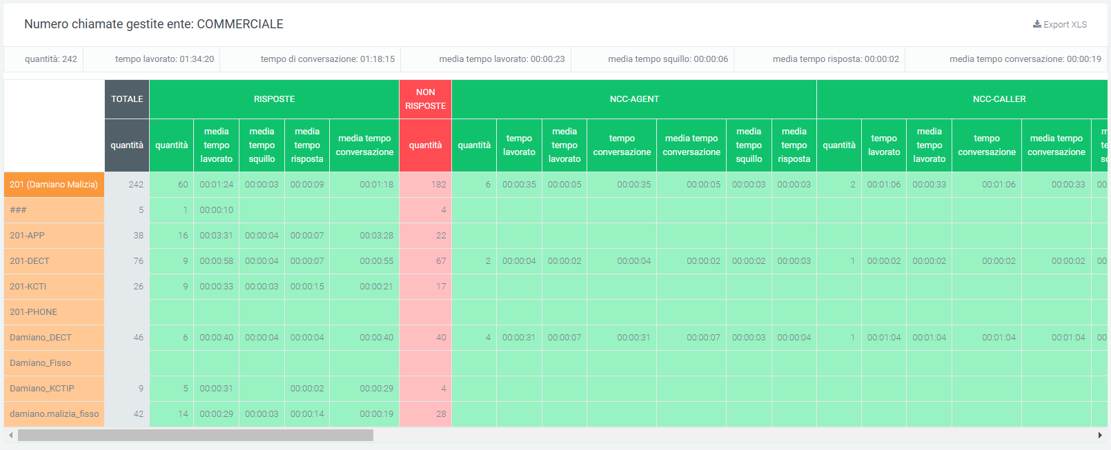
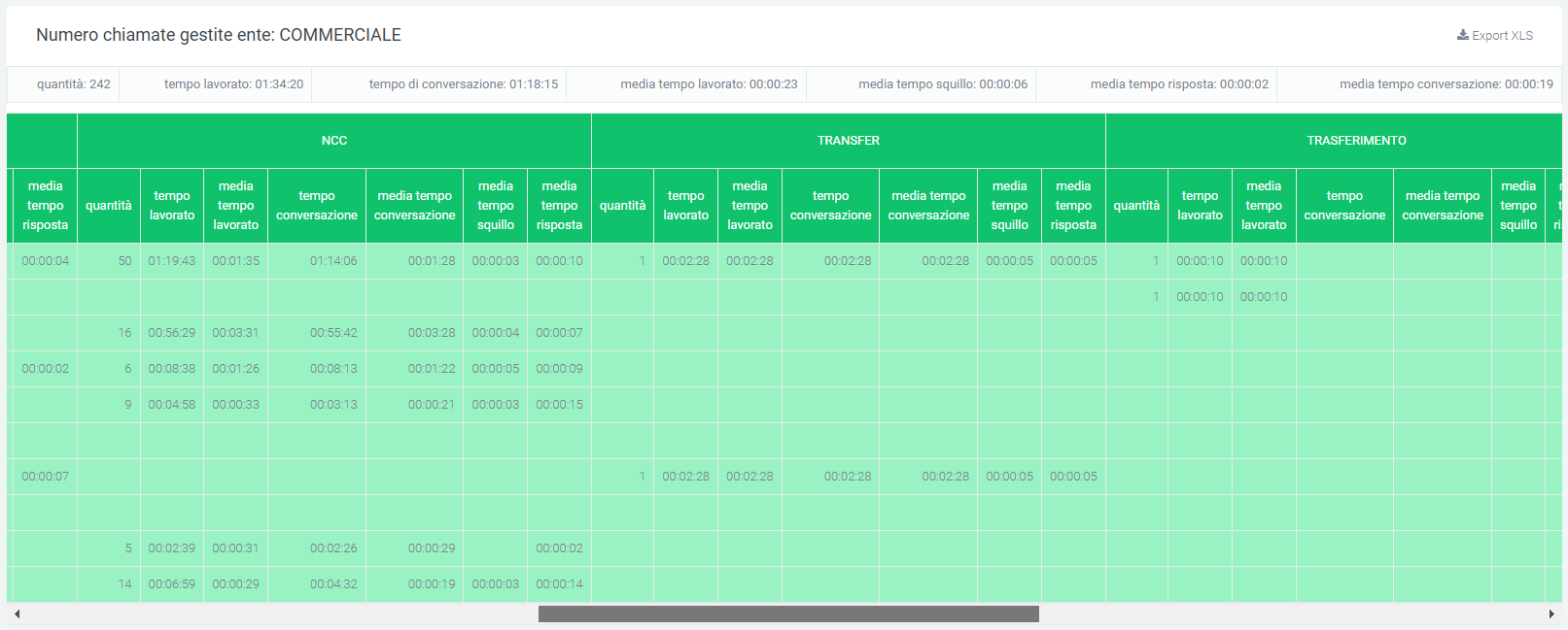
In this section, within the “Voip report CDR” module, you can view, in detail, call trends for individual operators, broken down into their respective queues. The information that is displayed concerns how many calls were answered and how they went, but also how many were not answered and the reasons why. This makes it easier to perform an analysis on each operator accurately. The following are displayed: total calls (amount of calls), answered, unanswered, NCC-Caller (call closed normally), transfer (caller transferred), answered elsewhere (call was answered by another operator), cancelled (caller put the call down after a waiting period), forward, refused (call was rejected by the operator, timeouf (call after a certain waiting time, is dropped)
Tables
Total |
Responses |
Non-Responses |
NCC-Caller |
Transfer |
Answered Elsewhere |
Cancelled |
Forward |
Refused |
Timeout |
|---|---|---|---|---|---|---|---|---|---|
Quantity / Average time worked / Average talk time / Average ring time / Average response time |
Quantity / Average Time Worked / Average Time Worked / Average Talk Time / Average Ring Time / Average Response Time |
Quantity / Time worked / Average time worked / Average time talk / Average time ring / Average time answer |
Quantity / Time worked / Average time worked / Average time talk / Average time ring / Average time answer |
Quantity / Average ringing time |
Quantity / Average ring time |
Quantity / Average ringing time |
Quantity / Average ringing time |
Quantity / Average ringing time |
Each row corresponds to an operator with its corresponding accounts. If a filter was entered on a single operator, only the operator concerned would be displayed.
As for the other queues, they would be displayed in the same table, but with different data and operators.
There is an “Export XLS” button in the upper right corner of each table to export the tables to excel (XLS) format.
Filters
To make data analysis more effective, it is possible to use filters that will allow only the necessary data to be derived from a search. To activate them, simply click on the “search” button at the top right and a mask will open with:
Start date
End date
Status
Exit causes (reasons for the end of calls)
Queue
Operator
Operator Account
Display calls in empty queue
By clicking on “search”, filters are enabled and a search with them is carried out. In case you want to delete them, just click on the “reset” button.
Queue data report
This section encapsulates the information found in the “Report Queue” section, but the breakdown is by day, based on the time frame entered through “start date” and “end date” filters.
Charts
The first graph represents total calls, answered and unanswered, along the time frame of one week. This allows a first general analysis to be performed quickly and easily. You can also select only some of the three pieces of information in the graph by clicking on the name of the one you do not want to display within the legend.
Tables
At the bottom of the section, below the graph, are tables for each queue broken down by date. Each row corresponds to a day within the period entered in the filters and is divided into columns, which show all the information needed to perform an accurate analysis of call trends for each specific queue.
The information contained within the table includes:
Total quantity |
Answered calls |
Non-answered |
NCC |
Cancelled |
No answered |
|---|---|---|---|---|---|
Quantity / Average call duration / Average talk time / Average operator response time. |
Quantity / Duration / Average call duration / Average talk time / Average queuing time / Average operator response time |
Quantity / Time worked / Total wait / Average wait |
Quantity / Total wait / Average wait |
Depending on the queue, there may also be an additional transfer part with:
quantity
duration
average call duration
conversation time
average conversation time
average queuing time
average operator response time
Each table can be exported to an excel sheet via special “Export XLS” button in the upper right corner.
Filters
By clicking on the “search” button at the top right of the section, filters can be enabled that include:
Start date
End date
Status
Exit cause
Queue
Calls in empty queue
Queue Time Report
Tables
This section contains only the tables divided by time slots, which contain all the information necessary for the analysis of calls in individual queues.
The information contained in the tables includes:
Total quantity |
Answered calls |
Non-answered |
NCC |
Cancelled |
No answered |
Transfer |
|---|---|---|---|---|---|---|
Quantity / Average call duration / Average talk time / Average queuing time / Average operator response time. |
Quantity / Duration / Average call duration / Talk time / Average talk time / Average queuing time / Average operator answer time |
Quantity / Total wait / Average wait |
Quantity / Total wait / Average wait |
Quantity / Duration / Average call duration / Talk time / Average talk time / Average queuing time / Average operator response time |
Each table is exportable as an excel child via special “Export XLS” button in its upper right corner.
Filters
Clicking on the “search” button at the top right of the section enables filters that include:
Start date
End date
Status
Exit cause
Queue
Calls in empty queue
After entering preferences, click on “search” to perform a filtered search. If you enter the filter for specific queues, only the tables of the selected queues will be shown.
Billing Codes Report (date, operator)
It is possible to observe the trend of calls recorded in the CDR broken down by billing codes (used in campaigns), which is why only outgoing calls will be analyzed.
Charts
To get a visual representation of the data just click on the “graphs” button.
Three types of graphs can be displayed in this report:
A pie chart (on the right) showing the number of calls answered and not by the billing codes entered through the filters.
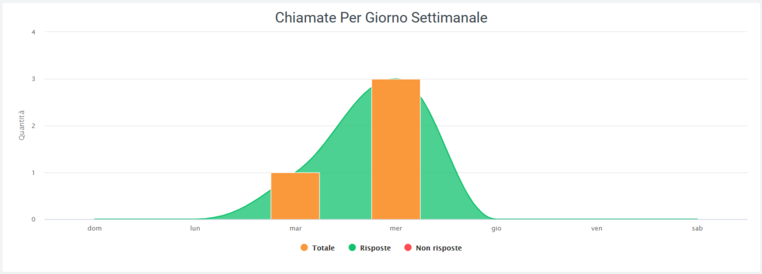
A graph showing call trends, again for selected billing codes, by day of the week (Sunday through Saturday). In orange is shown the total number of calls, and in green and red, the curves for answered and unanswered calls, respectively.
A graph showing average call trends by billing code broken down by time slot (00:00 to 23:00)
In all three graphs, it is possible to remove some data from the view via the legend by clicking on the name or colored dot. It is also possible to see in detail the number of affected calls by scrolling over the various graphs with the mouse, in the affected areas.
Tables
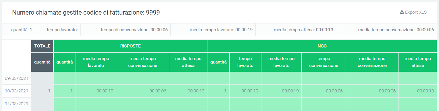
Below all the graphs shown above, there is a table called “Number of Calls Handled” where all the data regarding calls broken down by billing codes are collected. Before the tabulated data, under the title, there are a series of values showing the total amount of calls, total call time, total billing time, average talk time, average total time, average billing time, average hold time, and average talk time. It is also possible to export the table to excel format using the button at the top right of the table, “Export XLS.”
In the table, each billing code belongs to a row that allows the same information to be compared on different code. Next to the name of each, there is a pie chart representing answered and unanswered calls by the code concerned. After the pie chart, several more detailed information follows, for total, answered (OK) and unanswered calls. At the bottom of the table, however, are the totals for each column.
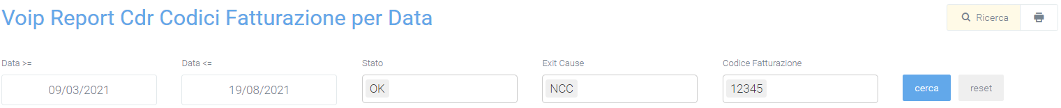
Filters
Filters are used to select a specific time frame in which to analyze the performance of billing code by calls, or to select some specific ones. To enable them, click on the “search” button with which a mask will open allowing the following data to be entered:
a start and end date of the time interval you want to observe
the status of the calls
one or more specific billing codes
After entering all the desired data, click on “search” to enable the filters, otherwise on “reset” to delete them.
The printer button, to the right of the “search” button, allows you to print the entire page view, including charts and the table.
Billing Codes Date Report
To analyze call trends for each billing code in more detail, you can take advantage of the “Billing Code Report by Date” section, which allows you to observe call trends for each individual day contained within the entered interval through filters (“start date” and “end date,” visible via “search” button in the upper right).
Charts
To get a visual representation of the data just click on the “graphs” button. The graph in this section shows an average regarding the distribution of calls over the days of a week (Sunday through Saturday). The green curve represents the trend of answered calls, while the red curve, the unanswered calls. The orange column shows the total calls on that day.
Using the legend, by clicking on the name or colored dot of any of the information shown, you can remove it and reinsert it into the display. By scrolling with the mouse over the graph, more specific values about what is represented will be visible.
Tables
In the lower part of this section, below the graph, there are tables showing the detail regarding calls for each day, from the first to the last of the entered interval. Each table belongs to a billing code, so by doing so it will be possible to observe the days on which calls were made, with all the relevant details, quantitative and qualitative.
For each day there is a wealth of information regarding answered and unanswered calls, showing information regarding why they were or were not answered. At the beginning of each row is a “TOTAL” column reporting the total number of calls made by the billing code, whether those calls were answered or not.
At the top of each table is a total of some information such as:
the total amount of calls
total time worked
total talk time
average time worked
average waiting time
average of conversation time
Each table can be exported to excel format through the “export xls” button in the upper right corner.
Filters
In order to display only certain information in the graph and tables, filters must be used. To enable them, click on the “search” button in the upper right corner and enter the desired data:
start and end date of the time interval in which to view the data
call status
exit causes, i.e., the reasons why the call ended
billing code to be displayed
Once the data entry is finished, click on the “search” button to enable the desired filters, otherwise click “reset” to delete them.
Widget
For explanation on creating, organizing and managing Widgets, visit:
Operator Billing Codes Report As in the other reports regarding billing codes, this section will also show call trends by billing code, but with the difference that here you will be able to observe the detail for each operator.
Tables
There is a table for each code and each row belongs to an operator (with the darker color) and its accounts (with the lighter color). For each of these it is possible to observe the detail of calls made, answered and unanswered, with reasons for them.
At the top (outside the grid) a total of some information such as:
the total amount of calls
total time worked
average time worked
total talk time
average talk time
average of waiting time
In the table, on the left you will be able to see the operators with their code. Then entering the table, before the whole set of information for answered and unanswered calls, there is a column called “total” which contains the total number made by the operator.
For each table it is possible to export a copy in excel format via special “Export XLS” button in the upper right corner.
Filters
To extract only some essential information, filters can be used by clicking on the “search” button in the upper right-hand corner and with which an appropriately dedicated mask will open. Here you will be able to enter information such as:
a start and end date of the time interval in which you want to consider the data
the status of the calls you want to view
their exit cause, i.e., why the calls ended
one or more billing codes that you want to observe
the operator involved
the account used by the operator
After entering all the data, click on the “save” button to enable the filters, otherwise press “reset” to delete them.
You can also print the page view by simply clicking on the button located at the top right of the page, next to the “search” button.
Report Coincidences
Coincidences refers to the number of calls that pass through the exchange in the same period of time, from answering to closing a call. Depending on the number of simultaneities the company has, it may receive a certain number of calls, i.e., occupy a certain number of lines, at the same time.
This section makes it possible to observe their progress through a graphical representation, allowing the company to understand whether it needs additional channels or if it already has too many that are not being used and are therefore an unnecessary expense.
Charts
Once you enter the section, you can see represented on the respective graphs, the channels occupied for the various gateways over the specified time interval.
As on other graphs, it is possible to remove from the information display via the legend by simply clicking on the name or symbol to the left. By scrolling with the mouse over the graph, it is also possible to view the specific data at that particular time.
In addition, on this graph it is possible to zoom in by holding down the right mouse button and moving it to select the part to be zoomed in, once selected let go of the right mouse button. To return to the initial view, click on the “reset zoom” button in the upper right corner of the graph.
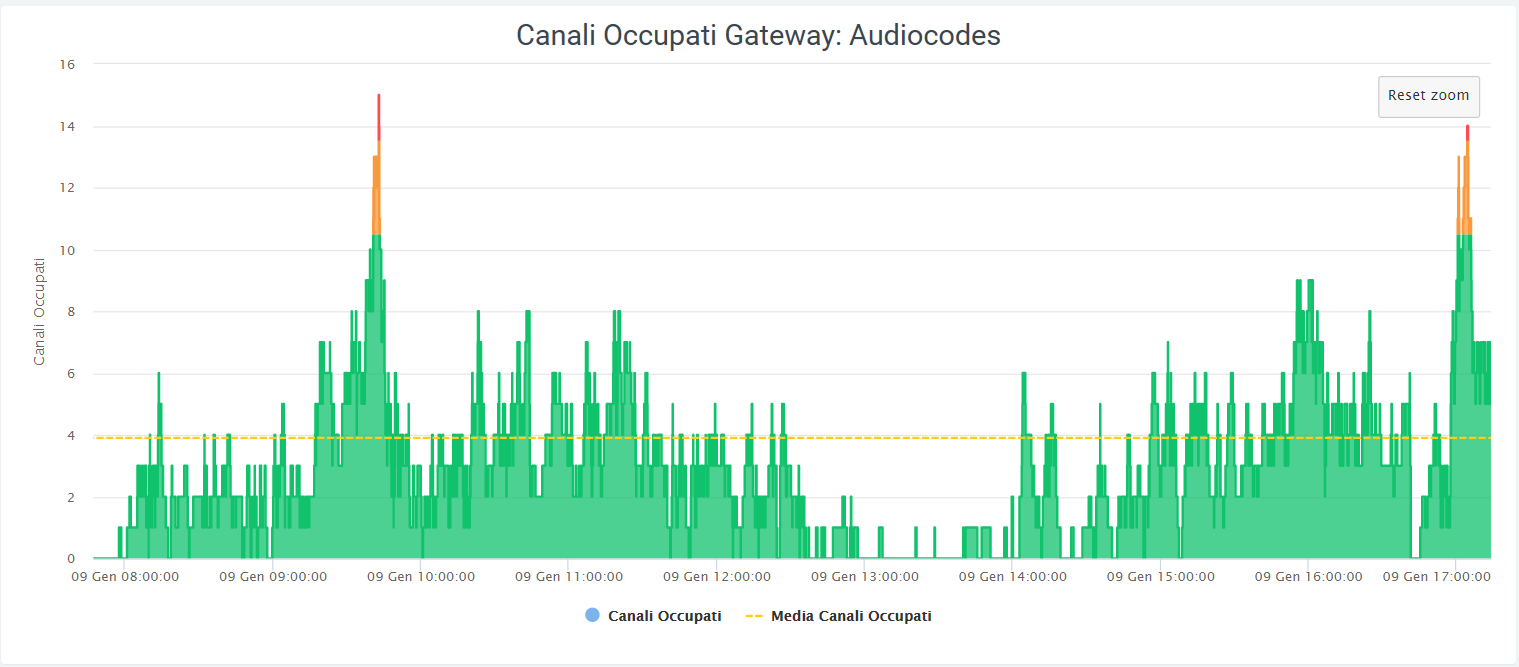
You can see how the calculation of simultaneities changes, even reaching some peaks (this is based on call traffic). To observe whether the number of channels in the various gateways are enough, just look at the graph:
the color remains green if the number of simultaneities remains below 75% of the number of channels
the color turns orange when you are approaching total channel occupancy, i.e., 75 to 90 percent
the color turns red when you are capped, i.e., when all (or almost all) channels are occupied: 90% and up.
The dashed line in yellow stands for the average channel occupancy during the interval.
This helps to perform a more accurate analysis toward channel availability throughout the day.
Filters
To make a more specific analysis, it is possible to filter the information represented on the graphs. To do this, simply click on the “search” button in the upper right-hand corner, with which a mask will open where you can enter:
A time period in which you want to observe the data (this via start and end date)
One or more specific gateways to observe
Once you have entered all the information, click on the “search” button to enable the filters, otherwise on “reset” to clear them completely.
Widget
For explanation on creating, organizing and managing Widgets, visit:
Coincidences Out
Unlike the “Coincidences” section, which takes into account all voice lines in the exchange, the “Coincidences Out” section counts only outgoing calls passing through “configurations.” The representation of the graphs is based on the representation of the gateway “configurations” data. Report Groups (date, time)
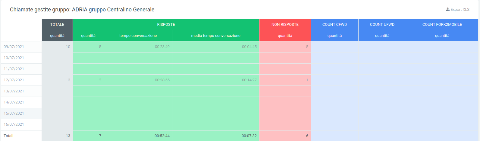
Report Groups
In this section it is possible to visualize the progress of calls divided into the various groups of the telephone exchange through the use of simple and clear graphs, but highlighting the information necessary for accurate analysis. In addition to the graphs, there is a table for each group, which contains detailed information.
Charts
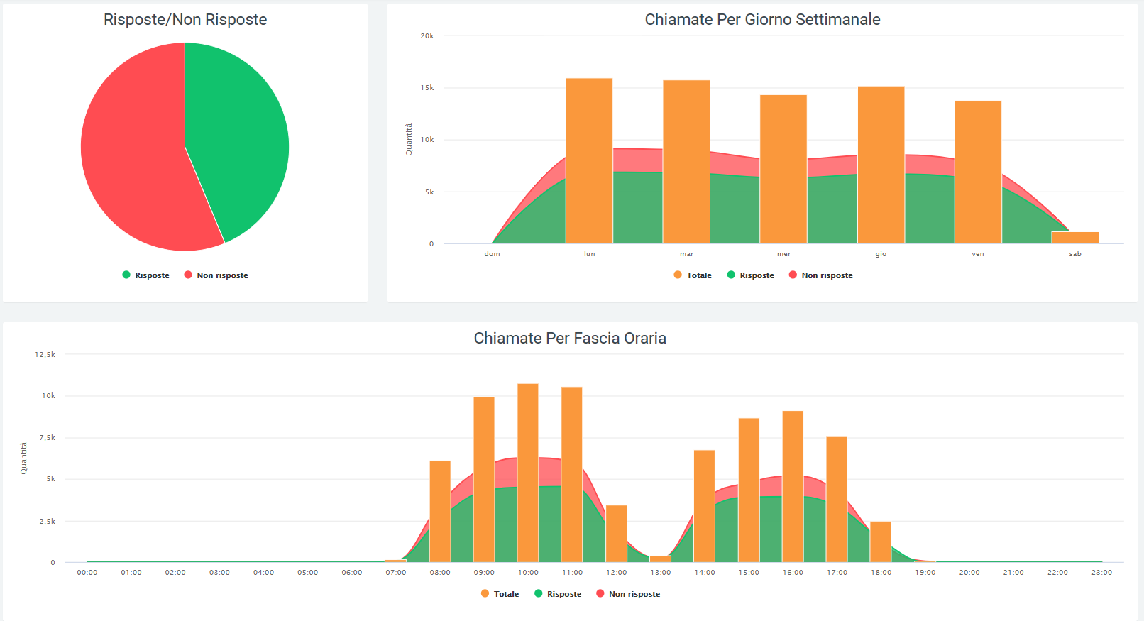
The first graph that can be observed is a pie chart representing the number of calls answered and not answered by the groups. By scrolling over it with the mouse, it will be possible to observe, depending on the position of the mouse, the numbers in detail.
Using the legend at the bottom, it is possible to remove and enable the display of a graph information by clicking on the corresponding colored dot.
The second graph represents the number of calls broken down by days of the week. The total number of calls and the trend of answered and unanswered calls is visible. Again, through the legend it is possible to select which information to display and which not to display.
The last graph represents the trend of calls broken down by time slot. This allows you to observe the trend of answered, unanswered, and total calls over the course of a day. You can use the legend to view only some of the information.
Tables
Below is a table called “Number of Calls Handled” which contains information regarding the calls in each group. On the leftmost part is the name of the group, followed by a small pie chart representing call trends for that particular group.
In the middle part of the table are:
Total: the total amount of calls arrived at the group
- Answered
quantity: the quantity of answered calls
converse time: total time of all answered calls
Average talk time: average time among all answered calls
Unanswered
Count CFWD (Conditional Forward)
Count UFWD (Unconditional Forward)
Count FORK2MOBILE (Fork to mobile).
The last row of the table contains the sum of all data in the respective column. For the average talk time, an average will be taken between all group averages.
These tables are exportable in excel format, via the “Export XLS” button in the upper right corner.
Filters
To perform the analysis of a specific group in a specified time period, the filter mask can be used, which provides:
start date filter: the system takes into account data present from the entered date onwards;
end date filter: data stored after the entered date are not used;
Group filter: only the groups entered in this filter will be displayed;

Filters are retrievable via the “Search” button in the upper right corner with which the mask will open, as in the picture, where it will be possible to enter the data to be investigated. After entering, click on “search,” while to delete all filters, click on the “reset” button.
Widget
For the explanation on creating, organizing and managing Widgets, please visit the page:
Report Date Groups
Unlike the “Groups Report” section that groups together total call information for each group, the “Groups Report by Date” allows this information to be analyzed separately for each individual day.
Charts
With the graph below, it is possible to observe the trend and quantity of calls with a breakdown by days of the week. In addition, by scrolling over the graphs with the mouse, the number of total calls, answered calls, and unanswered calls can be observed.
The data contained in the graph, shown in the legend, can be removed from view by clicking on the colored dot next to the name. To view them again, simply click on them again.
Tables
At the bottom of the screen you will see a table for each group, broken down by days of the week. For each of these you will be able to analyze the same types of data found in the group report table.
Again, the last row of the table contains the sum of all the data in the respective column. For the average talk time, an average will be taken between all group averages.
These tables are exportable in excel format, via the “Export XLS” button in the upper right corner.
Filters
If there is a need to analyze data on a specific date or time frame or for one or more specific groups, simply use the filter mask, which will provide:
start date filter: the system takes into account data present from the date entered onwards;
end date filter: data stored after the entered date are not used;
Group filter: only the groups entered in this filter will be displayed;

Report Groups Time
In the “Report Groups by Time” section you can view call trends, this time broken down into time slots. You can then analyze the data by checking, for example, in which time slots there is more call traffic or in which slot the groups work best.
Tables
For each group there will be a table broken down by time slots containing the same types of data as in the group report tables.
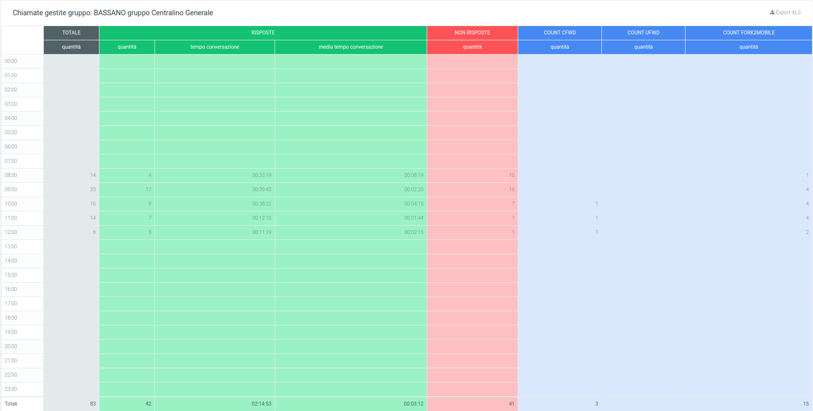
Filters
Again, if there is a need to analyze a precise date or time frame or to search for information for one or more specific groups, simply use the filter mask, which will provide:

start date: the system takes into account the data present from the entered date onwards
End date: data stored after the entered date are not used
Group: only data from the groups entered in this filter are displayed
Report Operators (account)
The following section reports call trends for each individual operator.
Charts
The total trend of answered and unanswered calls is graphically represented in a pie chart where, by scrolling over with the mouse, the quantities can be observed in detail.
In addition, there is the possibility of removing a data item from the visualization via the legend by clicking over the name or colored dot. To put it back into the visualization, simply click on it again. These two functions, detail and visibility, are also available in the same way on the other two graphs.
The other two graphs represent one the total call trends by breakdown by days of the week, the other by time slot. These two, in addition to the number of answered and unanswered calls, also report the total number of calls, as can be seen in the following picture.
Tables
After the graphical display of call trends, the data sonported in a table divided by operators, each with its own detailed information. Before reporting the data for each operator, the total data for each field can be observed:
the quantity of calls
the total time
the talk time
average total time
average ringing time
average answer time
average talk time
After this first part, the table shows for each row the respective operator with the exact information. On the left is the name of the operator, followed by the total amount of calls handled by it. Next, information on answered and unanswered calls is shown before going into the details of each of these macro-groups.
- Answers:
NCC-AGENT
NCC-CALLER
NCC
ANSWER
TRANSFER
TRANSFER
- Unanswered:
ANSWERED ELSEWHERE
BUSY
CANCELLED
CFWD
CONGESTION.
FORWARD
NOANSWER
PICKUP
REFUSED
TIMEOUT
NAVIABLE
Each of these subgroups will have a further subdivision into details.
For answered calls, the details present will be:
quantity
time worked
average time worked
conversation time
average ring time
average answer time
average talk time
For unanswered calls instead:
quantity
time worked
average time worked
At the end of the table, at the bottom, the totals of each detail column will be shown.
Using the appropriate button located at the top right of the table, it will be possible to export it to excel “XLS” format.
Filters
By using filters, it will be possible to improve the data analysis activity by focusing only on those of interest. In order to obtain them, it will be sufficient to click on the “search” button at the top right with which a mask containing the relevant filters will be opened. Through this enter the data in the appropriate boxes:
start and end date: only data present in this time frame will be included
status: where the status of the calls to be analyzed should be indicated
exit causes: the reason why the call is terminated
operator: this is to make sure to have a report, even a graphical one, exclusive to the selected operator (or more than one).
source: where the call came from
destination: where the call will end
Once the relevant data has been entered, click on “search” to start the filtered search, otherwise on “reset” to delete all data entered.
Widget
For explanation on creating, organizing and managing widgets, visit:
Operators Account Report
This section encapsulates the information found in the “Operators Report” section, but the breakdown is by account.
Tables
In this section we can find a table containing the working time and the number of calls handled by each operator account. This allows us to keep track of each operator’s work performance and to assess which account is being used the most (each account may be a different device on which a call may be answered).
As the first piece of information is the operator’s account code and name, then the total time worked in the time interval entered through the filters. Below the account code and name (in dark gray), there are other names (light gray box): these are the various accounts connected to the operator. After these you have a breakdown of calls by incoming, outgoing, and internal calls, each with its own detailed information.
Input:
quantity
time worked
average time worked
average response time
Output:
quantity
time worked
quantity OK (successful calls)
average time worked OK (with successful calls)
quantity KO (unanswered calls)
average time worked KO (with calls not answered)
Internal:
quantity
time worked
average time worked
Each of these boxes will show the exact data regarding a specific operator account.
Filters
The filters that can be entered are the same as those listed above:
start and end date
call status
exit causes
operator
operator account
call source
call destination
Report Organizations (operator)
This section allows you to analyze call trends for each organization, bringing back both graphical and tabular reports, so that you get first a visual and then a more detailed analysis.
Charts
There are 3 graphs in this section and they show call trends in total or distributed calls over a certain period of time:
pie chart: (on the right) represents answered and unanswered calls, within the time frame defined in the filters, from all organizations in the company. It performs a sum total.
Weekly graph: represents call trends over the week. It shows a curve for calls and their status, while reporting a column for the total number of calls.
hourly graph: shows the pattern of calls over the course of a day, thus with an hourly breakdown. Also used in this are the curves for call status and the column for total number.
In all three cases, it is possible to observe the detailed number of calls by simply scrolling with the mouse over the graph. You can also remove or reinsert one or more pieces of information into the view by clicking on the name or colored dot of the data item in the legend.
Tables
The table below shows, broken down by organization, call details, including information such as status, with all related information, and exit causes, i.e., why a call ended. First, at the top of the table, there are totals of the data in the table, namely:
the total quantity
the total time worked
the total talk time
the average time worked
the average time the phone rang
the average answer time
the average talk time
On the left side of the table, before the grid containing all the data, is the name of the organization with an associated small pie chart representing the status of calls received and made by operators belonging to that organization. Immediately following this is the total amount of calls, before all the detailed data.
As in any table, a total calculation of each column will be found at the bottom.
As always, it is possible to export the table to excel format via special “Export XLS” button in the upper right corner (of the table).
Filters
As described initially, to enable the filters simply click the “search” button in the upper right corner with which a mask will open in which all the necessary data should be entered:
start and end date of the time interval in which the data will be shown
status
exit causes, i.e. the reasons why a call is terminated
source
destination
organization (more than one can be entered)
operator
After entering all the desired data, click on “search” to enable the filters, otherwise on “reset” to remove them.
Widget
For explanation on creating, organizing and managing Widgets, visit:
Report Organizations Operator
Each organization consists of several operators, each holding different accounts. This section allows you to keep track of call trends for each of these by displaying a table for each organization, where each row belongs to an operator account.
Tables
The table will present information regarding total calls, answered calls, and unanswered calls, broken down by exit causes. For successful calls, the information contained in the exit causes will be:
the quantity
the waiting time
the total and average work and talk time
the average time for which the phone rang
the average of the answer time
Regarding unanswered calls, the information for each exit cause is basically three:
quantity
average time worked
total time worked
First, however, above the table is a grid containing a total of some information, viz:
the total quantity
the total time worked
the total talk time
the average time worked
the average time the phone rang
the average answer time
the average talk time
In the leftmost part are the operators (those with the darkest color) and their accounts (below the operator and lighter in color). Next, before going into the details of each exit cause, is a total of calls, both answered and unanswered.
Each table is exportable in excel format, individually via its own “Export XLS” button located at the top right of each one.
Filters
To enhance the analysis experience by selecting only certain information to display or certain specific time periods, filters can be enabled. To do this, click on the “search” button, with which a specially designed mask will open, and enter the desired data from those proposed:
start and end date of the time interval in which the data will be shown
call status
exit causes
source
destination
organization
operator
After entering all the desired data, click on “search” to enable the filters, otherwise on “reset” to delete them.
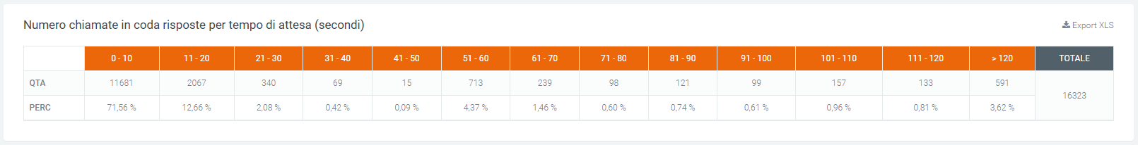
Waiting Times per Queue Report (incoming).
In this section it is possible to observe the report of the number of calls broken down by waiting times, by graphical display and table, of queues specified through the filter mask.
Charts
In the graph, the exact number of calls by waiting time of the specified queue is observed. It can be seen that the wait times in seconds increase as one proceeds to the right of the graph, starting from a range of 0 to 10 seconds, reaching a maximum of over 120. The height of each graph represents the number of calls within a range.
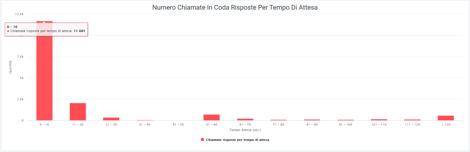
Tables
The table below shows the same data, i.e., the amount of calls by average waiting time. In addition, there is a percentage of accuracy in answering, based on the ratio of the amount of calls in a waiting time range to the total amount. The total is visible in the rightmost part of the table.
The table is exportable via special “Export XLS” button in the upper right corner.
Filters
The special feature of this section is the ability to view the number of calls by waiting time, of each specified queue via filters and to do this you will need to:
Click on the “search” button in the upper right corner
Click on the “queues” item
Select one or more interested queues
Click the “search” button
The time frame in which the data is represented is also variable via filters. After opening the mask as described above, under the “Date >=” and “Date <=” headings the start and end dates of the relevant time frame should be entered.

If, under “queues,” no preference is entered, the sum of all queues for each waiting time interval will be displayed.
Incoming Wait Times Report
In the following section it is possible to observe a report of the waiting times for incoming calls, with either a graphical display or by means of a table. In both cases, the quantities of calls answered within a certain waiting time are shown.
Charts
As in the previous graph, it can be seen that the wait times in seconds increase as one proceeds to the right of the graph, starting from a range of 0 to 10 seconds and reaching a maximum of over 120. Scrolling with the mouse over the graphs will show the exact number of calls.
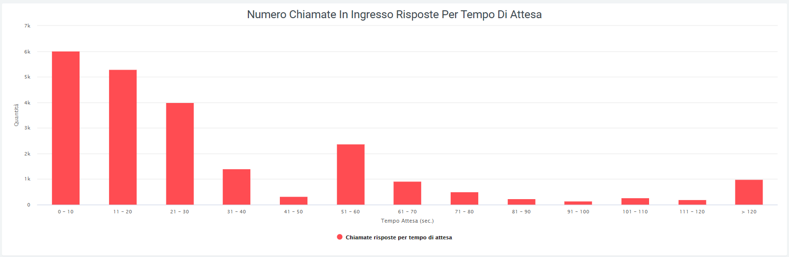
Tables
The table below shows the same data as the previous table.
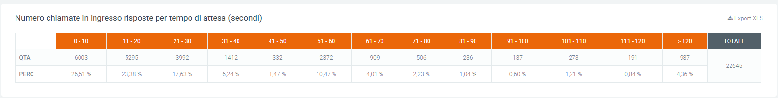
The table can be exported using the “Export XLS” button in the upper right corner.
Filters
Clicking on the “search” button at the top right of the page will open a filter mask where a time range can be entered in which the data will be displayed. This can be done by pressing on either box and entering the desired start and end dates.

Once the data is entered, press on the “search” button to start the filtered search, otherwise on “reset” to delete the filters entered.
Widget
For explanation on creating, organizing and managing Widgets, visit:
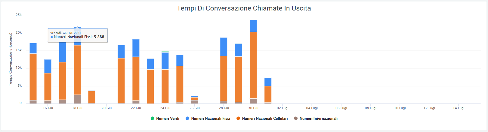
Conversation Times Report
This section reports the talk times, in seconds, of all outgoing calls from the telephone exchange to which the platform is connected. The data are first reported with a daily breakdown graph where conversation times to:
toll-free numbers
domestic fixed numbers
domestic cellular numbers
international numbers
Charts
By scrolling over the graphs with the mouse, it will be possible to view the exact number in seconds of the talk time of a specific field from those listed before. It will also be possible to remove the display from these via the legend. To do so, simply click on the colored dot of the information you want to remove from display. To reinsert it, click again on the dot, which will now have turned gray.
Tables
At the bottom of the page, on the other hand, it is possible to observe a table containing the talk times represented in the previous graph, but with a monthly time breakdown. As in the graph, here too it is possible to observe the trend of times in the various numbers (toll-free, fixed, cellular and international). The last row of the table encloses the conversation time totals for each category in the table.
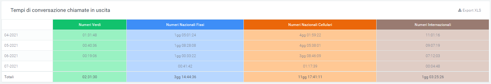
This can be exported to XLS format using the appropriate button at the top right of the table.
Filters
Pressing on the search button at the top right of the page will open a filter mask on which the time interval can be entered that will be represented on the chart and shown in the table. Simply enter the start and end date, then press “search.” To delete all the filters entered, click on the “reset” button.

Widget
Widgets For an explanation of creating, organizing, and managing Widgets, visit:
Report Organizational Unit (operator)
In case there is a need to analyze call trends for each organizational unit, this section allows this by showing reports with graphs and tables, so as to have an initial visual analysis through graphs and then a more detailed one through tables.
Charts
Answered, not answered
There are 3 graphs in this section and they show the trend of calls in total or distributed over a certain period of time:
pie chart: represents answered and unanswered calls, within the time frame defined in the filters, from all organizations in the company. It performs a total sum.
Weekly graph: represents call trends over the week. It shows a curve for calls and their status, while reporting a column for the total number of calls.
hourly graph: shows the pattern of calls over the course of a day, thus with an hourly breakdown. Also used in this are the curves for call status and the column for total number.
In all three cases, it is possible to observe the detailed number of calls by simply scrolling with the mouse over the graph. You can also remove or reinsert one or more pieces of information into the view by clicking on the name or colored dot of the data item in the legend.
Tables
The table below shows, broken down by organizational unit, call details, including information such as status, with all related information, and exit causes, i.e., why a call ended. First of all, at the top of the table, there are totals of the data in the table, viz:
the total quantity
the total time worked
the total talk time
the average time worked
the average time the phone rang
the average answer time
the average talk time
On the left side of the table, before the grid containing all the data, is the name of the organizational unit with an associated small pie chart representing the call status for that specific unit. Immediately following this is the total amount of calls received and made, before all the detailed data.
As with any table, a total calculation of each column will be found at the bottom.
As always, it is possible to export the table to excel format via special “Export XLS” button at the top right (of the table).
Filters
As described initially, to enable the filters simply click the “search” button in the upper right corner with which a mask will open in which all the necessary data should be entered:
start and end date of the time interval in which the data will be shown
status
exit causes, i.e. the reasons why a call is terminated
source
destination
organizational unit (more than one may be entered)
operator
After entering all the desired data, click on “search” to enable the filters, otherwise on “reset” to delete them.
The printer button, to the right of the “search” button, allows you to print the entire page view, including graphs and the table.
Organizational Unit Report by Operator
This section allows you to keep track of call trends, not only broken down by organizational unit, but also by individual operator and their accounts.
Tables
Everything is contained in a table (one for each unit) where there will be information regarding total, answered and unanswered calls broken down by exit causes. For successful calls, the information contained in the exit causes will be:
the quantity
the waiting time
the total and average working and talk time
the average time for which the phone rang
the average answer time
Regarding unanswered calls, the information for each exit cause is basically three:
quantity
average time worked
total time worked
Above the table is a grid containing a total of some information, viz:
the total quantity
the total time worked
the total talk time
the average time worked
the average time the phone rang
the average answer time
the average talk time
In the leftmost part are the operators (those with the darkest color) and their accounts (below the operator and lighter in color). Next, before going into the details of each exit cause, is a total of calls, both answered and unanswered.
Each table is exportable in excel format, individually via its own “Export XLS” button located at the top right of each.
Filters
To enhance the analysis experience by selecting only certain information to display or specific time periods, filters can be enabled. To do so, click on the “search” button, with which a specially designed mask will open, and enter the desired data from those proposed:
start and end date of the time interval in which the data will be shown
call status
exit causes
source
destination
organizational unit
operator
After entering all the desired data, click on “search” to enable the filters, otherwise on “reset” to delete them.
The printer button, to the right of the “search” button, allows you to print the entire page view, including graphs and the table.
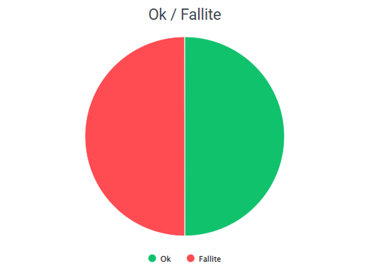
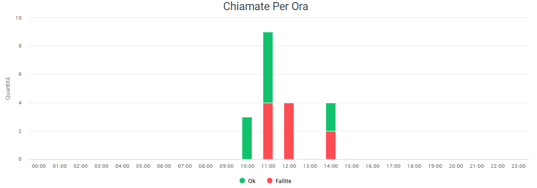
Checktime Report
Charts
This report allows you to view, through two graphs, how many calls went through time control (those in green) and how many did not go through because they were out of hours (in red). The first pie chart shows the ratio of calls passed (OK - green) to those not passed (FAILED - red). The second graph, on the other hand, shows, broken down by time slot that can be customized using filters, the amounts of calls passed and not passed by the time control.
In case you want to delve into the detail of every call that did not pass the time control, just enable the option in System Preferences/VoipToCall called “Import failed calls into time control.” In this way, all calls that do not pass the time control will end up in Voip to Call, where you can, in addition, observe their detail.
Filter for grouping
In the case just shown (image above), grouping will be done by hours (60 min. for each grouping).
IVR Menu Report
This report allows you to view call failure or success statistics before going to the IVR menu. The division is made by types of IVR menus that you want to analyze.
Charts
The first pie chart shows the ratio of passed (OK - green) to failed (FAILED - red) calls.
The second graph on the other hand shows, divided by time slot that can be customized using filters, the amounts of calls passed and not passed to the IVR menu.
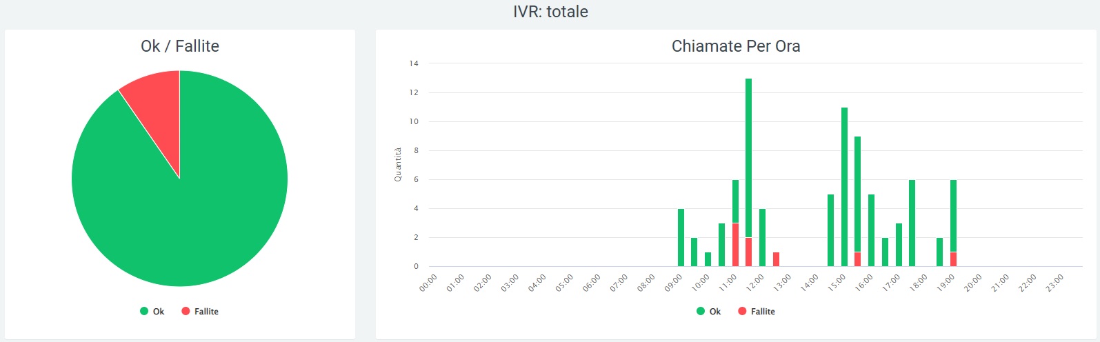
Filters
Clicking on the “search” button at the top right of the section enables filters that include:
Data range
IVR
Group graph (minutes)

Widget
For explanation on creating, organizing and managing Widgets, visit:
Report Provinces
Quest report allows you to view data related to:
Phone Calls - Fixed
Phone Calls - Status
Fixed Calls - Status
For Phone Calls - Status and Fixed Calls - Status you can view whether the call results:
Okay
Canceled
Unanswered
Unavailable
Busy
Failed
??
Charts and Tables
The graphs below show statistics for the above data, and the available tables cover the number of cellular calls-fixed and landlines-provinces.
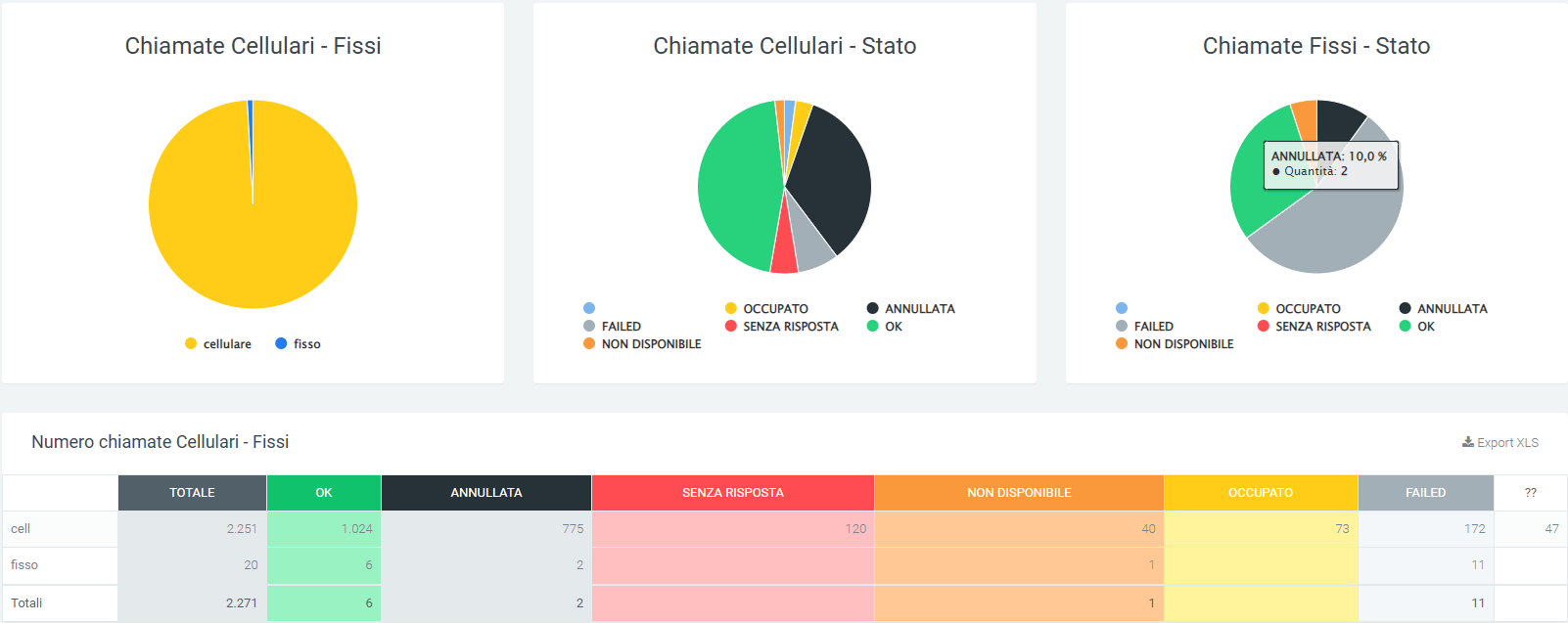
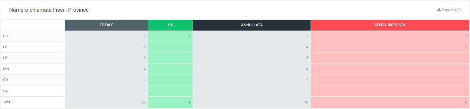
Each table can be exported to XLS format using the button in the upper right corner on the table itself.
Filters
By clicking on the “search” button at the top right of the section, filters can be enabled that include:
Date range
State
Province

Widget
For explanation on creating, organizing and managing Widgets, visit:
Time Abandonment Queue Report
This report shows the number of unanswered queued calls after waiting time.
Charts and Tables
The graph shows the exact number of unanswered calls per specified queue waiting time before abandoning the call.
The table below shows the above data by call quantity and percentage.
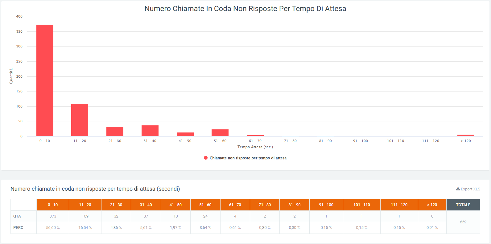
It can be seen that the wait times in seconds increase as we proceed to the right of the graph, starting from a range of 0 to 10 seconds and reaching a maximum of over 120. The height of each graph represents the number of calls within a range.
Filters
Clicking on the “search” button at the top right of the section enables filters that include:
Data range
Queue

Widget
For explanation on creating, organizing and managing Widgets, visit:
Time Abandonment Entry Report
This report shows the number of unanswered incoming calls after the hold time.
Charts and Tables
The first graph shows the number of unanswered calls by waiting time before abandoning the call.
The table below shows the above data by call quantity and percentage.
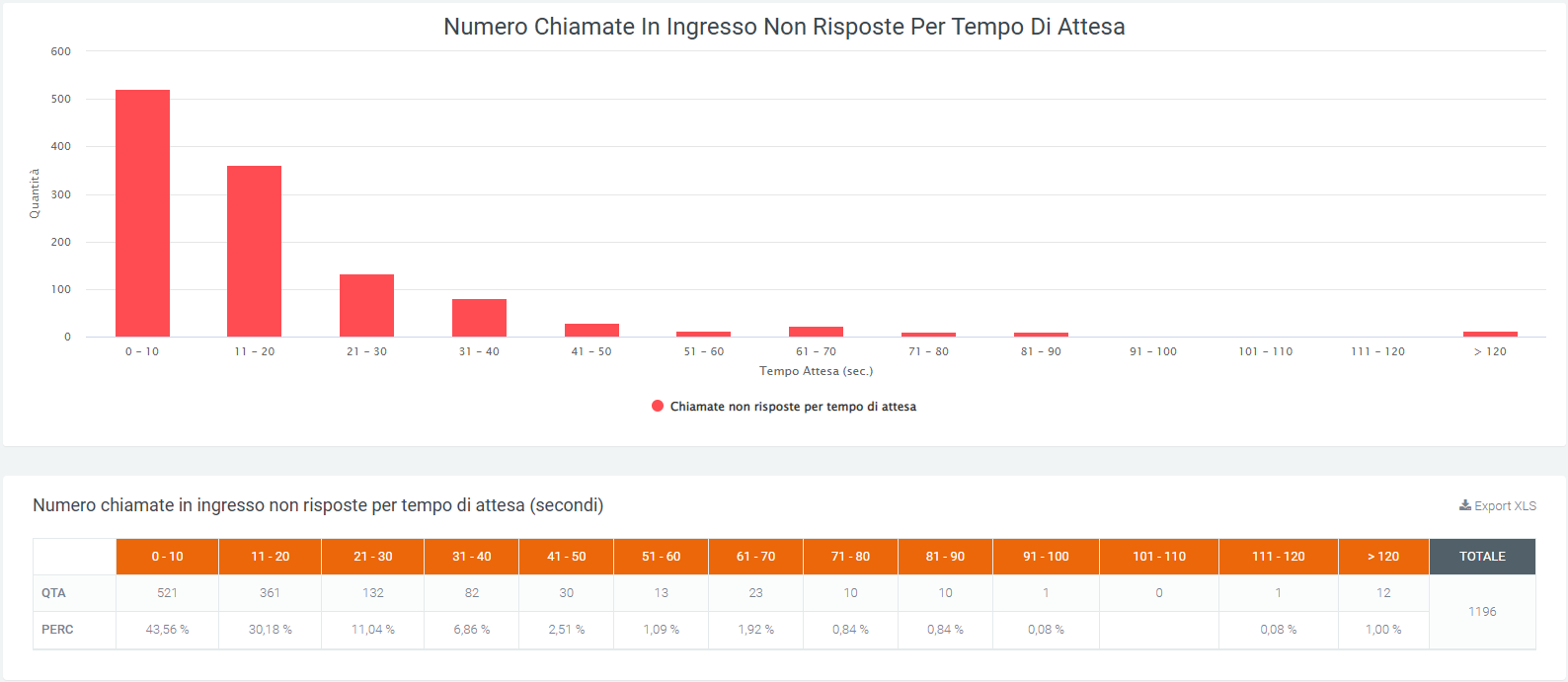
In the graph, it can be seen that the wait times in seconds increase as we proceed to the right of the graph, starting from a range of 0 to 10 seconds and reaching a maximum of more than 120. The height of each graph represents the number of unanswered calls within a range. Scrolling with the mouse over the graphs will show the exact number of unanswered calls.
Filters
By clicking on the “search” button at the top right of the section, filters can be enabled, which includes:
Date range

Widget
For explanation on creating, organizing and managing Widgets, visit:
VoIP Call Center report
Dashboard
Service description
By means of graphical and tabular representations, the dashboard section of the “Voip Report Call Center” module allows the user to visualize the trend of incoming calls from queues and local calls within the call center.
Upon opening the dashboard, the first information that can be observed are two tables with the quantity, total duration, and average duration of incoming and local calls.

Charts
The graphs in this section allow an analysis of the trend of calls, investigating how many of these are answered (served) and how many are not (not served). The first four pie charts show, respectively:
the ratio of served to unserved calls
the detail of the status of outgoing calls from the queues
the status of calls served
the status of unanswered calls
Next, six columnar graphs representing call trends in more detail are visible:
the first shows the number of incoming and local calls, including the amount of answered and unanswered calls.
the second shows the total and average duration of incoming and local calls, day by day.
the third shows the amount of calls broken down by time slot.
the fourth shows the duration in seconds of calls, broken down by time slot.
the fifth, like the third, shows the amount of calls, but broken down by day of the week.
the last graph shows the duration in seconds of calls broken down by day of the week.
For all the graphs described, it is possible to view the details of the data by scrolling with the mouse over the desired section of the graph. It is also possible to remove the display of information via the legend by clicking on the name or on the relevant colored dot.
Tables
At the bottom of the page, after the graphs, there are tables containing more detailed data regarding calls are shown: status, call volume, and duration. There are three tables: one contains day-by-day totals, another breaks down by time slot, and the last table breaks down by day of the week.
Filters
The data represented are included within a time frame indicated by filters. To vary this period, click on the “search” button in the upper right corner and enter the required data, viz:
date >=, which indicates the starting date of the data that will be extracted from the database
date <=, which indicates the maximum date of the data that will be extracted from the DB
Widget
For explanation on creating, organizing and managing Widgets, visit:
Report Code
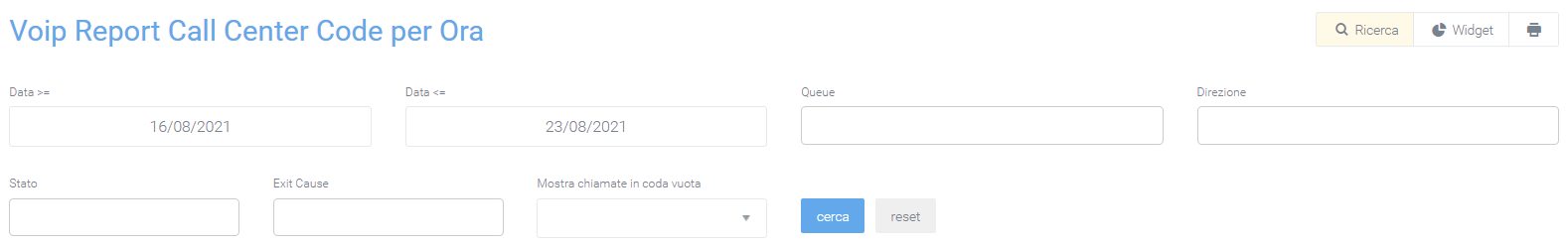
In the “Report Queues” section, under the “Voip report Call Center” form, you can see graphs depicting Call Center call trends and a table broken down by queues showing the detail.
Charts
Three types of graphs can be viewed in this report: the first pie chart contains information on the number of answered and unanswered calls. If no queue is entered in the filters, the graph will refer to all queues.
In addition to the pie chart, there are two graphs that contain data on answered, unanswered, and total calls divided by days of the week and by time slot.
This allows for immediate analysis on call trends.
Tables
Below the graphs shown above, there is a table called “Number of Calls Handled” where all data regarding calls broken down by queue are collected. Before the tabulated data, below the title, there are a series of values showing:
the total amount of calls
the total talk time
the average duration of a call
the average hold time with the welcome message
the average queuing time
the average waiting time in queue
the average waiting time

It is also possible to export the table to excel format using the appropriate button at the top right of the table, “Export XLS.”
In the table, each row belongs to a queue to allow you to compare the same information on different queues. Next to the name of each, there is a small pie chart representing answered and unanswered calls from the relevant queue. After the pie chart, several more detailed pieces of information follow: the total number of calls received by the queue, the number of answered and unanswered calls, the trend of those answered with their times, NCC calls, calls that have been transferred, calls that have been canceled, and calls that have not been answered, all accompanied by qualitative information regarding the time taken.
With more detailed data from the Call Center, a new status can be displayed: Cancelled Nowait, which indicates calls that have been terminated by the customer before the welcome message finishes playing.
Finally, at the bottom of the table are the totals for each column.
Filters
There is also a mask that groups filters that can be used to improve the analysis of the desired data. To activate the filters, click on the “search” button in the upper right corner. A mask will open with:
start and end date of the time interval for which the data will be shown
queue, i.e., the name of the queue involved
direction (whether it is an incoming call or a local call)
status
exit cause, i.e., how the call ended
show calls in empty queue: in case some calls were registered with empty queues, with this option it will be possible to display them anyway
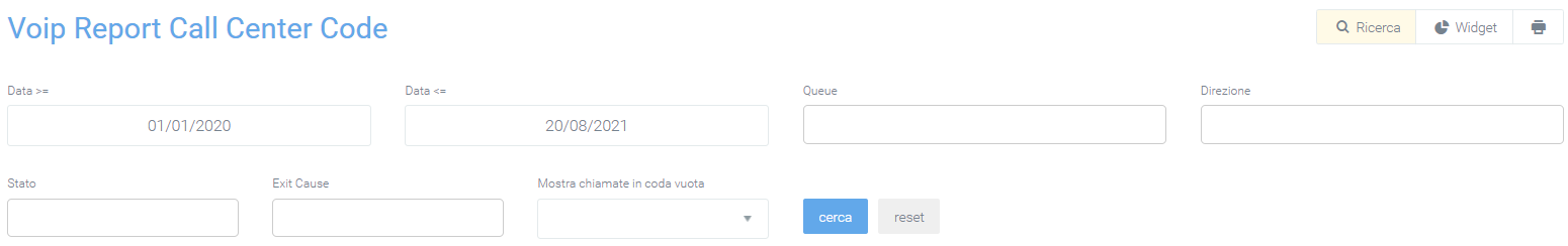
Once the desired filters are selected, click “search” to enable them, or “reset” to remove them.
Widget
For explanation on creating, organizing and managing Widgets, visit:
.. toctree::
Widget.rst
Caller Queue Report
This section shows, in two graphs, the trend of incoming calls in the queues. The first is a pie chart showing the ratio of answered to unanswered calls, while the second is a column chart showing the same states, but with the detail broken down by days included in the time interval entered through filters.
In both you can view the detail of the data by scrolling with the mouse over the desired section of the graph. It is also possible to remove from the information display via the legend, by clicking on the name or the relevant colored dot.
Filters
In order to see only certain information represented in the graphs, filters must be used. To enable them, click on the “search” button in the upper right corner with which the dedicated mask will open in which to enter data, such as:
start and end date of the time interval for which the data are reported
name of the queue concerned
show calls in empty queue: in case some calls have been recorded with empty queues, with this option it will be possible to include them anyway in the graphs

Data Queue Report
This section encapsulates the information found in the “Report Code” section, but breaks it down by day, based on the time frame entered through “start date” and “end date” filters.
Charts
The first graph represents total calls, answered and unanswered, along the time frame of one week. This allows a first general analysis to be performed quickly and easily. You can also select only some of the three pieces of information in the graph by clicking on the name of the one you do not want to display within the legend.
Tables
At the bottom of the section, below the graph, are tables for each queue broken down by date. Each row corresponds to a day within the period entered in the filters and is divided into columns that include all the information needed to perform an accurate analysis of call trends for each specific queue. The information contained within the table includes:
Total quantity |
Answered Calls |
Not Answered |
NCC |
Cancelled |
Cancelled nowait* |
No answered |
|---|---|---|---|---|---|---|
Quantity / Average call duration / Average talk time / Average operator response time. |
Quantity / Duration / Average call duration / Talk time / Average talk time / Average queuing time / Average operator response time |
Quantity / Total wait / Average wait |
Quantity / Total wait / Average wait |
Quantity / Total wait / Average wait |
Indicates calls that have been put down by the customer before the welcome message ends.
Depending on the queue, there may also be an additional transfer portion with:
quantity
duration
average call duration
conversation time
average conversation time
average queuing time
average operator response time
Each table can be exported to an excel sheet via special “Export XLS” button in the upper right corner.
Filters
By clicking on the “search” button at the top right of the section, filters can be enabled that include:
Start date and end date: to indicate a period in which to analyze the data
Queue: name of the queue to be displayed
Direction
Status
Exit cause: reason for ending a call
Display calls in empty queue: if during call registration on the Call Center, some calls are not associated with any queue, they can still be displayed through this specification
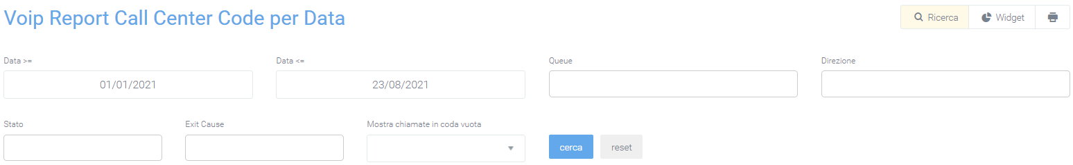
By clicking on “search,” filters are enabled and a search with them is carried out. In case you want to delete them, just click on the “reset” button.
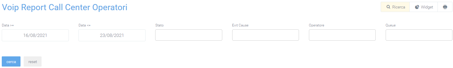
Operators Queue Report
In this section, within the “Voip report Call Center” module, it is possible to view, in detail, the progress of calls for individual operators, divided into their respective queues. The information that is displayed concerns the number of calls that were answered and the respective outcome, but also how many were not answered and the reasons why. This makes it easier to perform an analysis on each operator accurately.
Tables
All call performance data are grouped in tables divided by queue number, within which are the names of each operator working in that same queue with associated (visible in lighter colors) accounts. The information they contain is:
Total |
Responses |
Non-Responses |
NCC-Caller |
Transfer |
Answered Elsewhere |
Cancelled |
Cancelled nowait |
Forward |
Refused |
Timeout |
|---|---|---|---|---|---|---|---|---|---|---|
Quantity / Average time worked / Average talk time / Average ring time / Average answer time |
Quantity / Average Time Worked / Average Time Worked / Average Talk Time / Average Ring Time / Average Response Time |
Quantity / Time worked / Average time worked / Average time talk / Average time ring / Average time answer |
Quantity / Time worked / Average time worked / Average time talk / Average time ring / Average time answer |
Quantity / Average ringing time |
Quantity / Average ringing time |
Quantity / Average ringing time |
Quantity / Average ringing time |
Quantity / Average ringing time |
Each row corresponds to an operator with its corresponding accounts. If a filter were entered on a single operator, only the operator concerned would be displayed.
As for the other queues, each has a separate table where the same information will be displayed.
In each table, there is an “Export XLS” button in the upper right corner to export the tables to excel (XLS) format.
Filters
To make data analysis more effective, it is possible to use filters that will make it possible to extract, from a search, only the necessary data. To activate them, simply click on the “search” button at the top right and a mask will open with:
Start date and end date: to indicate a period in which to analyze the data
Status: whether the call was successful or not
Exit cause: reason for the termination of a call
Queue: name of the queue
Operator
Operator account
Display calls in empty queue: if during call registration on the Call Center, some calls are not associated with any queue, they can still be displayed through this specification
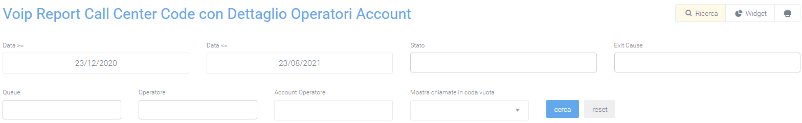
By clicking on “search,” filters are enabled and a search with them is carried out. In case you want to delete them, just click on the “reset” button.
Report Code Now
Tables
This section contains only the tables divided by time slots, which contain all the information necessary for the analysis of calls in individual queues. The information contained in the tables includes:
The information contained in the tables includes:
Total quanity |
Calls Answered |
Not Answered |
NCC-Caller |
Cancelled |
Cancelled nowait |
No answered |
Transfer |
|---|---|---|---|---|---|---|---|
Quantity / Average call duration / Average talk time / Average operator response time. |
Quantity / Duration / Average call duration / Talk time / Average talk time / Average queuing time / Average operator response time |
Quantity / Total wait / Average wait |
Quantity / Total wait / Average wait |
Quantity / Total wait / Average wait |
Quantity / Duration / Average call duration / Talk time / Average talk time / Average queuing time / Average operator response time |
Filters
By clicking on the “search” button at the top right of the section, filters can be enabled that include:
Start date and end date: to indicate a period in which to analyze the data
Queue: name of the queue to be displayed
Direction
Status
Exit cause: reason for ending a call
Display calls in empty queue: if during call registration on the Call Center, some calls are not associated with any queue, they can still be displayed through this specification
By clicking on “search,” filters are enabled and a search with them is carried out. In case you want to delete them, just click on the “reset” button.
Widget
For an explanation of creating, organizing and managing widgets, visit:
Operators Report
This section reports call trends for each individual operator.
Charts
The total trend of answered and unanswered calls is graphically represented in a pie chart where, by scrolling over it with the mouse, the quantities can be observed in detail.
It is possible to remove a data item from the visualization via the legend by clicking above the name or colored dot. To put it back into the visualization simply click on it again.
These two functions, detail and visibility, are also available in the same way on the other two graphs. Graphs that represent one the total call trends by breakdown in days of the week, the other by time slot. These two, in addition to the number of answered and unanswered calls, also show the total number of calls, as can be seen in the following picture.
Tables
After a graphical display of call trends, this data will be reported in a table broken down by operators, each with their own detailed information. Before reporting the data for each operator, the total data for each field can be observed:
the quantity of calls
the total time
the talk time
average total time
average ringing time
average answer time
average conversation time

After this first part, the table shows for each row the respective operator with the exact information. On the left is the name of the operator, followed by the total amount of calls handled by it. Next, information on answered and unanswered calls is shown before going into the details of each of these macro-groups.
- Answers:
NCC-AGENT
NCC-CALLER
NCC
ANSWER
TRANSFER
TRANSFER
- Unanswered:
ANSWERED ELSEWHERE
BUSY
CANCELLED
CFWD
CONGESTION.
FORWARD
NOANSWER
PICKUP
REFUSED
TIMEOUT
UNAVIABLE
Each of these subgroups will have a further subdivision into details. For answered calls the details present will be:
quantity
time worked
average time worked
talk time
average ring time
average answer time
average talk time
For unanswered calls instead:
quantity
time worked
average time worked
At the end of the table, at the bottom, the totals of each detail column will be shown.
Using the appropriate button located at the top right of the table, it will be possible to export it to excel “XLS” format.
Filtri
Utilizzando dei filtri, sarà possibile migliorare l’attività di analisi dati focalizzandosi solo su quelli interessati. Per poterli ottenere sarà sufficiente cliccare sul taso “ricerca” in alto a destra con il quale si aprirà una maschera contenente i filtri interessati. Tramite questa inserire i dati negli apposito box:
data iniziale e finale: verranno compresi solamente i dati presenti in questo lasso di tempo
stato: dove dovrà essere indicato lo stato delle chiamate da analizzare
exit cause: il motivo per cui la chiamata è terminata
operatore: questo per fare in modo di avere un report, anche grafico, esclusivo per l’operatore (o più di uno) selezionato.
queue: nome dalla coda da visualizzare
By clicking on “search,” filters are enabled and a search with them is carried out. In case you want to delete them, just click on the “reset” button.
Widget
For an explanation of creating, organizing and managing widgets, visit:
Missed Calls
With the Missed Calls module, the management of calls that have not been answered is made easy to use for any operator. Indeed, it will be possible to book and make callbacks to initially unserved customers through a few clicks, with methods that prevent multiple operators from calling back the same customer.
The module is designed not only for operators, but also for their administrators. In fact, reports are reserved for them to monitor the way various requests are handled and pages that allow them to force close callback requests or manually assign them to specific operators.
The purpose of this module is the refinement of the relationship between company and customer through the delivery of a markedly improved service.
The module includes:
Assign Call
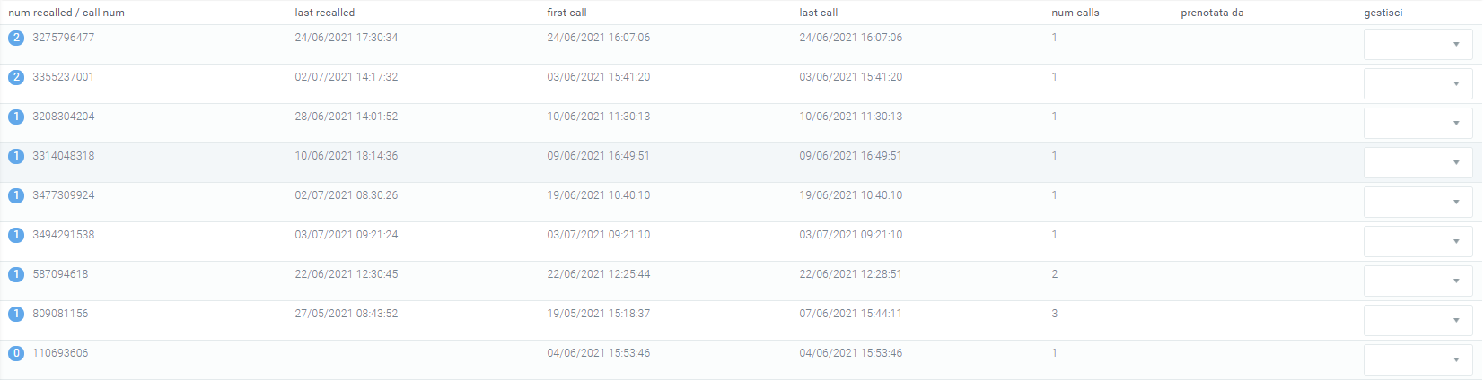
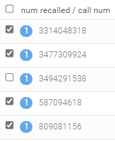
Within the “Missed Calls” module is “Assign Call,” which is a section generally enabled for managers only. It allows you to view all phone numbers related to customers still under management (missed callback) and to assign or unassign callbacks to the various operators. In the mask each record displayed is complete with
num recalled: number of times it has been called back
call num: caller number
last recalled: date of the last time the number was recalled
first call: date of the first call
last call: date of the last call
num calls: number of times called
booked by: operator who booked the callback
Management
The management part is generally the responsibility of the managers, who will be empowered to manually assign the operator to perform the callback. To do this, simply click on the mask under “management” and select the operator to be assigned the job.

If an operator had already booked to call back, there is an option to cancel the booking by clicking on the button to the right of the name, under manage.
The users that can be selected in the management part are exclusively those users who in their profile have the Voip Extension extension (entered during the creation of the user’s profile in the “Voip” tab) configured with the same code present in the kalliope central unit.
It is also possible to enable management of only certain users among those correctly configured. To do this simply:
click on the cogwheel at the top right of the entire cogwheel page.
click on “system preferences”
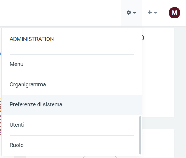
select the “Voip” tab
scroll down to “Operator Extension” at the bottom of the page
Select only those operators who will be considered for management
In case this last field is left blank, all correctly configured users would be included.
Filters
The page is complete with a filter that allows searching by:
Num. recalled
Last recalled
First call
Last call

Dashboard
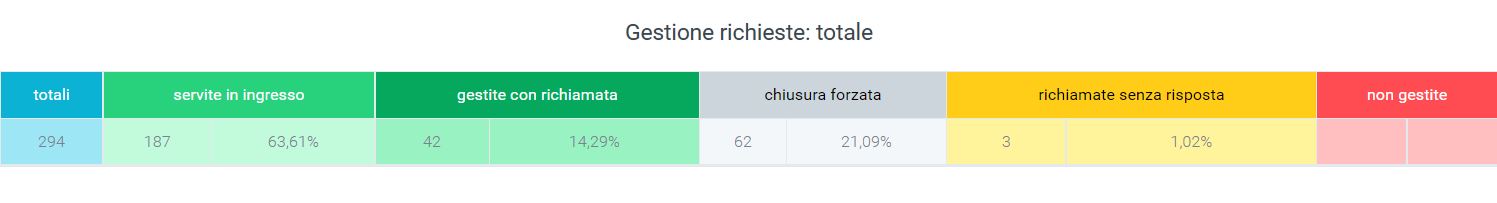
The data collected in the dashboard are represented through graphs and tables that provide a clear and comprehensive view of the management of call requests.
Tables
A first table shows the calls:
Totals
Served inbound
Handled with callback
Forced out
Unanswered callbacks
Not managed
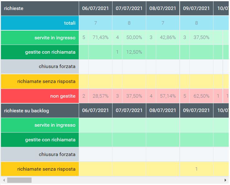
The daily detail of requests is then provided through a table:
Totals
Served inbound
Managed with callback
Forced closure
Callbacks without response
Unmanaged
And of daily requests on backlog:
Served incoming
Handled with callback
Forced closure
Unanswered callbacks
Charts
The daily detail is also represented through a graph showing the trend of requests as follows:
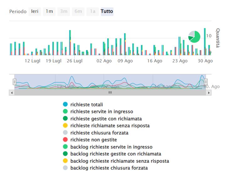
By running the mouse over the graph you can select specific parts to analyze them in more detail. You can always remove data from the display by clicking on the name or colored dot, in the legend.
Filters
This facade can be modified by activating filters by clicking on the “Search” button at the top right, with which you can select:
Date range: time range you want to specify
Type: type of request
Name: specific name of the request
(with the print button you can print all the information on the page such as graphs and tables)
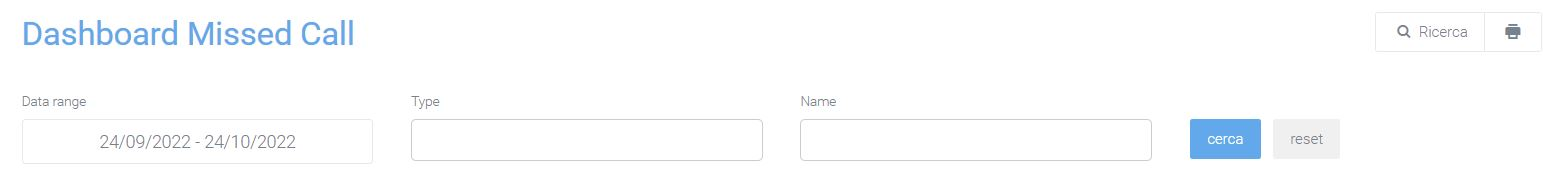
Once the filter fields are filled in as desired, press on the “search” button in light blue to save and display the screen with the activated filters, otherwise press on “reset.”
Widget
For explanation on creating, organizing and managing Widgets, visit:
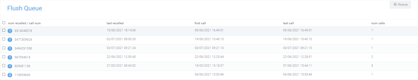
Flush Queue
This section is generally enabled for managers only.
It allows you to view all phone numbers related to customers still being handled (unsuccessful callback), with the ability to delete them by selecting them and clicking the “flush queue” button at the bottom. In this way the numbers will no longer be displayed among the Missed Calls either.
In the mask each record displayed is complete with:
num recalled: number of times it has been recalled
call num: caller number
last recalled: date of the last time the number was recalled
first call: date of the first call
last call: date of the last call
num calls: number of times called
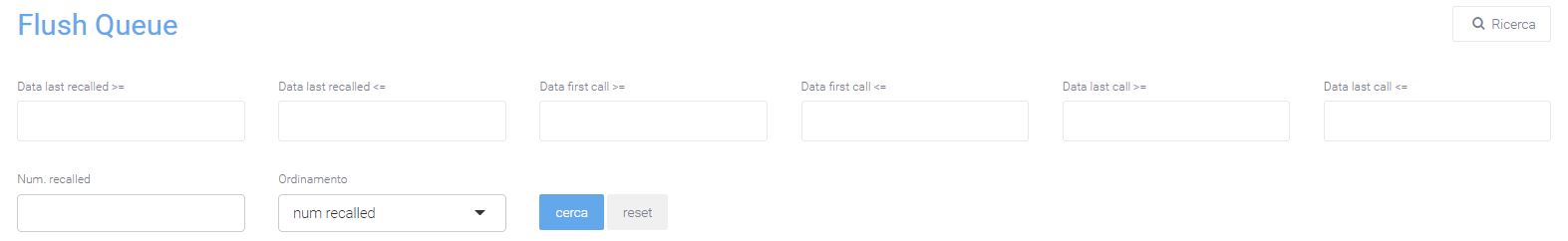
Filters
The mask is complete with a filter that allows searching by :
Date last recalled >= / <=
Date first call >= / <=
Date last call >= / <=
Num recalled
Sorting: order by num recalled, last recalled, first call, last call, num calls
In the Mask you can select the various phone numbers for which you were unable to contact the customer. By means of specific button located at the bottom of the list, under “recalled/call num”, you can delete them in mass mode from the mask “Numbers to call back”. This eliminates the possibility for operators to be able to book them for the next callback.
Missed Calls
Within the “Missed Calls” module we find the section of the same name where in one mask all phone numbers that need to be called back are displayed, while in the other all calls booked by the user viewing the page are visible.
Structure
The mask is divided into 2 sections:
“Numbers to call back”: contains the list of all numbers that need to be called complete with:
firstcall date: date of the first call
date lastcall: date of the last call
calls: number of calls made
recalled: number of times it has been recalled
date lastrecall: date of last callback
call num: number to be recalled
queue: name of the queue the customer was in when not answered
An operator, using the button with the “+” symbol in green, can book a specific call, i.e., the callback activity of that specific number. This action will move the number from the “Numbers to Call Back” section to the “Booked Calls” section. Numbers in the “Booked Calls” section will be visible only to the operator who booked the call.
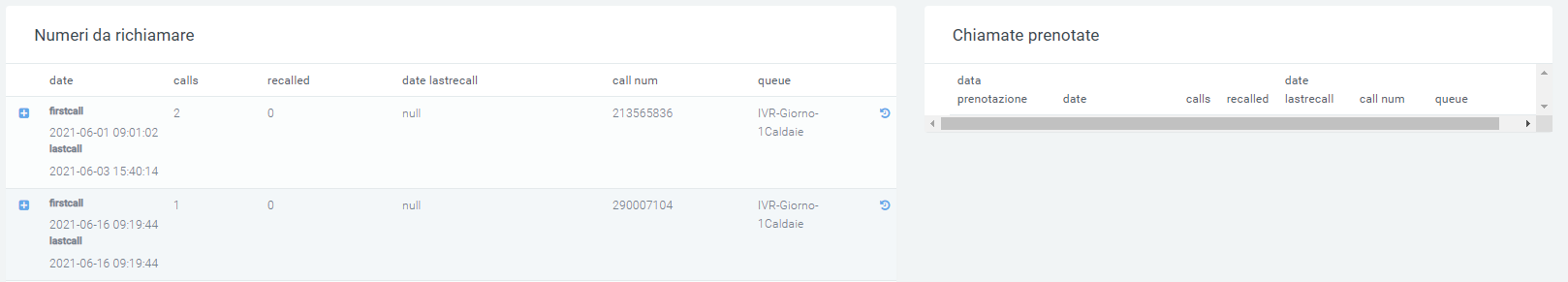
“Booked calls”: contains the list of all numbers booked by the specific operator logged into the system, complete with:
reservation dates: date when the reservation was made by the operator
firstcall dates: date of the first call
lastcall dates: date of the last call
calls: number of calls made
recalled: number of times it was recalled
date lastrecall: date of last callback
call num: number to be recalled
queue: name of the queue the customer was in when not answered
The call center operator who booked the call can immediately make the call by simply clicking on the number to be called (call num). This function is known as Click2Call (C2C). Using the specific button with a “-” symbol in red instead, the operator has the option to cancel the call reservation and then reissue it in visibility in the “Numbers to call back” section available to all Call Center operators.
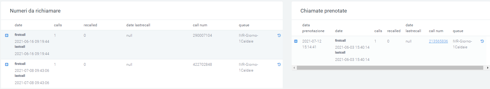
It is possible to view the details of all calls received and made to and from that specific customer. In the “Booked Calls” section there is the above-mentioned C2C feature that allows the operator to dial the call by pressing on the phone number in the record. A specific colored indicator will recommend the callback if the current time is within the range of the period to be called back, set in the system parameters. It is also possible to activate a specific LINK for opening by parameter preconfigured WEB pages (e.g., CRM page with Caller Number Parameter).
At the moment when the operator initiates the call, the system hides the record and allows it to be re-displayed only if the call was unsuccessful to the customer. In the event that another operator–not the one booked–makes the call and it is not answered, the record will still be hidden. A call is considered “successful” when it is answered by the customer and has a minimum talk time of more than 5 seconds.
To properly import overflow calls into the missed calls section, you must first configure dynamic routing in the Kalliope central office. When creating this you will be prompted for parameters, including the url that will call the central, and the xml file. In the link enter the following:
https://nome_azienda.kalliopenexus.cloud/voipToCall/kalliopeToCall/insert/
(replace “nome_azienda.kalliopenexus” with the link of the Kalliope Nexus in your possession).
As an XML file instead, enter the following dynaminco routing on Kalliope to retrieve and import the call into voip to call:
<?xml version="1.0"?>
<parameters>
<unique_id>%UNIQUE_ID%</unique_id>
<caller>%CALLER_NUM%</caller>
<called>%DNID%</called>
<servicecode>%PARAM1%</servicecode>
<param1>NOME_DELLA_CODA</param1>
<param2>queue</param2>
<param3>%PARAM3%</param3>
<param4>%PARAM4%</param4>
<param5>%PARAM5%</param5>
</parameters>
Filters
By pressing the “Search” button in the upper right corner, you can add a filter on the queues, so that only missed calls made to a particular queue are displayed. You can filter by:
Type: Type of call
Name: Name
Source: Source of the call
Caller: Caller
Account Code: Account Code
Date first call >= / <=: Date of the first call
Date last call >= / <=: Date of last call
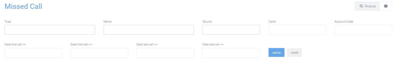
Once the data entry is finished, click on the “search” button to enable the desired filters, otherwise click “reset” to delete them.
Report
The “Report” section consists of the dashboard made available to Call Center managers who can have all the parameters available in real time to monitor Call Center activity. The data are divided into the two sections Today’s Report and Backlog to Manage:
Today’s Report:
Total phone calls
Total customers
Managed customers
Unmanaged customers
Total Inquiries
Inquiries called back + backlog
Average Bill Secs
Average recalled
Requests to be managed
Percentage of requests to be handled
Unbooked requests to be handled
Percentage of unbooked requests to be handled
Customers not contacted
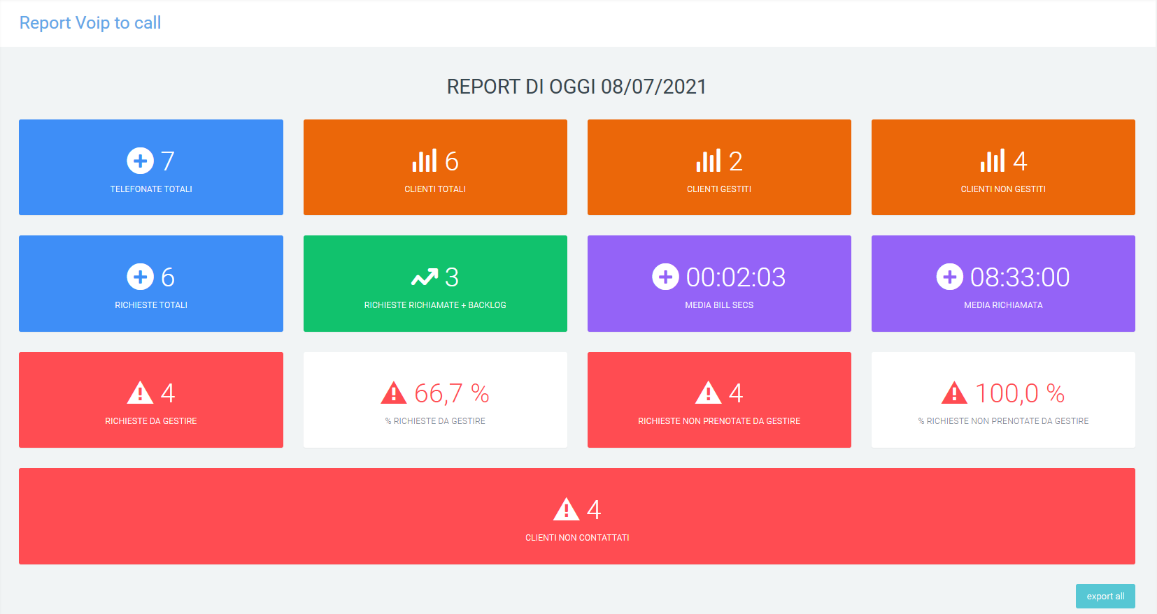
The “export all” button in the lower right corner allows the data on the screen to be exported to excel format, even as a history.
Backlog to manage:
Phone calls to manage
Requests to be managed
Customers to manage
Inquiries called today
Unbooked requests to be managed
Percentage of unbooked inquiries to be handled
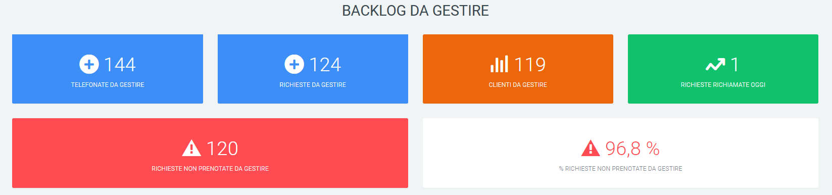
Report Caller Queue
Charts
In this section it is possible to observe a graphical representation, first by pie chart and then by histogram, of the general trend of calls over the selected time period and in the specified queues. The histogram presents a daily breakdown for representation.
As in the other graphs on this platform, the quantity of both answered and unanswered calls can be observed by simply scrolling with the mouse over the relevant graph. It is always possible to remove data from the display by clicking on the name or colored dot, in the legend.
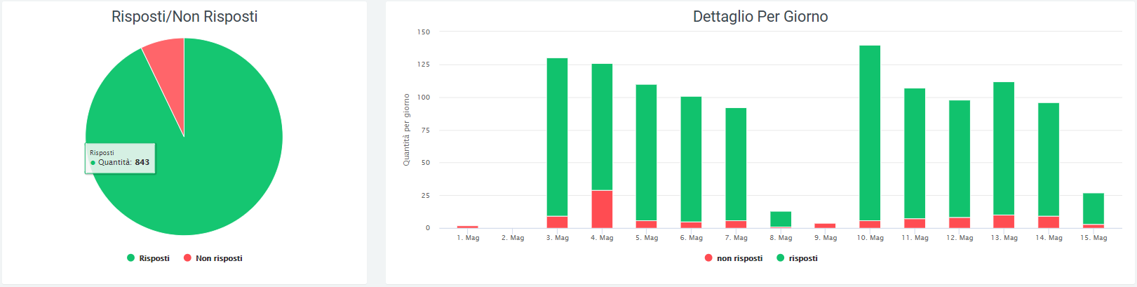
Tables
Underneath the graphs are tables for each queue, containing more specific information regarding call trends with callers, i.e., customers who called. The information in each table is broken down by date and includes:
number of answered calls
number of unanswered calls
the total numbers who called
the total numbers that were answered
the total numbers that were not answered
the amount of numbers that were called back and answered
the amount of numbers that were called back but did not answer
the amount of numbers that were not called back
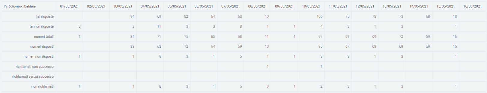
Filters
To speed up the search for certain information in precise time periods, filters are used. These can be found within a visible mask by pressing on the “search” button at the top right of the page. The filters that can be used are:
start and end date of a time interval for displaying data (shows data in the database from one day to another)
queue, which is the ability to enter one or more queues that you want to display

Once all the data have been entered, click on the “search” button to enable the filters entered, otherwise click on “reset” to delete them.
To print the page view, click on the printer-shaped button in the upper right corner, next to the “search” button.
History Report
Two graphs can be viewed in this section of the “Missed Calls” form.
The first graph shows the number of customers who, on a given day, called but were not answered and therefore ended up in Voip to Call. Of this quantity, you can see in green the number of customers who have been called back and in red those who have not yet been called back (and are therefore still visible in Voip to Call).
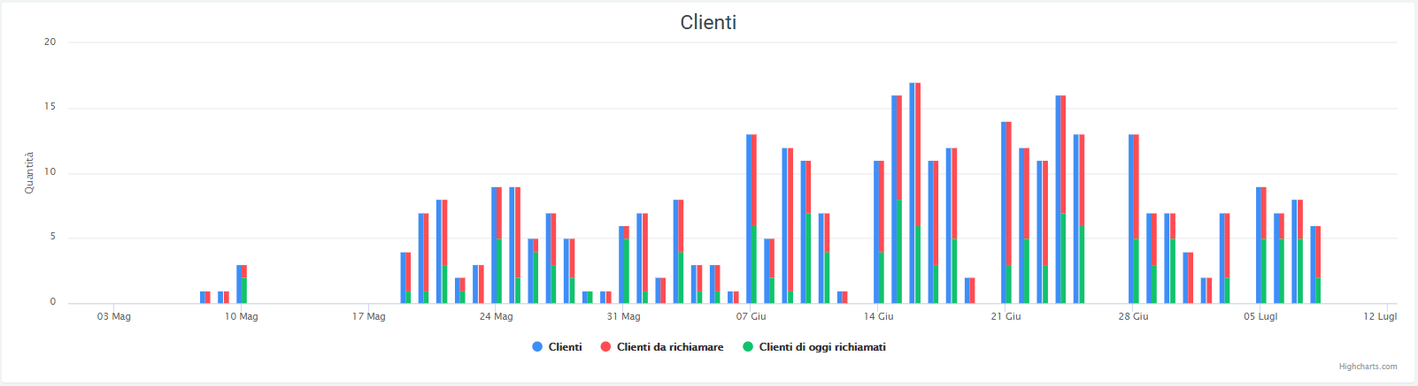
The second graph, on the other hand, reports only the number of calls that: arrived at the exchange, were not answered, and thus ended up in Voip to Call (whether called back or not).
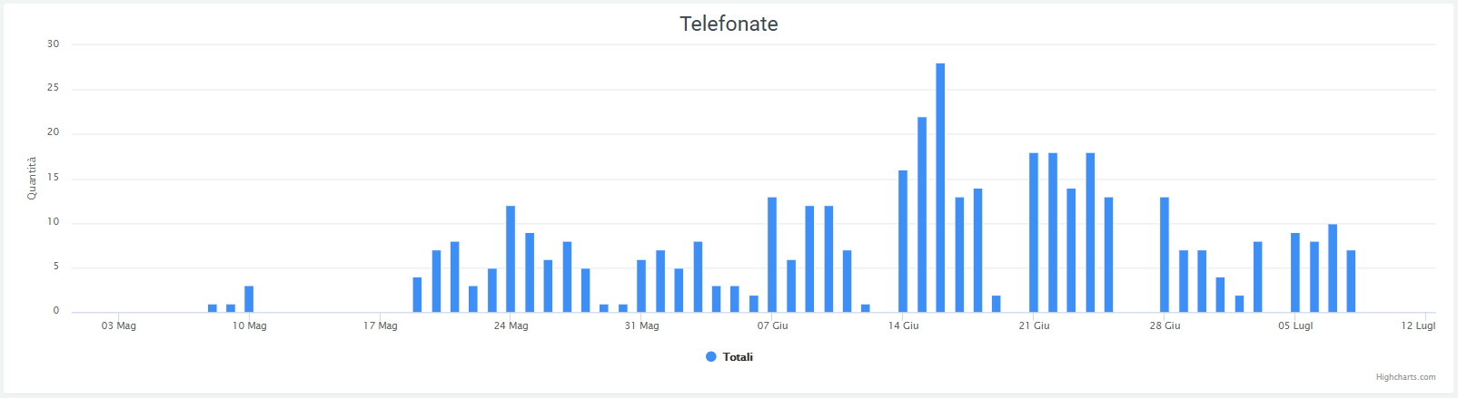
Filters
There is, by pressing on the “search” button in the upper right corner, a filter mask with:
time range: start and end date in which to represent the data
number of calling customers
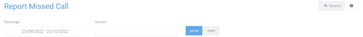
Ticket
Description
Features
The module presents the following functionalities:
Customer master data management: The platform allows you to manage your customer master data and automatically associate each new ticket with the corresponding customer.
Type classification management: Ticketing allows you to classify ticket types for proper display of activities with a type-code_operator logic.
Custom field creation: The platform allows you to independently create new fields to be able to record all the information to improve and speed up the service and support service.
Ticket priority management with identifying colors: Ticketing allows you to manage the priority of tickets with a description and an identifying color for each priority level.
Asset management: In tickets it is possible to enter the Asset for which the request was opened.
Contract management: It is possible to associate the specific contract active for the customer who opened the request with the ticket, monitoring associated SLAs and service delivery mode (e.g., prepaid).
Activity planning and deadline tracking: All activities can be planned and scheduled in the platform’s internal calendar, allowing you to monitor scheduled deadlines in real time.
Escalation management: The platform can notify you via e-mail of any escalations related to contractual SLA deadlines.
Tracking time recording: Each operator can record the time he/she has dedicated to the activity allowing at the end of the period to report for each customer the activities performed with the related dedicated time.
Automatic ticket mask opening management from caller number: The platform, thanks to integration with the IPPBX system, facilitates ticket opening by presenting the operator receiving the phone call with the mask pre-filled with the customer’s data.
Automatic opening management from email: The platform allows the reading of emails, received on specific system-configured addresses, and the subsequent automatic creation of tickets. The system manages responses entered either in the ticket by sending notifications via email, or from email by entering responses in the ticket.
Click to Call Management: The platform, through integration with the IPPBX system, facilitates calls to customers by taking advantage of click to call features.
Attachment Management: The management of attachments within the platform is extremely intuitive and functional to the activity of processing customer requests. Attachment management is useful for exchanging documents with customers and with users outside the system. Customers can attach one or more files to the email with which they open or respond to the ticket.
Ticket List
On the Ticket home page, accessible via “Support -> Tickets,” a grid can be displayed where all tickets that have been created and that the user is authorized to view are shown. On the left are quick filters to apply divided by priority, status, type, area, tags, estimation and tracking.
On the default table we can find the essential information:
The ticket number
The name of the ticket
The Account
The Final Customer
The status of the ticket: new, in process, cancelled, closed
Who is in charge of the ticket
To whom the ticket has been assigned
Its priority: high, medium, low
The type of the ticket
Notifications: if you receive an internal note or email in response to the ticket, it is reported through a bell icon in the ticket list. To delete the flagged notification, simply click on the letter depicted in the following icon:

If the letter depicted in the lower left corner is yellow, the notification has not yet been read and appears in the ticket list; if it is green, the notification has been read and disappears.
The date of the last response
The estimated processing time in hours
The tracking, i.e., the recorded time people have worked on the affected ticket.
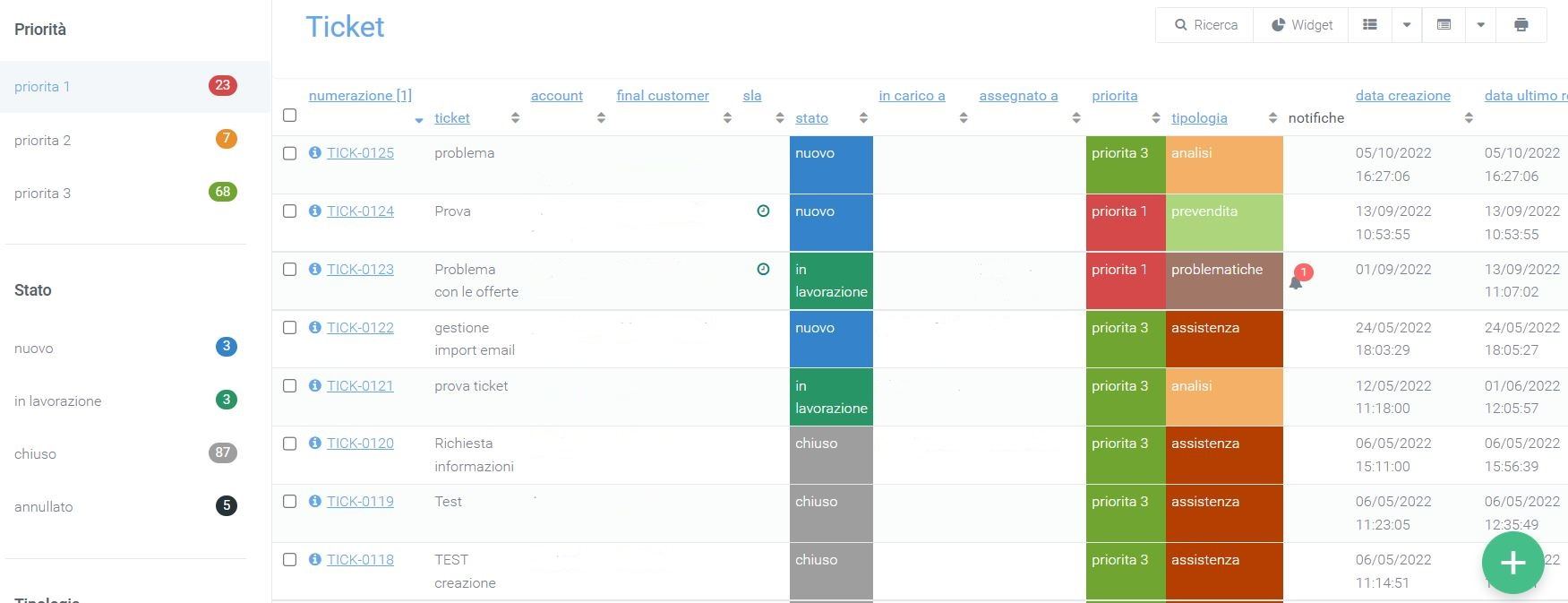
Search
In case there are many tickets and you wish to perform a more specific search than the one offered through the quick filters, you will be able to press the “Search” button in the upper right corner. More precise and customizable filters will then be displayed as needed.
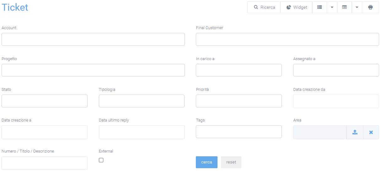
Available filters are divided by:
Account: the company reselling a service/product
Final Customer: the final customer
Related Projects
In charge of: the person in charge of the ticket
Assigned to: who the ticket is assigned to
Ticket status: new, in process, closed, canceled, suspended
Type
Priority
Creation mode
Date of creation from: to indicate a range of time in which tickets were created
Date of last replay
Tags: keywords inserted in tickets to speed up searching
Area associated with the tickets
The ticket number, title, or description
Select tickets with unread notifications
The last flag, “External,” is used to instruct the system to search for tickets destined for external vendors.
Widgets and grids
Each operator can create Widgets to monitor in real time the status of the activities and tasks he or she has to perform in order to stay aligned with scheduled plans. In addition to widgets, specific visualizations can be created via customizable Grids per operator so that the information collected is displayed specifically according to each operator’s tasks. All these customization actions can be performed via the buttons following “Search.”
To add and use widgets follow the explanation on this page:
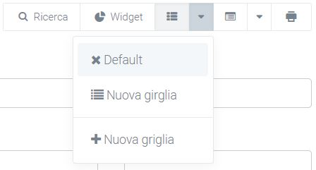
Actions menu
Using the actions menu found next to the grids button, you can export the ticket grid in XLSX and CSV format and import it into XSLX.
Next you will also find some sections for further customization:
Default type
Type by company
Type by area
Ticket from email
Ticket subscriptions and notifications
Link dates on calendar

Default type
This section contains all the types that the final company will be enabled to see and select, “default” refers to the case where the company was not enabled to view specific types (assigned in “type by company”). To add or remove them, simply check the box next to the name of the type you want to enable companies to view.
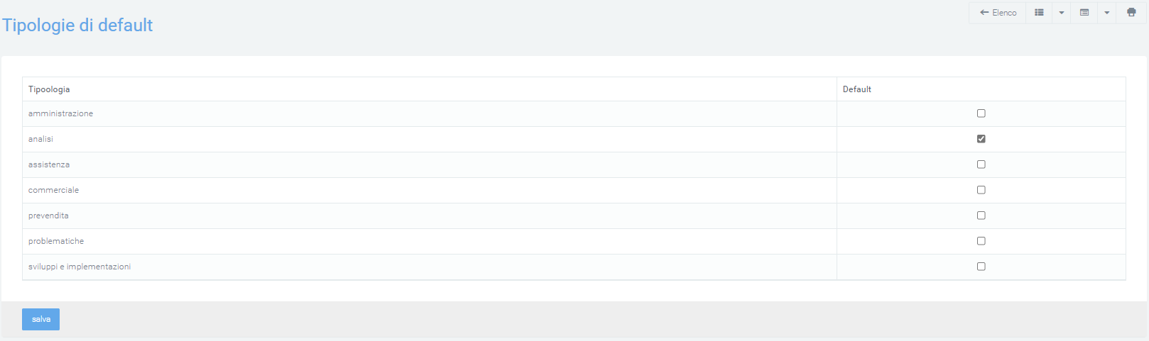
Company type
In this section the ticket types that a specified company will be enabled to select during creation can be selected. Simply select the company under the appropriate heading and assign it a type. To add more, you will need to click on the “+” button to the right of the “type” entry and repeat the assignment process.
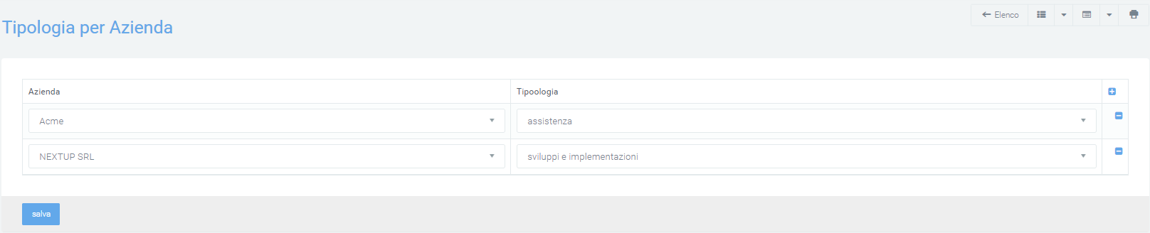
Area type
Through this section, tickets of a specific type can be assigned to a specific area. In this way, the visibility of all tickets of a specific typology will be exclusive to the relevant area. To do this, from the “Area Type” screen, click on the box under “Assignment Area” and select the intended area.
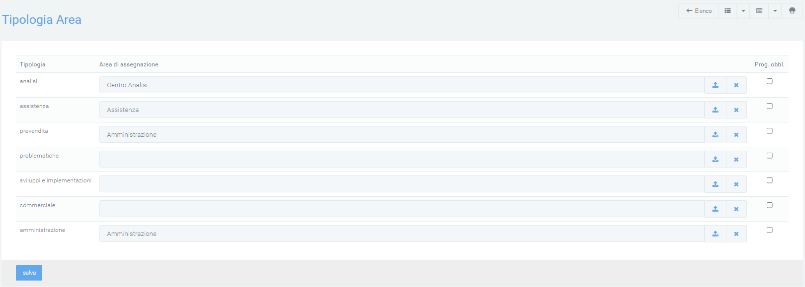
Ticket from email
This section allows you to configure the creation of tickets by the arrival of an email in a specific mailbox. You can decide who to assign a ticket to and what company name it should be associated with, in case the email address is not already registered. It is also possible to generate a company from the email address extension, associate a contract and a project with it, again based on the same extension.
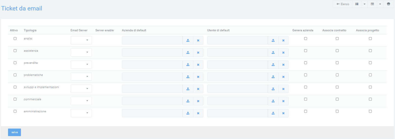
Each company type can be assigned the server where emails will arrive via the “Email Server” entry.
The name that will be displayed under the “Default Company” heading of the ticket should be entered, in case the sender is not recognized by the system.
The Default User will be enabled to read the ticket and can be added by clicking on the box under the “Default User” heading.
The “Generate Company,” “Associate Contract,” and “Associate Project” buttons, if selected, will use the email extension to do what the button indicates, so a company will be generated with the name of the email extension and a project and contract will be associated with it, again with the name of the extension.
After entering all preferences, click on the light blue “save” button to store the changes.
Ticket subscriptions and notifications
In this section, you can control the sending of notifications for creating (insert) and replying (reply) tickets, support tickets, and tickets generated via email. To do this, simply select via appropriate flags
which roles should receive the notification (owner, in charge, …)
under what circumstances (after creation or upon ticket reply)
to what type of ticket the notification should be sent (ticket, support ticket, ticket from email).
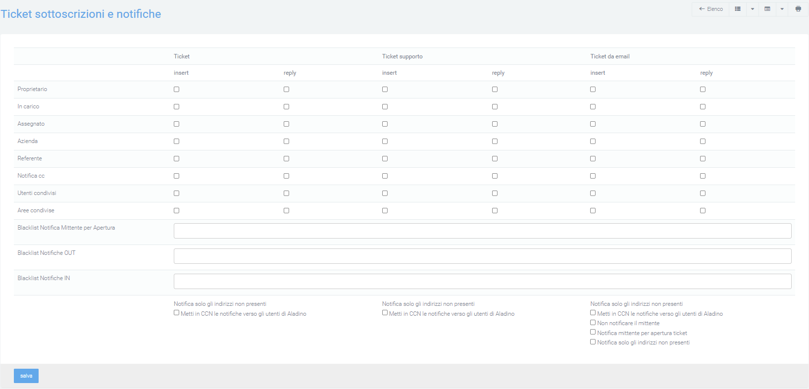
“Sender Notification Blacklist for Opening “: email addresses or domains can be added to which the ticket opening notification should NOT be sent, in case the “Sender Notification for Ticket Opening” flag is active.
“Blacklist Notifications “: it is possible to add email addresses, or just the domain, which should NOT receive notifications regarding the affected tickets, from opening to replying to the ticket, either incoming (IN) or outgoing (OUT).
The flag “Put notifications towards Kalliope Nexus users in CCN “ will allow to hide the addresses of all those to whom the initial email will be sent in CC, so that the client, responding to the email, will only respond to the correct one, avoiding errors that would be shared with other addresses as senders.
The “Notify sender for ticket opening “ flag, if activated, will notify the system to send an email notifying the sender of the initial email of the ticket opening.
The “Do not notify sender “ flag will not send response email notifications to the sender (either in creation, or in response)
The “Notify only non-present addresses “ flag is used to avoid repetitive notifications to users. The customer email that will then generate a ticket will have several users as recipients, in addition to the customer’s referral email address (e.g., supporto@azienda.com). The generated ticket will send notifications to specific users, among whom there may be users who have already received the original email notification. To avoid repetitive notifications, it is necessary to enable the flag to notify the ticket only to addresses not in the original email.
Link dates on calendar
Clicking on this option will allow you to choose a ticket date field to be entered into a calendar at will.
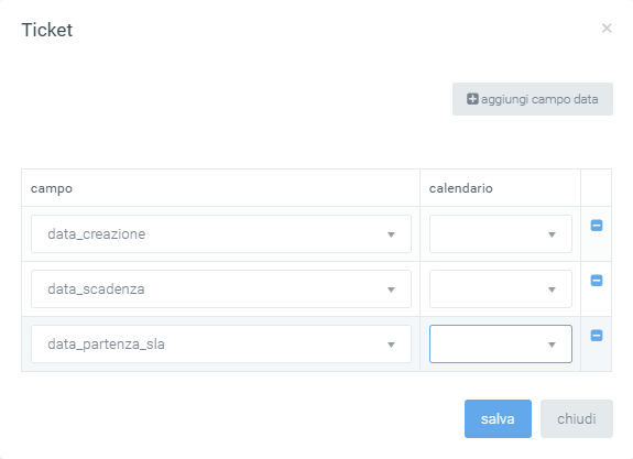
The fields that will be displayed on the calendar, can be found on the “Scheduler” form, where you can find all the calendars created as personal and system.
Create ticket
Using the green button in the lower right corner with the “+” symbol, you can manually create a new ticket that will be visible to authorized users (preferences entered through role configuration).
During ticket creation, four tabs can be viewed in the upper left corner:
Ticket
Info
Attachments
Sharing
Ticket
Within this section you can find various fields to fill out:
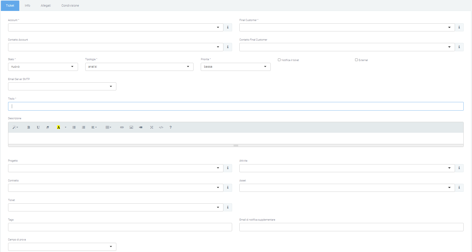
Account and Final Customer: the two fields “Account” and “Final Customer” indicate the referring company that opened the ticket and the company on which the activity is performed, respectively. By clicking on the “i” on the right side of the drop-down menu, more information regarding the relevant company can be displayed:
info
asset
associated contacts
associated contracts
offers
opportunities
orders
passwords
prepaid
projects
tickets
Account Contact and Final Customer Contact: These two fields are used to indicate the two contacts associated with the Account and Final Customer. The drop-down menu allows the choice of input fields.
Status: tickets created have a “new” status. This status can be changed according to the activities performed (“in process”, “taken in charge”, … , “Closed”)
Typology: with the typology field it is possible to classify the ticket to facilitate its recognition and taking in charge by the various operators. The types are configurable by the user.
Priorities: priorities, which can be customized by the user, identify the importance of the ticket and are displayed in different colors, also configurable by the user.
Email SMTP Server: through this item you can select the server from which you will want to send the notification email. All emails that will be sent or received will refer to the entered SMTP email server.
Notification Ticket: selecting this field enables the system to send notifications. Notifications are sent according to the configuration made in the appropriate “subscriptions and notifications” section.
External: if checked, this is used to indicate tickets whose resolution is intended for external providers.
Title: in the “title” box should be entered the title under which the ticket will be displayed, so as to provide an idea of what it will be about. In case the ticket is opened by email, the title would correspond to the subject.
Description: the “description” details the customer’s requests and any problems to be solved.
Contract: in case there is a contract between the Account and the Final Customer entered, an existing contract can be entered. If there is an SLA (Service Level Agreement) in the selected contract that has minimum or higher priority, the contract timelines will be automatically associated.
Asset: Entering an asset makes it easier to identify the problem and speed up support operations. Other open and/or closed tickets belonging to the entered account/final customer can be indicated, so as to correlate the tickets and help understand the problem.
Ticket: you can indicate other open and/or closed tickets belonging to the account/final customer entered, so as to correlate the tickets and help understand the problem.
Tags: tags can be added through this entry, which can then be used in filters, to improve the search for certain tickets.
Additional notification emails: through this box you can enter additional email contacts who will be notified when the new ticket is created.
Additional: at the bottom of the creation mask, depending on the modules enabled in the platform, additional fields are available to associate the ticket with:
Projects
Activities
Contract
Asset
Ticket
…
At the bottom is a section specifying:
Date of tracking
Tracking
Type
Tracking is billable
Alternative tracking description (if left blank the ticket description will be used)
Completing the tracking causes the status of the ticket to change from “new” to “in process”.
Info
Creation date: date on which the ticket was opened
Estimated start date: estimated date for the ticket to begin processing
Expiration date: date the ticket expires
SLA start date: automatically calculated date from which the system starts calculating the SLA associated with the ticket.
Ticket estimate: in this section you can enter an estimate in hours of the time taken to resolve the affected ticket.
User in Charge and Assigned User: a ticket can be assigned to a user. A user can take charge of the ticket although it has not been assigned to him/her.
Assignment and taking charge are key information for controlling ticket management activities.
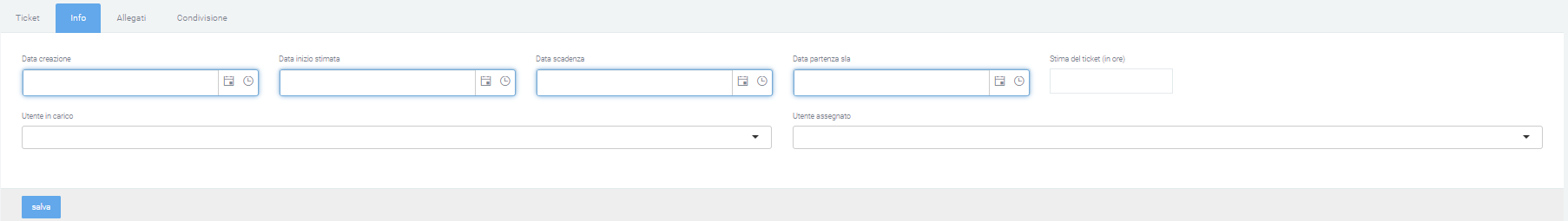
Attachments
In this section you can add attachments that will then be visible within the ticket. To add an attachment, click on the “choose file” button and select the file to be uploaded to the ticket. This section also contains any attachments in the emails imported from the system.

Sharing
In this last section you can share the ticket you created even with those who do not have visibility. You can give visibility to individual users or entire areas.


Saving the ticket
After filling in all required mandatory fields (those marked with an asterisk “*”) you can save and create the ticket via the “save” button in the lower left corner. Once created, by pressing on the ticket number link you can view, in addition to Info, Attachments and Sharing, the Tracking if previously configured.
Intake
Once the ticket has been issued, the relevant users will be able to click on it and then, by clicking on the orange button at the bottom right, take it in charge. This will display in the “in charge to” column the name of the user has taken charge of the ticket, the user can decide when to change the status of the ticket.
At the bottom, a message box is displayed, which is useful for communicating notices regarding the ticket. It is possible to set the message as an internal note or public reply. To send the created message simply click on “Reply,” the message will then be displayed with the first and last name of the person who sent it, the date and time, the status of the ticket, and the type of reply (internal or public). It is possible to quote received messages via the top right citation icon.
In case “internal note” is selected, no email will be sent. On the other hand, if “public reply” is selected, the message will be notified to the email of the user who created the ticket and the user who is assigned the ticket. It is also possible to add additional email addresses. In addition to typing the text, there is the ability to attach a file and/or pause the SLA via the “Pause linked SLA” checkbox. In addition to the “Reply” button, there are options to “change ticket status” to “working,” “closed,” “canceled,” and an options menu containing the list of people to whom the ticket can be assigned, thus changing the person in charge.
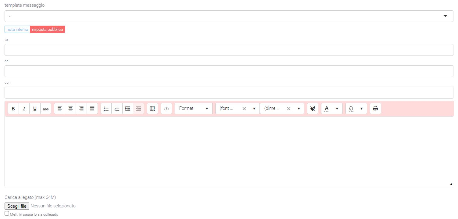
Edit Ticket
To edit information within a ticket, it is necessary to click on the number link and then the “edit” button in the lower left corner. After making changes, click on the “save” button.
Opening ticket from email or website
The platform allows a customer to open a ticket in several ways. The most common are through sending an email to a specific mailbox or through logging into the platform in the Ticket section within the support part. For the automatic opening of tickets, the system relies on the email address to which the messages arrive and, in case this is used for ticket generation, it will automatically create a ticket by reporting the sender’s information and the request in the email. The generated ticket will be automatically routed to the relevant area linked to the recipient email address. This allows you to greatly optimize time by avoiding reading each email and manually entering each ticket. In addition, you can indicate in the actions menu-if the ticket arrives from a specific email server-the type and priority of the ticket. In this case, if a contract is present, it is automatically associated. Other ways of entry can be provided, such as, for example, from specific forms on Internet sites.
Billing
Warning
The Billing module is included in the purchase of the Analytics module.
Through the Kalliope Billing module, the Kalliope Nexus platform can manage debit and multi-service documentation.
Pricing
The “Voip Tariffing” module is divided into two sections:
Pricing: section dedicated to setting the rates that are applied to calls
Dashboard: section that calculates and displays the total call charges based on the filters entered
Structure
The section in question allows you to go and create, edit and delete rates that associate a value with each call. The latter point is done through the presence of the billing time present on each call and according to the rules set in the tariff, such as:
company
prefix
country
gateway
free limit
status
The subsequent act of calculating these costs is fully automatic through the use of scheduled crons.
The section has two main masks: one for displaying all tariffs created and one for creating or detailing each tariff.
List
The list of tariffs shows:
description
start and end date of validity
inbound/outbound gateway name
prefix
in/out rate
click
status
annual free limit (minutes)
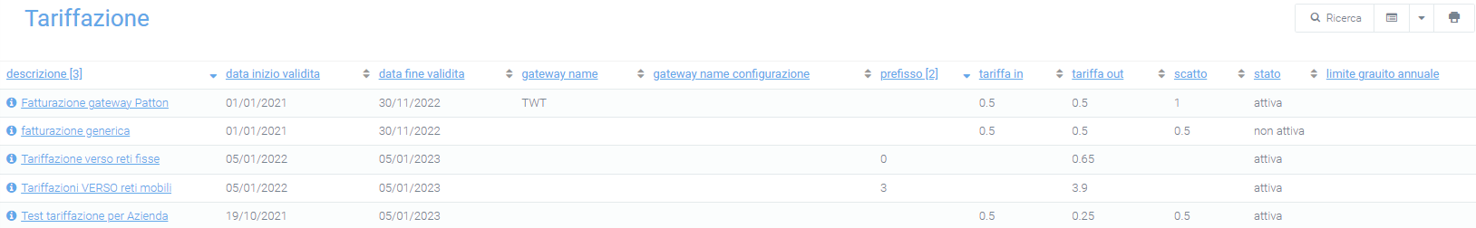
Detail:
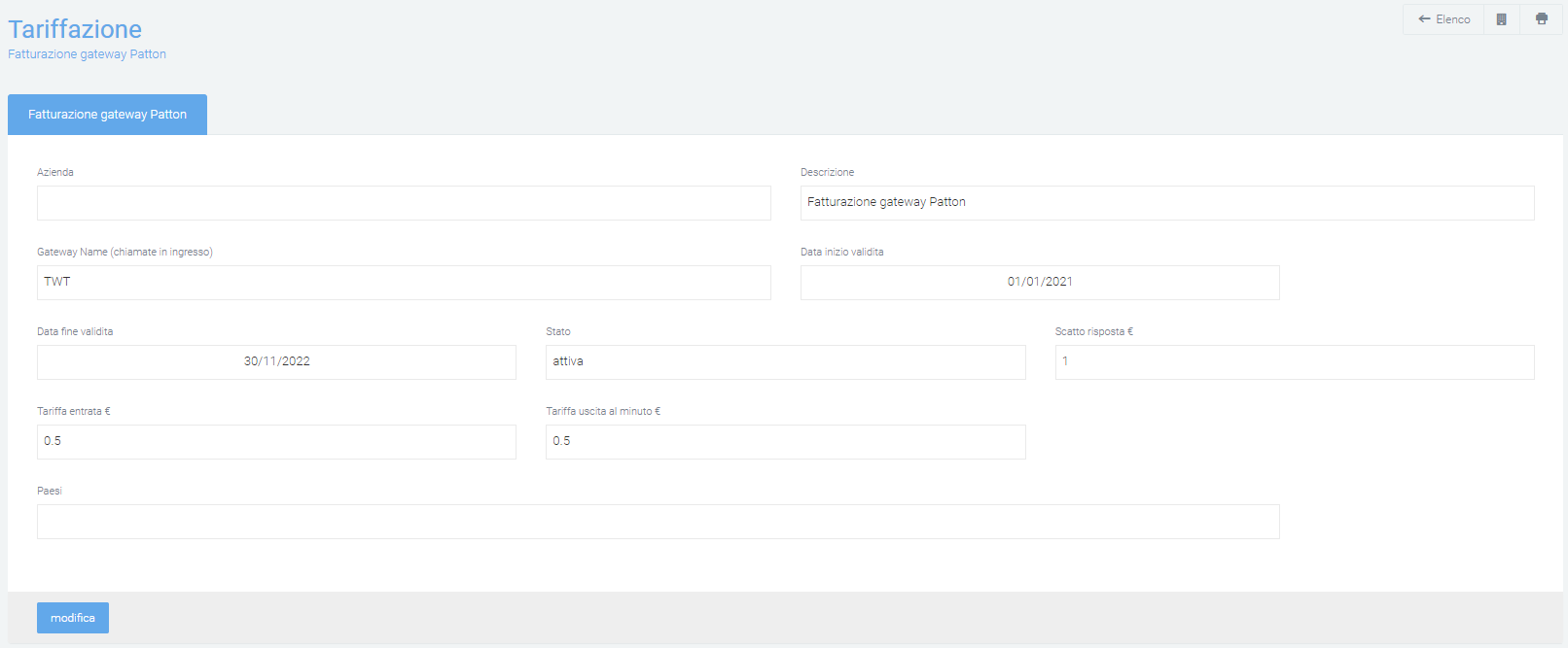
Create new pricing
In order to be able to create and configure new tariffs, which will then go on to value the affected calls, from the “Tariffing” page click on the green “+” button at the bottom right.
Next, the creation mask will be displayed in which all the data necessary for the correct application of the tariff on calls will have to be entered, such as:
Company: the company for which the tariff applies (if the company is different or not recognized, this tariff will not be applied)
Description: short title that makes the tariff recognizable in the list on the main page
Input/output gateway for which the tariff applies
Start/end validity date: period of validity of the tariff
Status: current status
Response charge (in €)
Outgoing/incoming rate per minute (in €)
Annual free limit (minutes)
Area code
Country: for which the rate applies
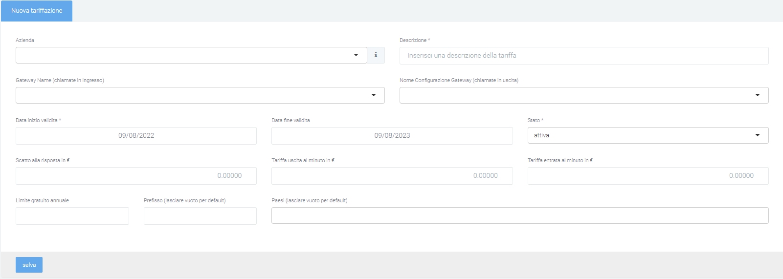
Once all fields deemed necessary have been filled in, save the tariff using the appropriate button at the bottom right.
After saving, the specifics of the tariff are visible and you can view the daily consumption divided by:
Incoming calls
Outgoing call
Total
Of each, it is possible to analyze the time spent on incoming calls, the cost and the hypothetical cost (without free rate). A ratio of minutes used to total minutes is also displayed at the bottom:
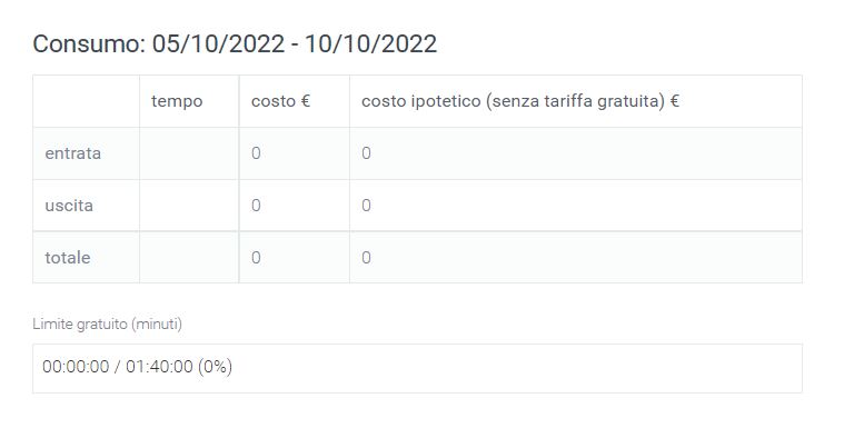
Filters
Available in the main mask, filters (click on the “Search” button) and export/import methods. Filters allow selection by:
Company
Start date range
Gateway
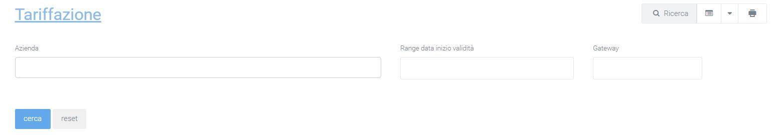
Dashboard
Once the charges have been created and activated, attention can be shifted to the Dashboard section where, as calls enter the CDR and are valued, the total costs are calculated and displayed based on the filters entered via the “Search” button.
This section is structured in a first part (above the charts) where the totals of quantity, time and costs are displayed in a generic way. This allows the user to have the essential information at hand immediately.
Immediately following, there are two graphs with monthly and daily breakdowns.
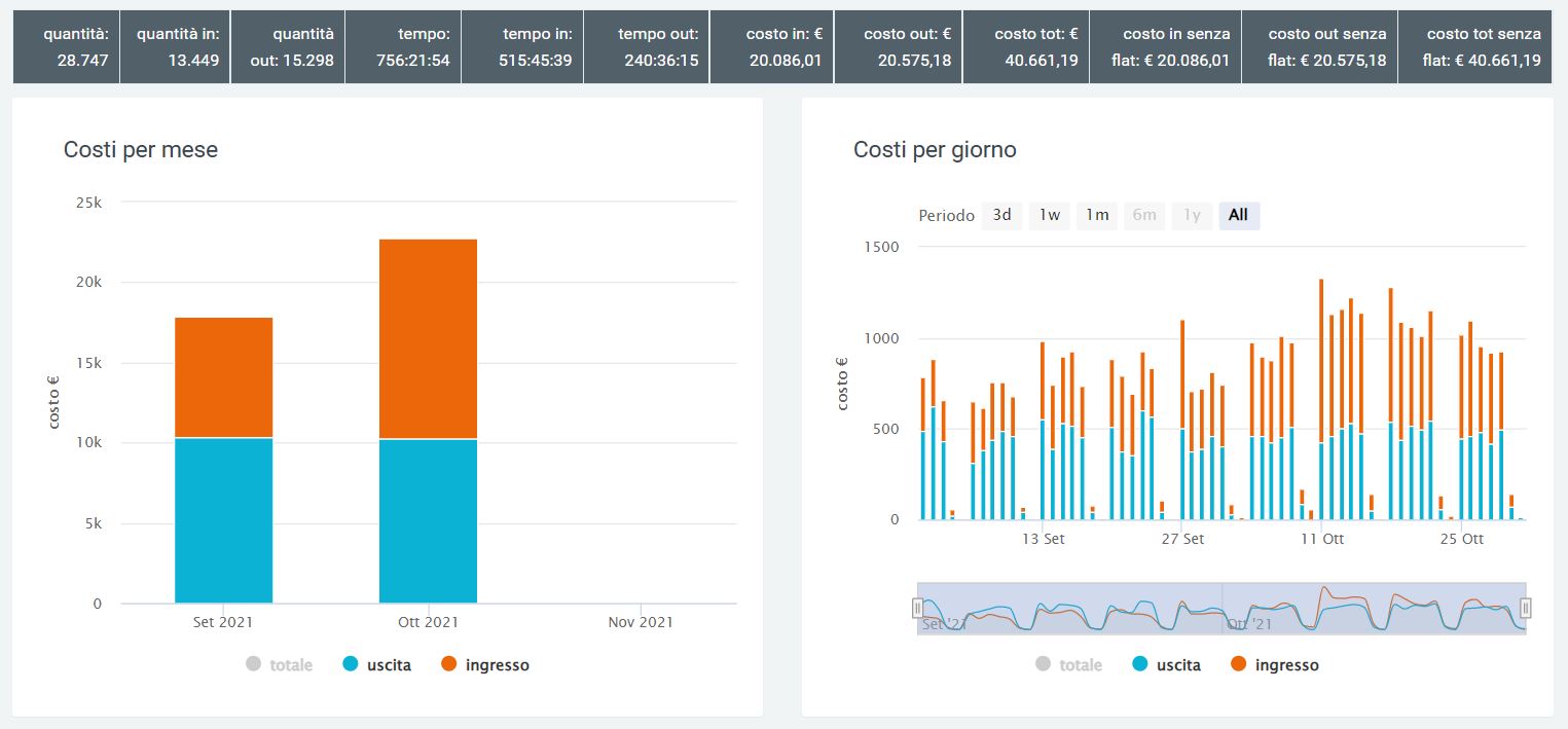
For a more detailed analysis of the costs generated by calls made/received, the second part of this section shows quantities, times, and costs with breakdown by:
month
date
organization
organization
gateway
operator
cost center
division
Some examples follow:
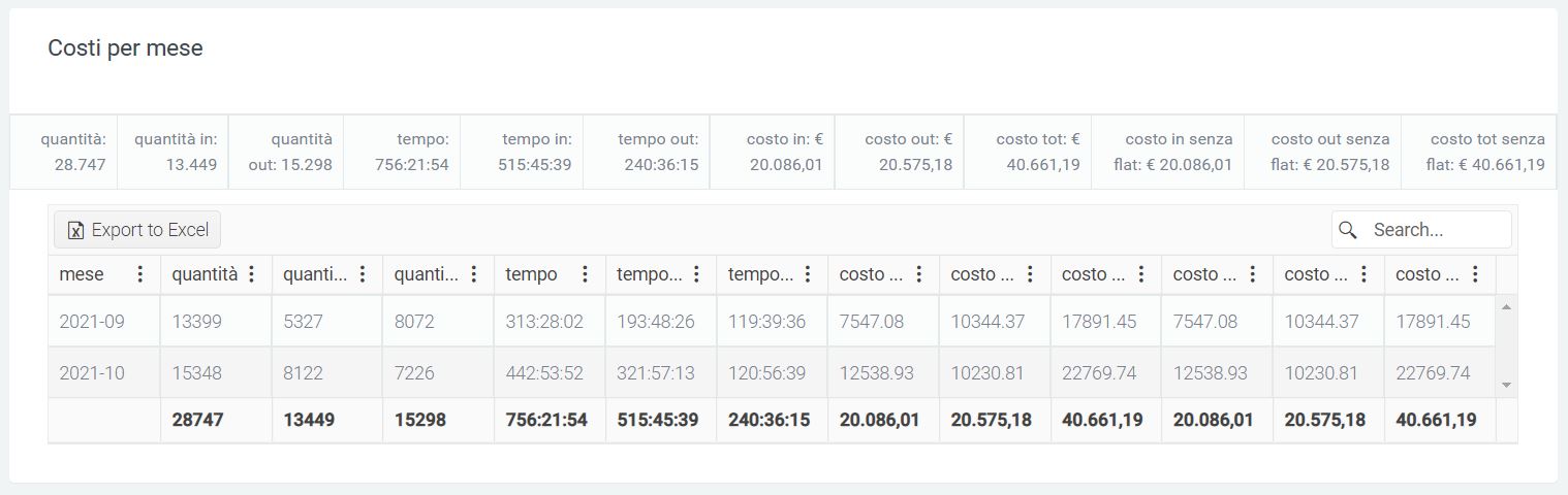
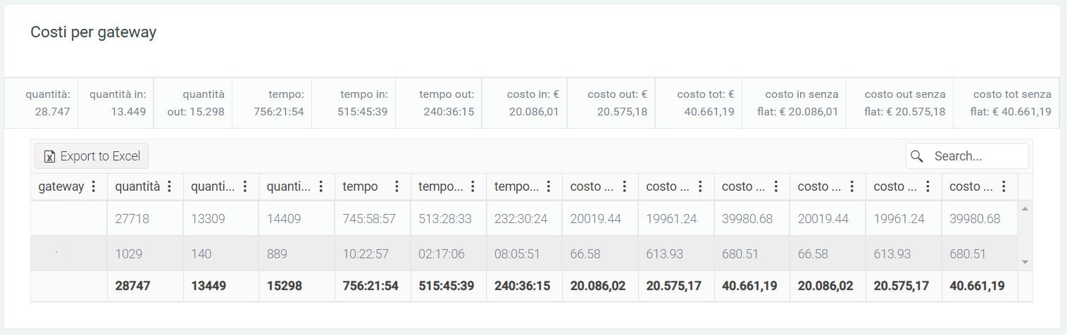
Multiservice
The Multiservice module stems from the need to manage the valuation of calls billed to its customers as if a service were being offered. Thanks to this, it will be possible to use the platform simultaneously to:
manage the charges for each call through the “Pricing” module
manage the value of calls that are to be billed to the customer as a service through this module
There are two sections within this and they allow you to:
manually manage the services offered in the contract
view a report containing the quantities and prices of the services used, including calls (which will be calculated automatically by the system)
Billing
In this section you can view the report regarding the various services and incoming and outgoing calls, with their total costs that are billed to each customer.
Structure
The report is structured so that each company has its own dedicated line, with quantities and costs of each service used.
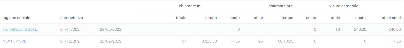
Looking at the table above, the first column shows the company name, the second column shows the contract period on which the services offered are shown, and the next columns show the various services used:
Total: the total amount of service used (in the case of calls, this will be the total number of calls offered that were made and then used)
Time: the total time of all calls shown in the total
Cost: the total cost calculated on the service used or call minutes made (in the case of calls)
At the end of the display of all services used, you will find the total cost to be incurred by the customer indicated at the beginning of the line.
Configuration
In order to start using this module, it is necessary to indicate, in the various contracts that are to be created, the services that are offered with their costs. To do this, when creating the contract, at the end of it you will find a button ( [+] new line ) that will have to be pressed to add a service to that contract.
Once done, the various fields will need to indicate:
the service
the rate of the service
the maximum limit of “products” of the service that the customer will not have to pay for
as far as calls are concerned, also the connection charge
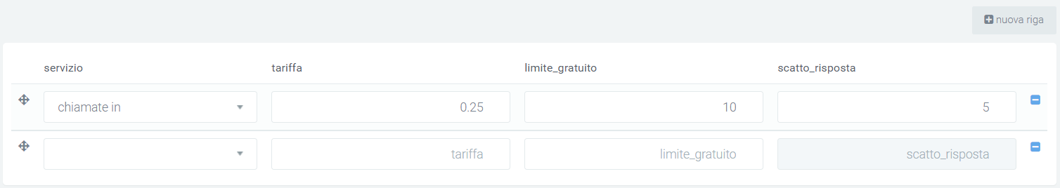
Once this initial setup is completed, all that is needed is to manually indicate for each service (except calls) the quantities used by the various clients. Everything else, including the evaluation of each call, will be done automatically.
Filters
By using the filtering system, you are able to get the best out of this module, being able to easily indicate, through 3 fields, the companies you want to display and the time period in which you want the calculations to be done. They can be found in the upper right corner by clicking on the search button.

Trace
Trace Inbound
Description
The Kalliope Trace module makes it possible to handle inbound calls by allowing the operator to collect and display a range of information about the customer associated with the calling number. The latter is automatically recognized and, based on the contacts already saved in the platform, information is provided to the operator who is going to handle the call. Different types of information can be displayed, from the simple name of the customer or company, to open tickets for the latter or calls already recorded.
Saved calls are displayed in one place so that notes or descriptions taken for each call and for which the form screen was used are not lost.
Mask Calls
The first point concerns receiving or answering a call from an operator. Based on a specific configuration made on the KCTI present on one’s PC (settings -> automatic actions -> dynamic url opening) and a preference indicated on Kalliope Nexus, an operator receiving or answering the call will see a page open on his monitor in his browser containing the Kalliope Nexus mask. The mask contains some pre-filled fields so as to facilitate recognition of the company and its financial status.
This occurs when the company is registered in the “Companies” section and thus is recognized by the system; conversely, the operator will have the option of simply entering the caller’s data and then registering the company.
An example of a call from a number not recognized by the system can be seen in the figure below. In this case it is the operator who creates the connected company by clicking on the pencil icon to the right of the “i”. In this way the company name, code and vat number data will have to be entered.
Using the ticks it is possible to: add the number to blacklist, associate the number with the company, and associate the number with the contact person.
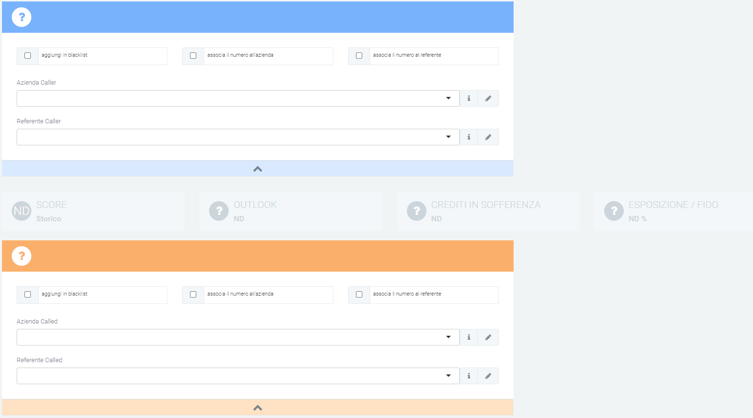
In case the caller is already registered in the platform, the previously blank fields will be filled in automatically and the colors of the financial part will change automatically to make it easier to read.
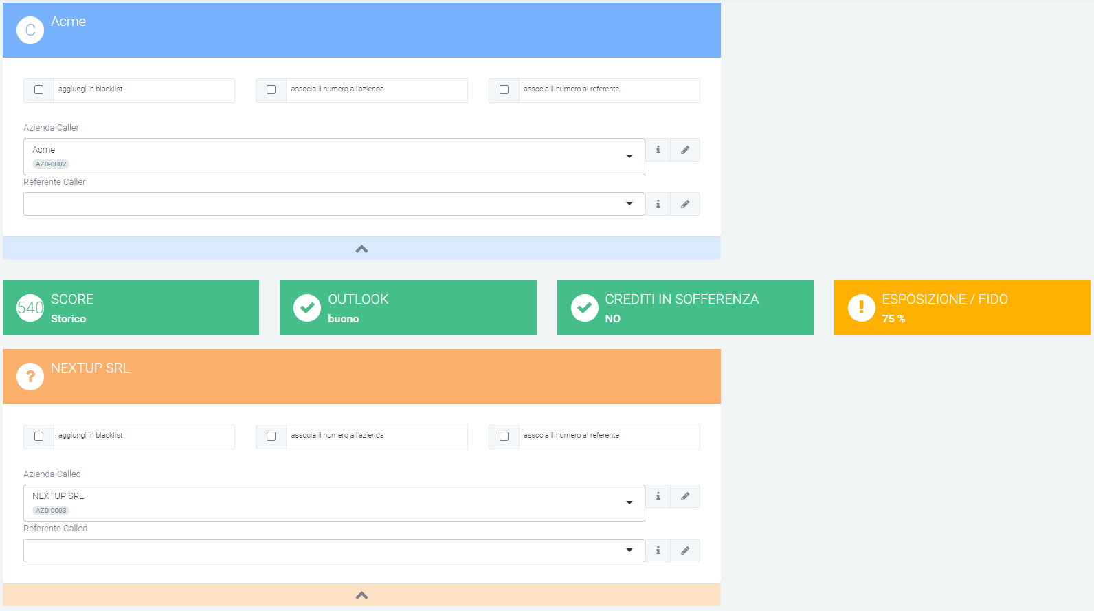
In both cases, the url that will be opened by KCTI due to the “dynamic url opening” configuration will be as follows:
indirizzio_di_aladino/chiamataInbound/main/edit/?caller=<callernum>&callername=<callername>&callercompany=<callercompany>&callerunit=<callerunit>&extenNum=<extenNum>&queueName=<queueName>&uid=<uid>&called=<callednum>
List of received calls
The second main function of this section is the list of incoming managed calls. This allows you to view various information, with the possibility of linking and displaying them in the previously mentioned “call” mask with the relevant data. The information contained in the columns consists of:
numbering
company name of the calling company (CALLER)
company name of the called company (CALLED)
description of the call
owner
caller
called (number)
type
call start date and time
call end date and time
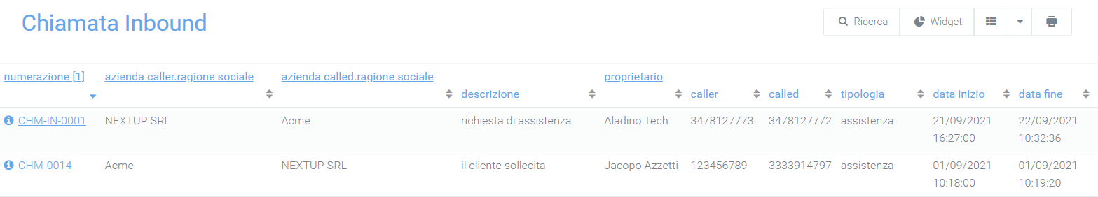
From this page you will be able to view the details of each call by simply clicking on the number that identifies it (highlighted in blue below in the “numbering” column). This will show information about the companies (caller and called), notes taken by the operator, description, associated type, and priority rating entered, as well as the date and time the call started and ended.
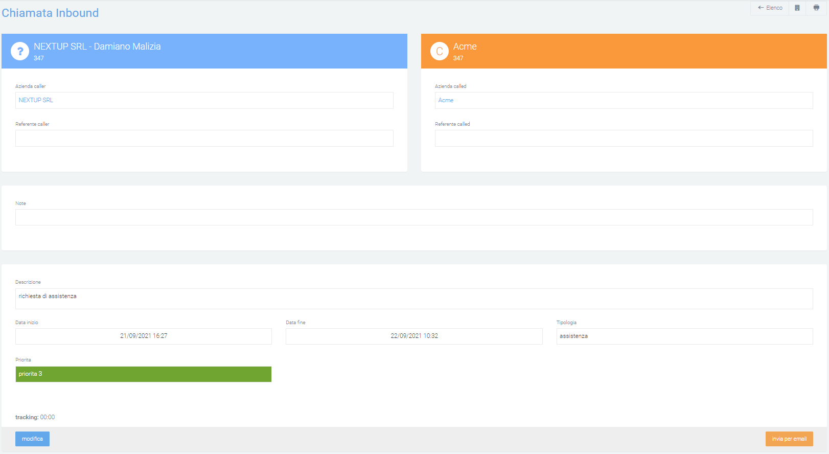
Two buttons will be available at the bottom of this mask: one on the left and one on the right. The first (left) “edit,” enables the user to make changes to the call, with the possibility also to delete it by clicking on the red “delete” button. Summary graphs can be displayed in this mask, which can be enabled through “System Preferences.”
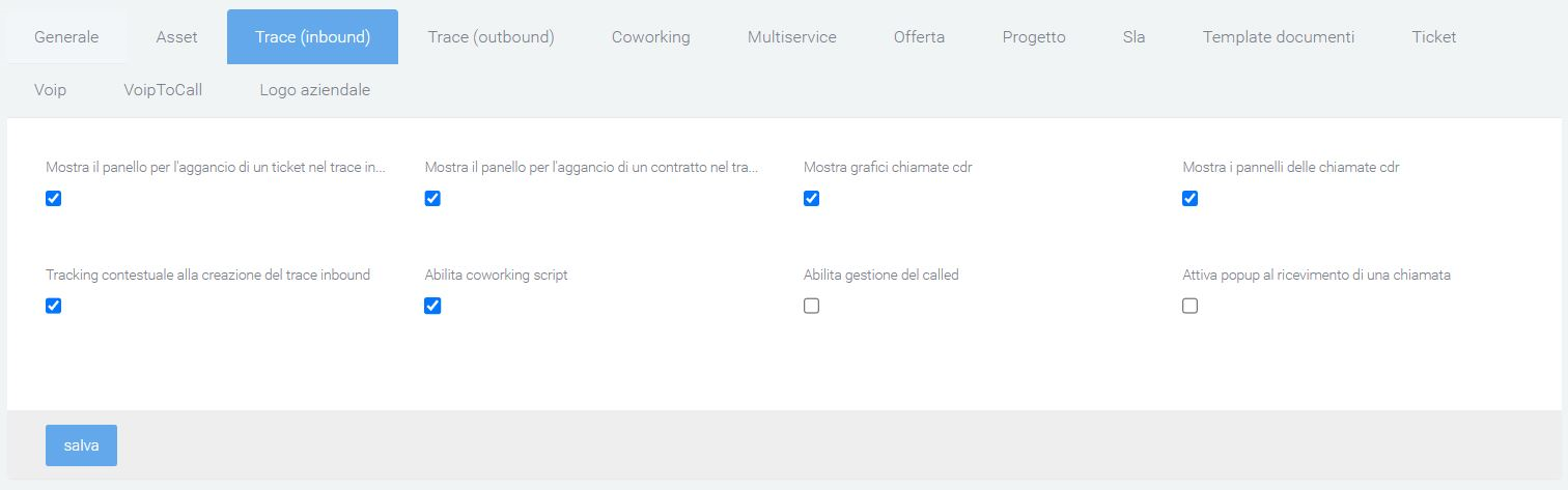
Charts allow you to view: call history report, incoming/outgoing calls, hook a ticket, hook a contract, view a script, etc.
After making changes to the call, click on “save” to save them or on “detail” to exit the edit screen without saving.
The second button instead (right), “send by email” will allow you to select the message template, sender, recipient, and specify subject and description.
Grids and widgets
From the main page of the section, where the list is visible, the display of information in the list can be varied by changing the grid used. To do this, click on the “available grids” button and select the desired grid. If this is not present, it will always be possible to create a new one through the appropriate “+ new grid” button with which you will be redirected to the creation mask of the “Grid” section. After that, carry out the instructions of the indicated section.
To add and use widgets follow the explanation on this page:
Trace Outbound
Service Description.
The Kalliope Trace module allows the management of outbound calls, that is, calls made by the operator to a customer, thus outbound from the telephone exchange. This module sees its usefulness in recording the data of the calls made and automatically opening a “call” mask like that of Inbound Calls, with the only difference being that, in this module, there will be no mask for the calling company (being always the same) but only that of the called company (CALLED).
Call Mask
Again, as with inbound calls, the automation of opening the mask when the call starts is due to the configuration of the telephone exchange, which this time will generate the following url:
nome_azienda.aladino.cloud/chiamataOutbound/main/edit/?caller=<callernum>&callername=<callername>&callercompany=<callercompany>&callerunit=<callerunit>&extenNum=<extenNum>&queueName=<queueName>&uid=<uid>&called=<callednum>
This screen will also be available by clicking the green “+” button in the lower right corner.
As with inbound calls, the operator will be able to create a new company for the contact they called, and thus were not recognized by the system, by simply clicking on the pencil icon to the right of the “i” in the “company called” or “referrer called” row.
The company’s financial fields (socre, outlook, bad debt and exposure/overdraft) will be automatically populated, coloring them appropriately to make them intuitive. The user will always be able to edit the fields below, attach documents, write a description or add notes.
Unlike the inbound calls module, this module displays all calls made to the same called among the last 50, with information such as:
unique id
start date and time
caller number
called number
status
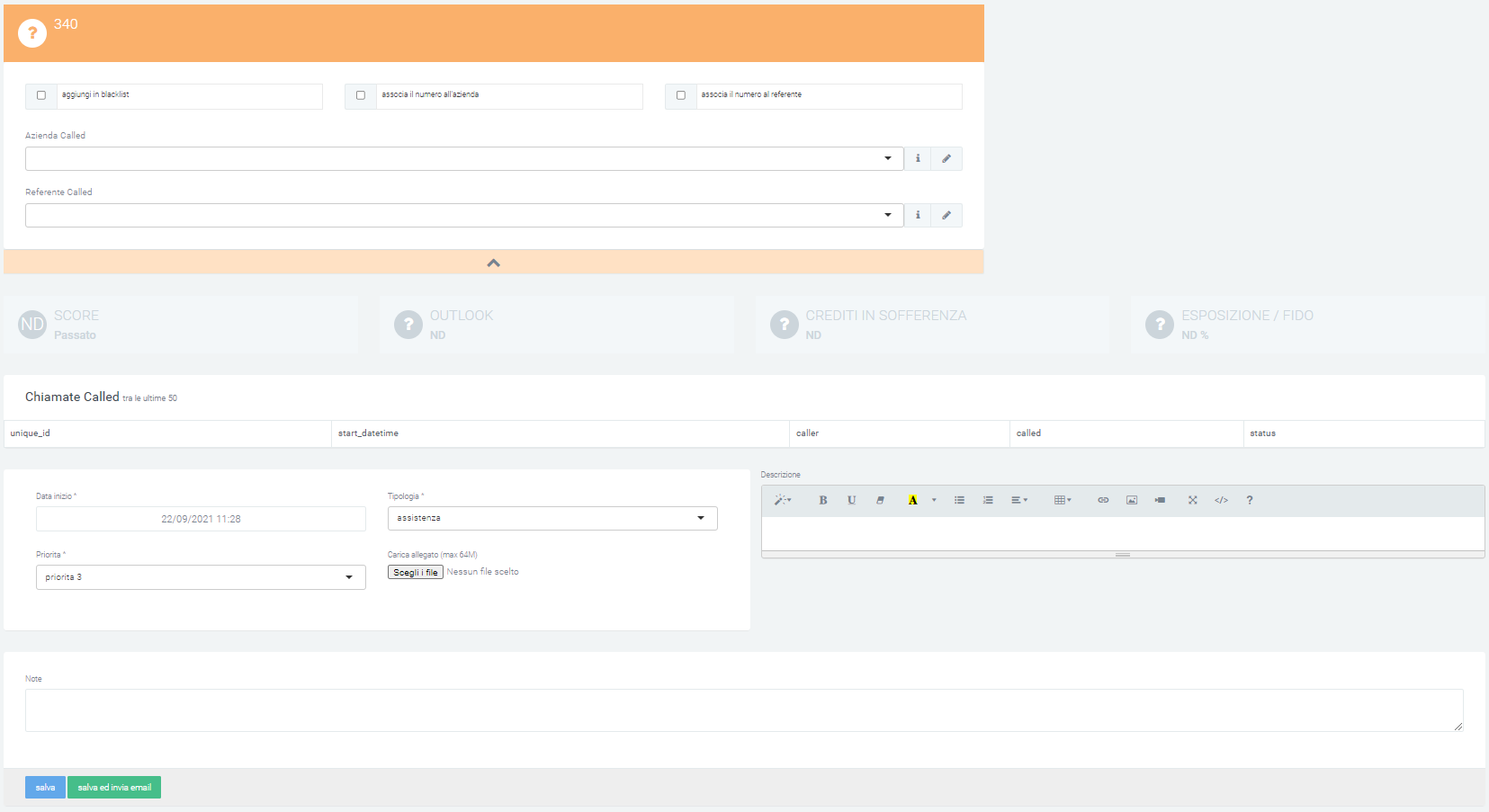
Once the call is finished, simply press “save” to store it in the list or “save and send email” to send emails (a mask will open with the fields of a classic email to be filled in) in addition to saving.
List
The list that will be visible as soon as the section page is opened, will be the same as in the inbound calls section, except that the caller’s company name will not be present. The information that will be contained in the grid will be:
numbering
company name of the company called (CALLED)
description of the call
owner
caller
called (number)
type
call start date and time
call end date and time
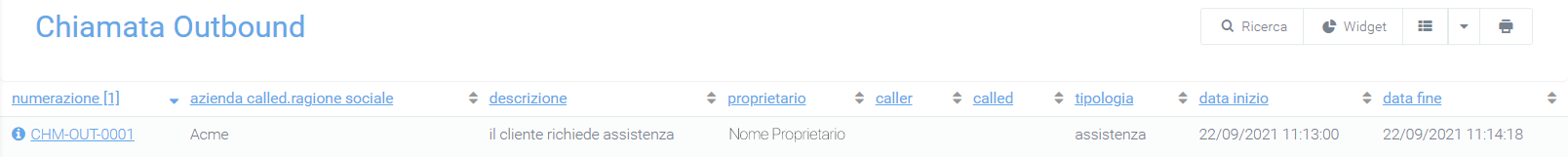
You can view the detail mask of each call by clicking on the number in the “numbering” column. This will show information about the company, the notes taken by the operator, the description the associated type and the priority rating entered, as well as the date and time the call started and ended.
As in Inbound calls, two buttons will be available at the bottom of this mask: one on the left and one on the right. The first (left) “edit,” enables the user to make changes to the call, with the possibility also to delete it by clicking on the red “delete” button. Summary graphs can be displayed in this mask, which can be enabled through “System Preferences.”
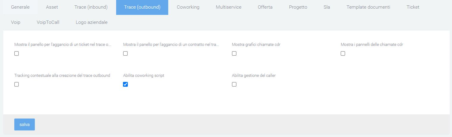
Charts allow you to view: call history report, incoming/outgoing calls, hook a ticket, hook a contract, view a script, etc. After making changes to the call, click on “save” to save them or on detail to exit the edit screen without saving.
The second button instead (right), “send by email” will allow you to select the message template, sender, recipient and specify subject and description.
Grids and widgets
From the main page of the section, where the list is visible, the display of information in the list can be varied by changing the grid used. To do this, click on the “available grids” button and select the desired grid. If this is not present, it will always be possible to create a new one through the “+ new grid” button with which you will be redirected to the creation mask of the “Grid” section. Once here, follow the instructions in the indicated section.
To add and use widgets follow the explanation on this page:
Live Chat
Description
The LiveChat module allows you to take advantage of an effective communication channel with your customers. Through the “chatbox” graphical interface integrated into your company’s website, you can interact via instant messaging directly with operators.
There are three ways to interact:
Via web
Via Whatsapp, Telegram, Messenger
Via telephone
Web-based interaction
Via web, by clicking on the chat icon, the chat with the virtual assistant will be opened on the right where the user is asked to enter the tax code or vat number.
The moment the user enters information already on the system, he/she is identified and called by the name/company name.
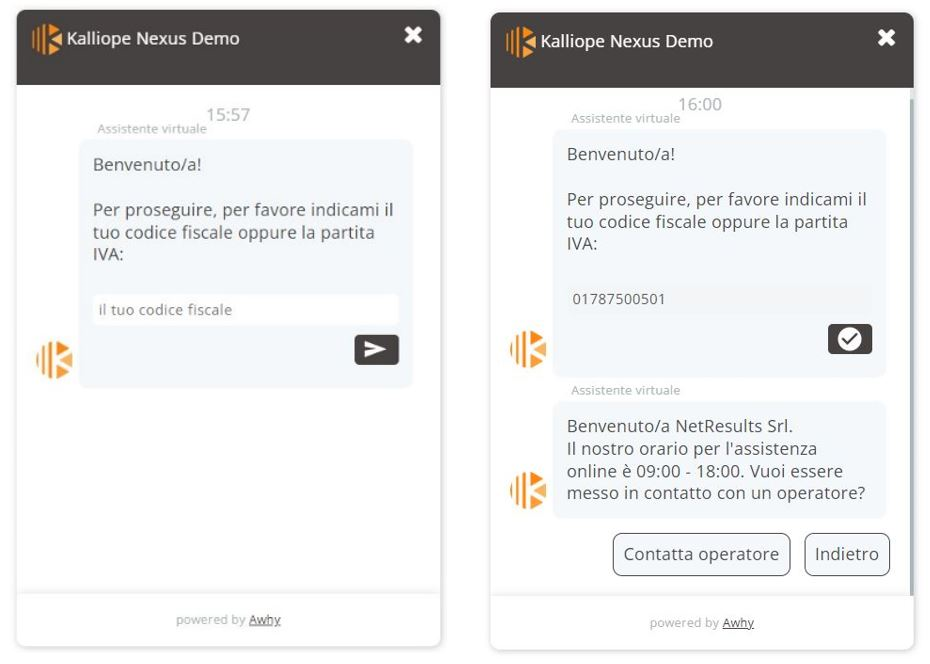
If the user types a question that is not in the chatbot’s knowledge base, it is possible to converse directly with an operator.
On the operator’s screen, upon the user’s request, a notification will appear in the following ways:
in the General channel, on the left: the conversation can be joined via the appropriate “Join” button
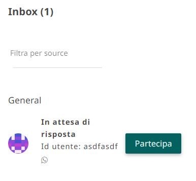
above the indication “Operator Chat”
via the notification bell
The next images show the chat from the user’s point of view and the operator’s screen
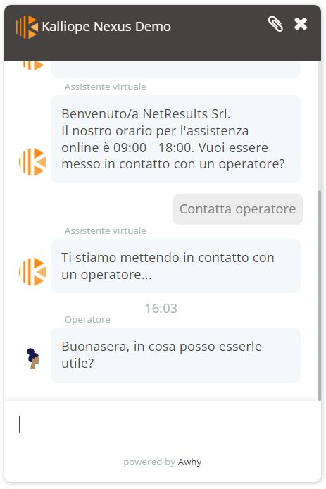
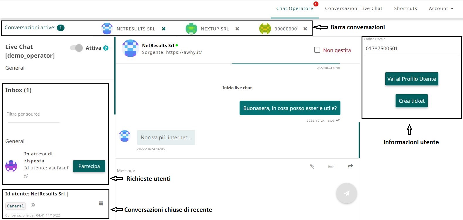
The operator’s screen allows the operator to observe all available actions for effective management of submitted issues.
The operator can:
Read the conversation with the user and previous conversations had (if the user is recurring) and respond as in a normal chat
Close the chat by clicking on the “x” at the top next to the user’s name/code. Once closed, this will be archived with the previous chats in the “General” channel.

Forward the conversation to another operator via the forward button.
Check the “unmanaged” box to report the conversation in case the user exits the chat before the problem is resolved
Attach a file to the conversation
Use/create shortcuts to facilitate the conversation by clicking on the keyboard icon to the right of the message entry box (see the figure below)
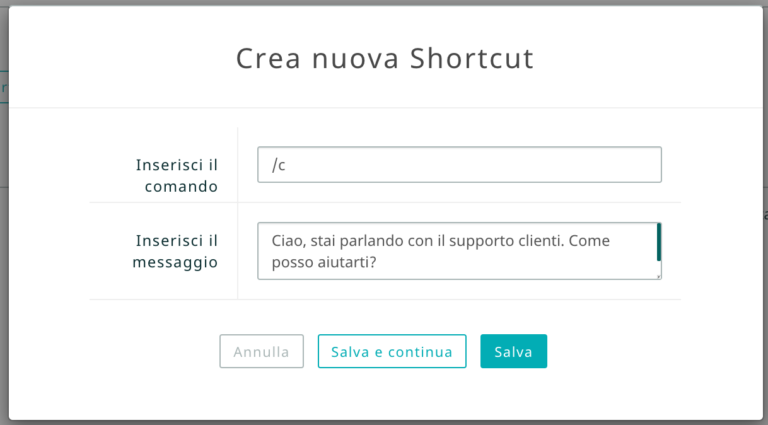
On the operator screen, on the right, there are buttons:
“Go to user profile “: allows inspecting the user as he is identified, via the company description card.
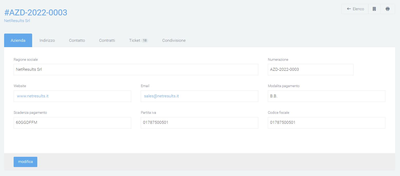
Create ticket “: allows you to create a ticket based on the issues encountered during the conversation.
On the left, there is a list of “recently closed” conversations and conversations that are still active.
Interaction via Whatsapp, Telegram, Messenger
With the “Multi-Channel” option, the customer can connect the livechat engine with Telegram, Messenger and/or Whatsapp social channels.
In the main operator screen seen above, the origin of the request will be indicated via the icon characterizing the social (circled in red):

Interaction via phone
The voicebot module allows you to resolve service-related issues via phone. One proceeds by dialing the number to be called, an IVR is played listing the available options, and, choosing the help and support option, one is guided through the creation of a ticket described by voice. In fact, the service allows you to filter technical support requests by categorizing the type of request and setting up ticket creation automatically. In case you are unable to describe the disservice, you can request to speak to an operator, an extension from the Kalliope central office will then be contacted to resolve the problem. The voicebot is configurable; you can choose whether the customer has to wait for a “beep” to respond or whether the flow is continuous, thus overlapping with the voicebot.
Backup
Warning
This section is visible only to admin users and can be reached via the menu path Voip admin > Central Backup.
The backup section allows you to manage and perform backups of your telephone exchange directly through the web interface, so you can have more autonomy in managing this process.
Backup list
Backups can be made manually via the “+” button, once pressed a row will be automatically added to the backup list with the corresponding newly generated backup file of the telephone exchange. In the list, backups are identified by:
Filename: name of the file
Size: size of the file
Backup date
Master central IP: IP address of the master central
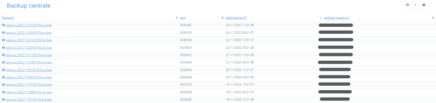
Backup detail
Clicking on the file name in the list takes you to the detailed view of the backup file where the same information as in the list is contained, but with the added specification of:
Tenant: in case the central unit is multitenant, you need to specify the tenant with which you are associated. Instead, the “default” value will be set automatically
Path: where the backup file is allocated.
Using the green button at the bottom right, you can restore the backup file, to reload it within the central, so that you have all the data available at the time the backup was made. Via the red button at the bottom left, delete, you can delete the backup file.
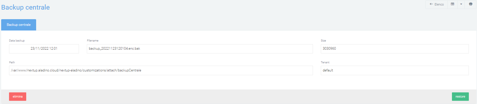
List of restores performed
In this section, which can be reached via the menu on the right, is the list of restores performed, displayed by: outcome, date and url of the control unit on which it was performed, and whether in case it failed.
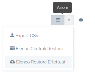
Central restore list
In this section you can indicate the secondary power plants on which to activate the restore. You then indicate on which other power plants you can restore a backup file that is already in the system. While the primary central unit that is being backed up to can be viewed by going to: System Preferences > Voip.
If it turns out to be the main and only central unit entered, it is shown again in “master central units” with the essential information to make the backup.
Using the “New central” button, you can specify secondary central units, you can decide to make periodic backups for each central unit. Ex. A company may find itself managing multiple telephone exchanges, so you may decide to make periodic backups for each. Periodically, thanks to cron, the central can make backups of the files.
Monitoring
Description
Monitoring your company’s IT infrastructure is essential to ensure its proper functioning and to detect any malfunctions. By constantly checking for problems that are detected, opening tickets as needed, and then sending notifications to the affected areas and contacts, it is possible to have total control over processes. All problems that occur are stored and displayed in a single section with a corresponding level of severity. This level can be fully customized via the appropriate section, indicating with which type of problem, or group of problems, a certain severity should be associated. The Monitoring module thus offers a tool to quickly and efficiently manage all the problems detected on the assets in your company, saving you time and money.
To reach it, you need to press on “Monitoring” in the menu on the left.
Structure and configuration
The module is divided into several sections, but the main ones-where basic monitoring information is reported-can be found in the Host and Problems modules. Also of fundamental importance is the Dynamic Classes section, whose structure and configuration follows the two main sections.
HOST
In the Support > Assets section, creating an asset and checking it as “to be monitored” will automatically create a host with the necessary information to be monitored.
In the list of hosts (accessible via Monitoring > Hosts) you can view for each host:
Host name
Id of the host
Category
Account
Final customer
Referring user
Last problem: date of detection of the last problem
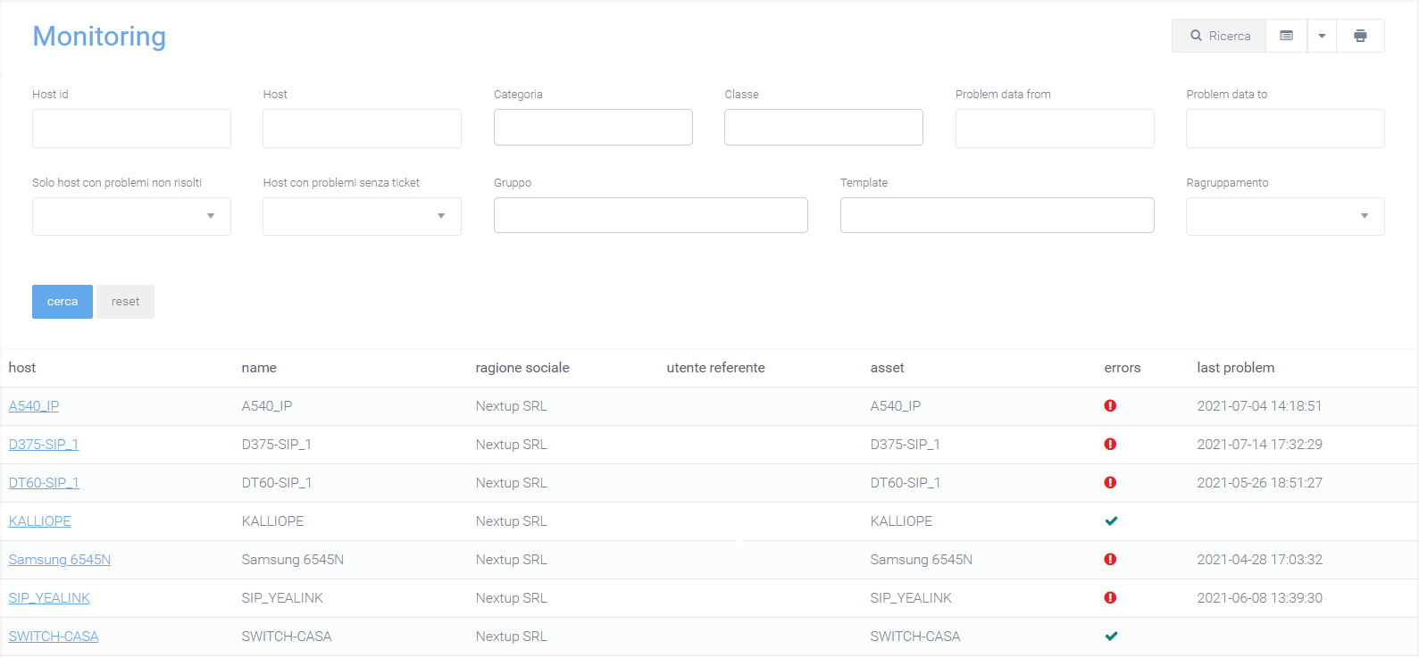
Thanks to the configuration of classes in the “dynamic class” section, it is possible to define times for which asset monitoring should be active: if some equipment at certain times is turned off, monitoring will not report errors.
Host detail
By selecting a host in the list (by clicking on the name), it is possible to enter the host detail mask, where it will be possible to view the monitoring details of the apparatus and the ASSET data. To change the information of a host, you must change the information of the related connected asset. Within the detail mask there is the first section divided into two tabs. In the first one, with the name of the host, some of its essential information is shown. In the second, called “Host Inventory,” all the detailed information is shown
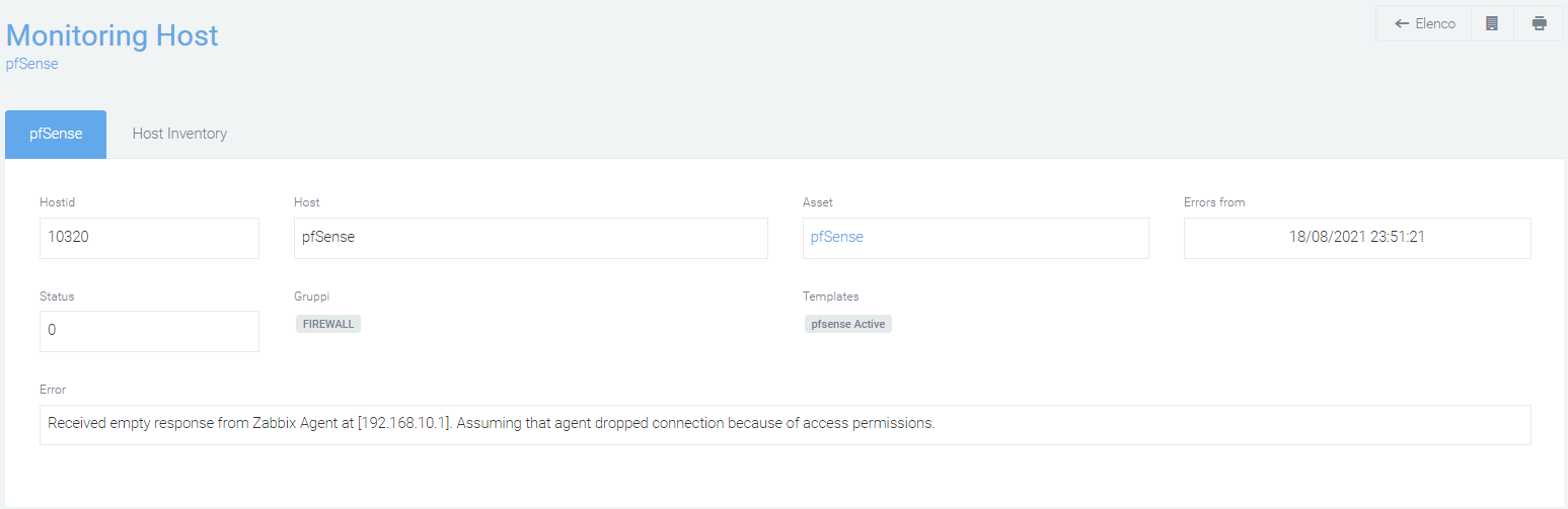
Under these two tabs a list of all the problems detected by the system is visible and for each one it will be possible to open tickets through a special button (new ticket) that, if indicated, will lead to the sending of specific ticket opening notifications to the various contacts. The notification email is structured with a customizable template that will contain all the asset data necessary for the unambiguous identification of the equipment for a rapid resolution of the fault:
Host id: host identification code
Eventid
Lastchange: date of the last change in the host problem
Name: name of the problem
Class: indicates the severity of the problem (inserted via dynamic classes)
In addition to the ability to create tickets, it is also possible to perform a forced closure of the problem, so that it no longer appears as such and is not visible in the problems list. Any changes to the ticket will be notified to the various contact persons. Forced closure of the problem prevents it from appearing further on the platform.
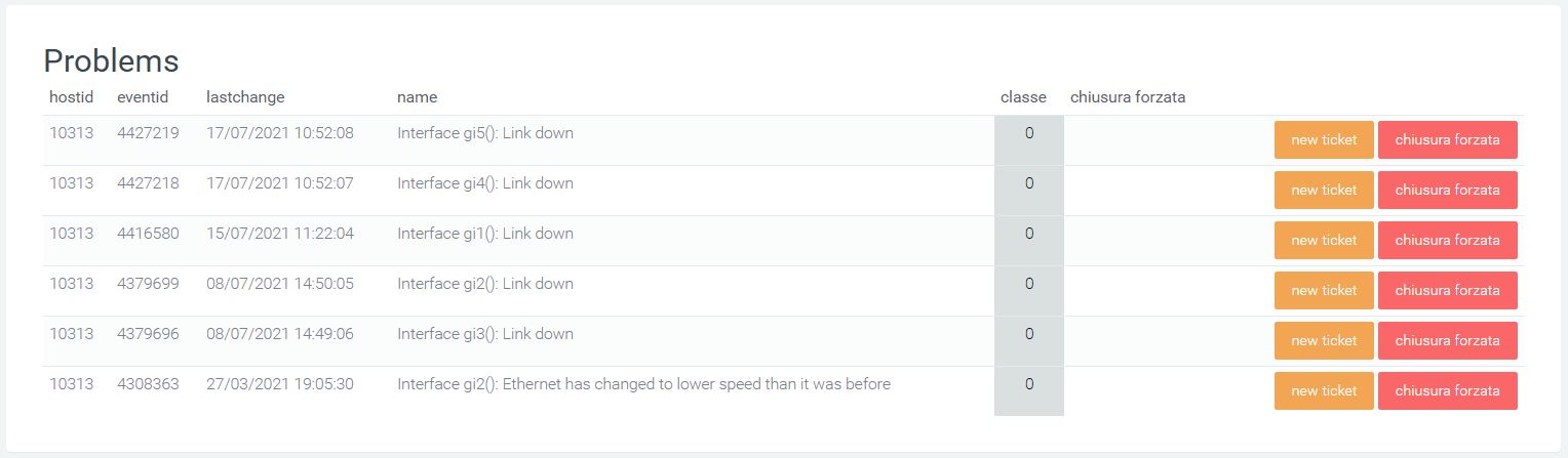
In the Graph section, you can select the type of graph you want and the period to be considered to display the time graph of monitored resource utilization for that specific host (e.g., download or upload trend for specific router).
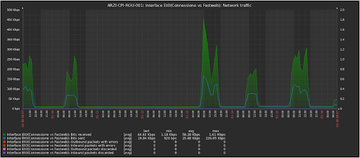
Host Filters
You can filter the data in the list using the “Search” button in the upper right corner and enter:
Account
Final Customer
Host id: host identification code
Host (name)
Category of the host to be monitored
Class: identifies the priority of the detected malfunction
Problem data from: start date for the search for problems
Problem data to: end date of the time interval in which the search for problems is performed
Only hosts with unresolved problems (yes or no)
Hosts with problems without tickets (yes or no)
Group
Tamplate
Grouping (zip code, municipality, province, identifier)
Problems
This section (accessible via Monitoring > Problems) reviews all problems that have been detected, with their customizable severities in the form provided. It may happen that some problems resolve themselves, in which case there will be a check mark in the table, otherwise - if not - a cross.
The problems in the list are classified by classes that identify the priority of the detected malfunction.
Information about the problems listed in the table includes:
host name: the name of the host
account
final customer
firstchange and lastchange: date of the first and last detected change
resolution time: time to resolve the problem
name: name of the problem
class: rating of the severity of the problem
hide: indicates whether the problem has been solved (yes) or is still pending (blank)
date forced closure (if it happened)
ticket.numbering: ticket number of the ticket linked to the problem
ticket.title: title of the ticket linked to the problem
ticket.status: status of the ticket linked to the problem
intermittent: whether the problem is intermittent or not
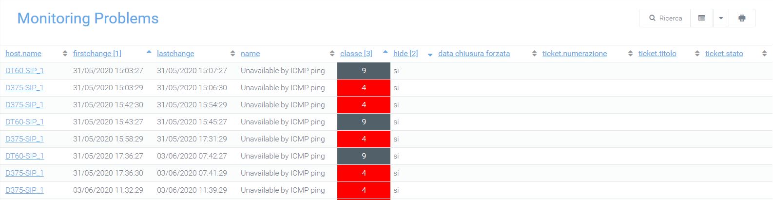
Click on the host name to enter the “host detail” section (see above).
Filter Problems
Clicking on the “search” magnifying glass will allow you to filter problems by:
Account
Final customer
Host id: host identification code
Host name: name associated with the host
Ticket: possibility to search by ticket title or description
Problem description
Category
Class: priority rating of the malfunction
Problem data from: start date for searching for problems
Problem data to: end date of the time interval in which the search for problems is performed
Only unresolved problems (displaying yes or no)
Only solved problems but with open tickets (yes or no display)
Only problems without class (display yes or no)
Solved problems with resolution time (indicating the time)
Group
Template
Dynamic classes
It is possible to associate each problem of each host with a specific class. Classes are needed to assign the severity level to each problem so that reports are handled with the correct priorities.
The class is identified by a number and defaults from -1 to 9, where -1 indicates out-of-hours problems and 0 is assigned to problems that you do not want to monitor and for which the system (although it logs them in the database) does not report failures. In the customization of the section, you can configure the recipients of email notifications, specifying Subject and body of the email.
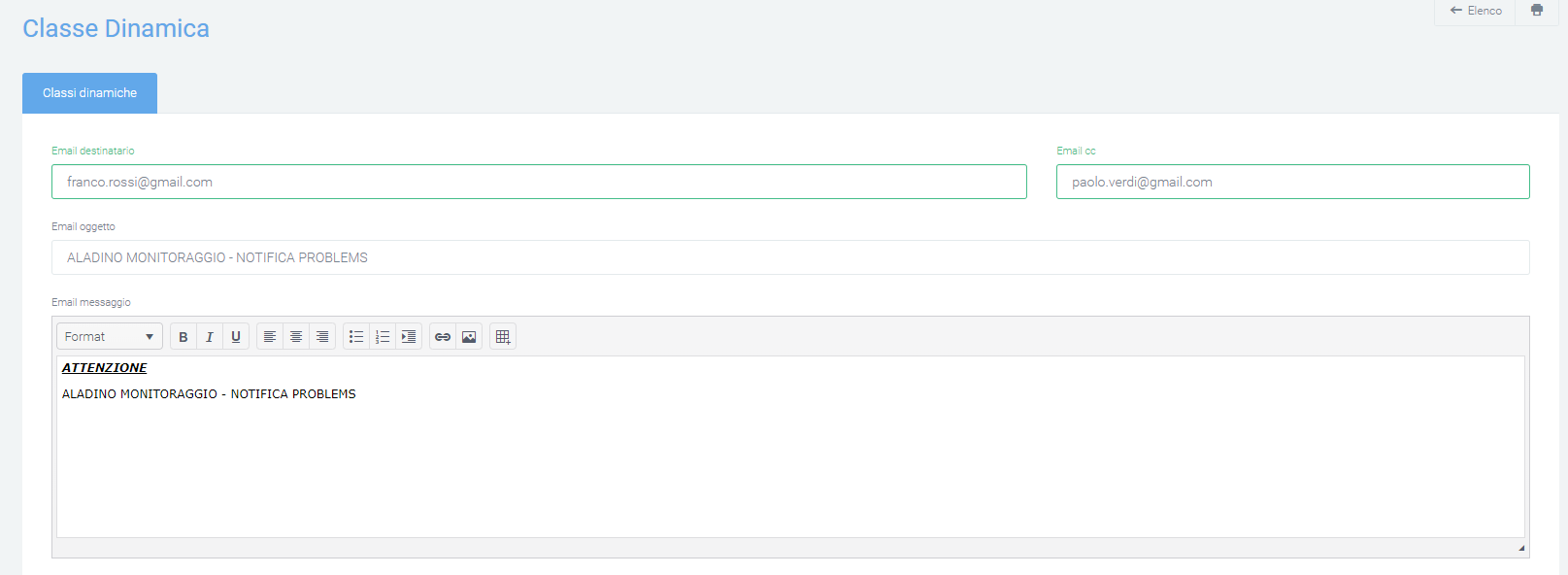
The platform assigns a class to a problem based on specific logic, taking into account that in the monitoring machine the recorded severities range from a minimum of 0 and a maximum of 5. However, it is possible to configure new classes by associating them with problems, via the “+ New Class” button.
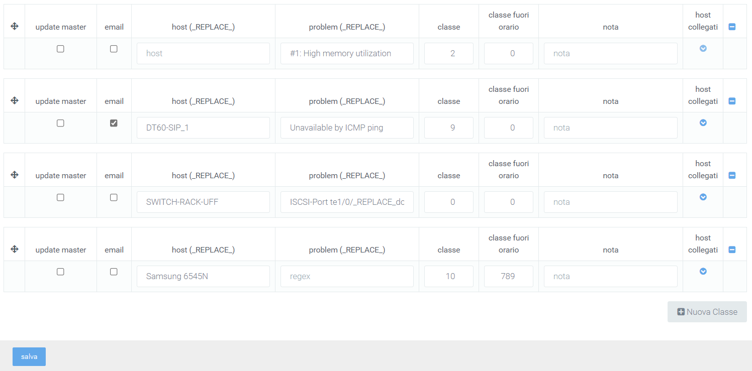
Classification is based on activated filters that work on the host name and error message description. The placeholder “_REPLACE_” can be used to refine the search for ‘hosts’ and ‘regexes’ for subsequent class assignment to problems. Examples:
By entering ESO-CPI-ROU-001 in the ‘hosts’ field, the system matches only hosts with this name
By entering ESO-CPI-ROU_REPLACE_ in the ‘host’ field the system matches all hosts starting with ESO-CPI-ROU
By entering _REPLACE_ROU_REPLACE_ in the ‘hosts’ field, the system matches all hosts that contain ROU
The same logic can be applied to the ‘regex’ field, which is the description of the error that generates the problem. Each dynamic class that is created provides a detail section in which specifications can be added to specify the cases for which a problem will have one specific class instead of another.
connected hosts
schedules
tickets
intermittent problems
Pressing on the first button, “connected hosts,” will open a configuration mask with the fields “host” and “problem” with a “+” on the right. This is necessaryb to add constraints on the main classification, that is, a given class will be assigned only if there is a problem in the connected hosts, among those entered. Only a host name and error description may be entered, or both linked.
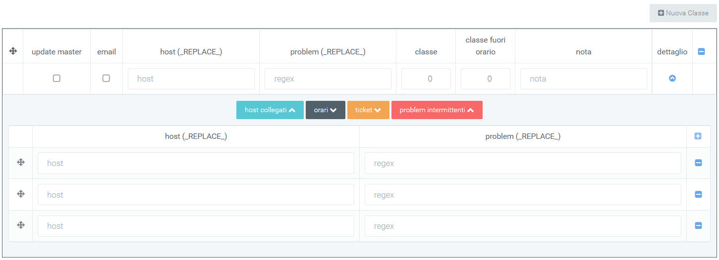
The second button, “schedules,” shows a grid divided by days and time slots where it will be possible to enter specific times when a host is to be monitored. To indicate this time period, simply select the flag that intersects day and time slot of interest. Normally, holidays are not counted, but you can change this by selecting the “include holidays” flag in the upper left corner. Instead, to select all days, check the “select all” flag.
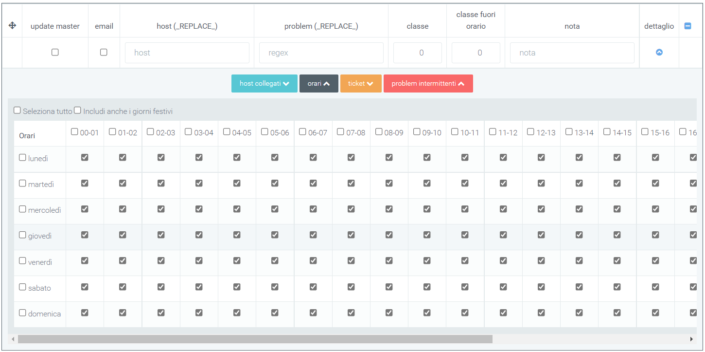
By clicking on “ticket,” the mask displayed allows you to schedule the opening of a ticket for a problem. The problem for which the ticket will be opened is the one indicated in the main box for which the detail is being created. Some parameters of the ticket should be indicated in this mask:
type
priority
title
description
On the left are 3 flags, “open ticket,” “notify company,” and “external,” which will be used respectively to: open the ticket upon problem detection, notify the company for which the ticket is being opened, and indicate the open ticket as a ticket in external, i.e., referring to suppliers.
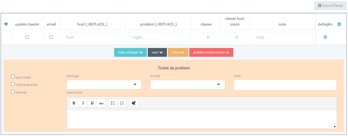
The last button, “intermittent problems,” allows you to open tickets for intermittent problems as well. They are detected problems that are resolved independently in a certain time interval; however, some of them may cause disruptions. To handle this type of problems, specific tickets can be created. E.g. If we know that a certain problem is created every time interval (minutes, hours), to avoid a ticket being created tot times, it is convenient to fill out the following section.
After clicking on the button, a mask will be shown in which the following should be entered:
ticket type
priority
whether to notify the company of the ticket opening
whether it is a ticket for suppliers (external)
ticket title
description
The time interval and criteria for which a problem is defined as intermittent, are customizable via 3 cells:
no. problems: number of problems that occurred in a certain time interval
time interval: number representing an interval for performing the check for intermittency of a given problem
time interval in: unit used to indicate the time interval (minutes, hours, days).
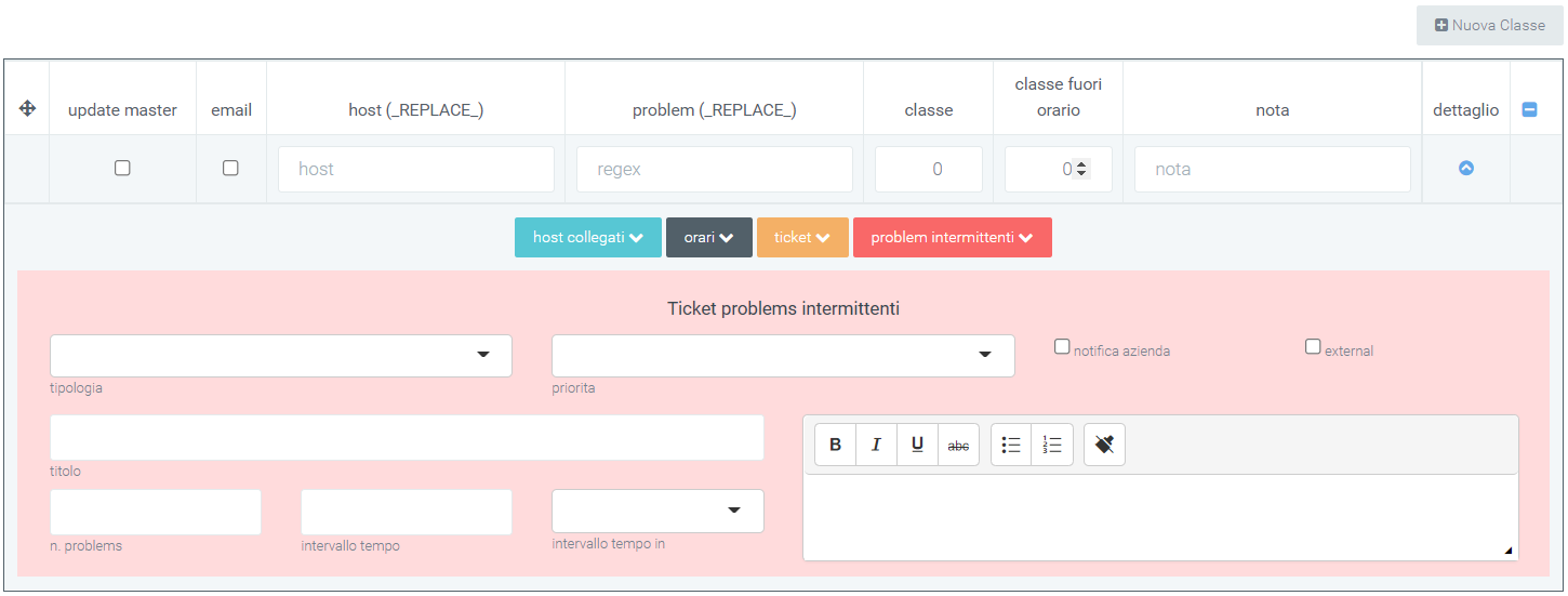
Template –> ability to upload or update templates via file.
Template repository –> point to / create as if it were a repository, you save templates to then be pointed to within the template section.
Report
In the “Monitoring” section, four main reports are made available that allow you to intuitively understand what is the status of the various issues detected. The reports are divided by category and location; there is also a report reserved for detailed data analysis. The four reports are useful for getting an overview at the generalized level of what is the status of the various problems that are detected. The four reports are divided into:
Reports: the following section is a general section in which two graphs, one pie chart and one histogram, showing the ratio of resolved errors (DONE) to those that are still open (ERRORS) can be viewed
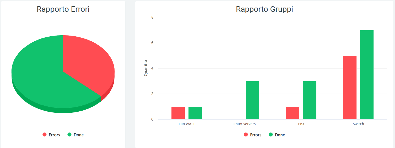
Analysis Report: in this section you can find a dashboard where the number of problems with their status (unresolved, still open) and the average time for unresolved problems are reported.
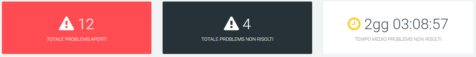
Graphs representing the progress of problems are also present:
the first represents open problems broken down by date and by status (solved/unsolved)
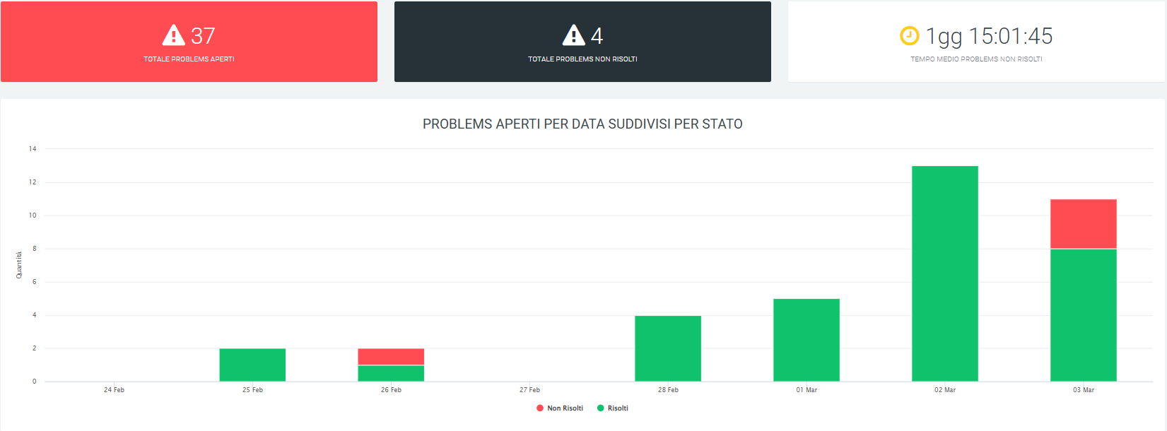
the second and third graphs represent respectively open problems broken down by group and broken down by date, and unresolved problems, also broken down by group and broken down by date
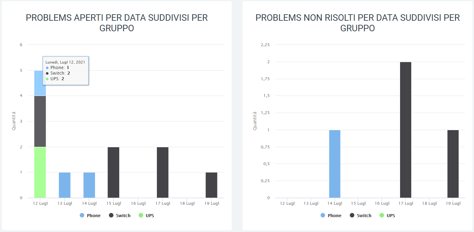
the fourth and fifth charts represent open or unsolved problems, again by date, but broken down by class
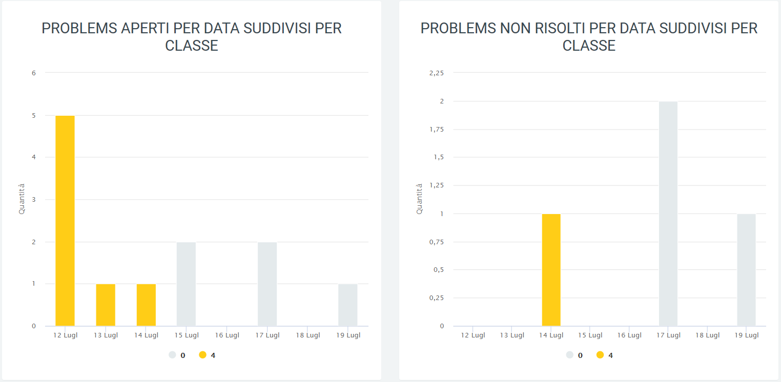
The sixth graph consists of the total representation of problems by date, with the ability to display: - open problems - problems solved - average of open and closed problems - trend of open problems - trend of solved problems - trend of open and solved problems
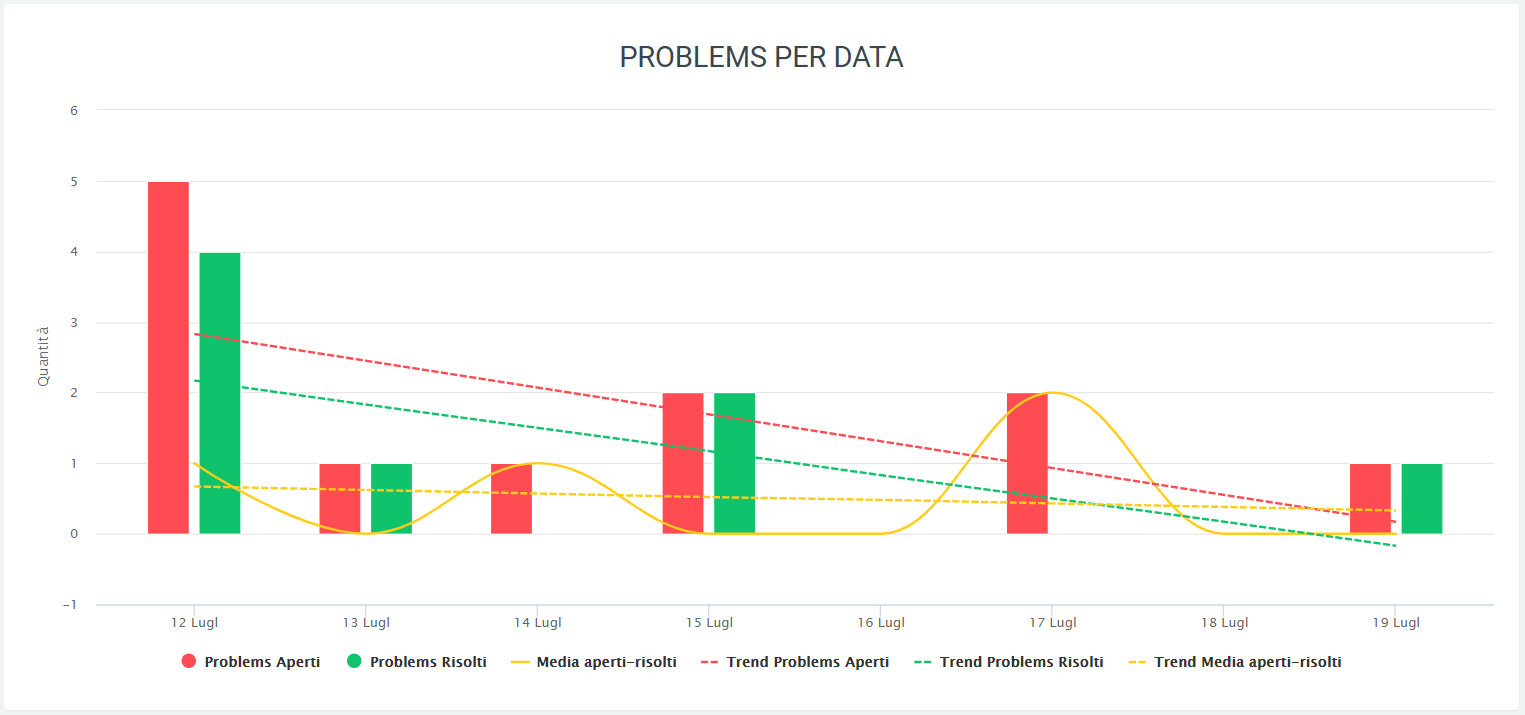
The last graphs are four pie charts representing: - The total problems broken down by group - The problems not yet solved broken down by group - The total problems broken down by class - The problems not yet solved broken down by class
As in all graphs on the platform, it is possible to remove or add to the display some data via legend and to view quantities by scrolling with the mouse over the graph.
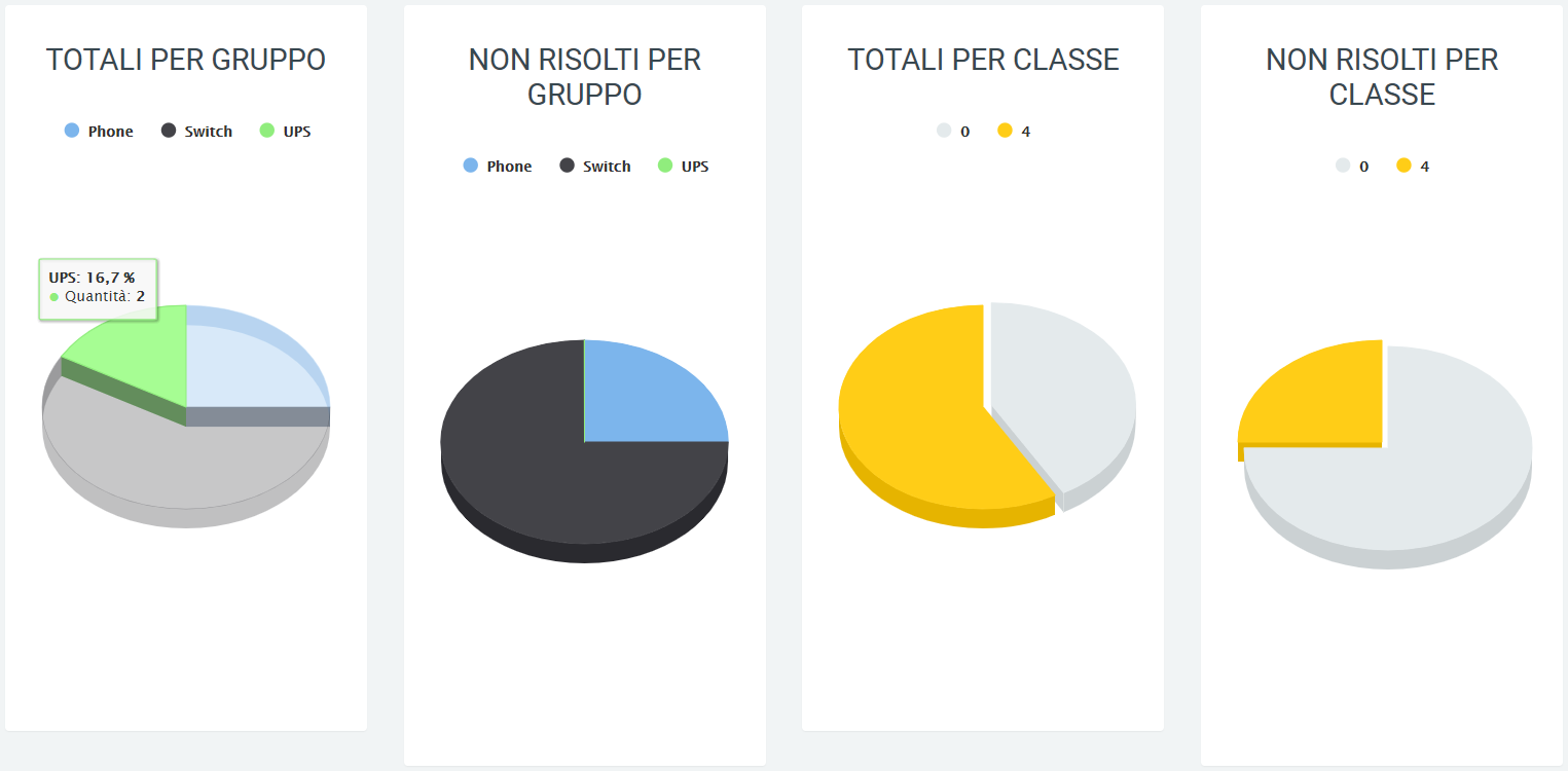
Date-time report by category
In this section, one can observe the progress of problems over a period of time indicated through filters (which can be activated thanks to the “search” button) in dates subdivided in turn by time slots. Again through the filters, one can choose which category of problems to include in the graph. The states (open and solved problems) and categories are displayed, also described in the legend.
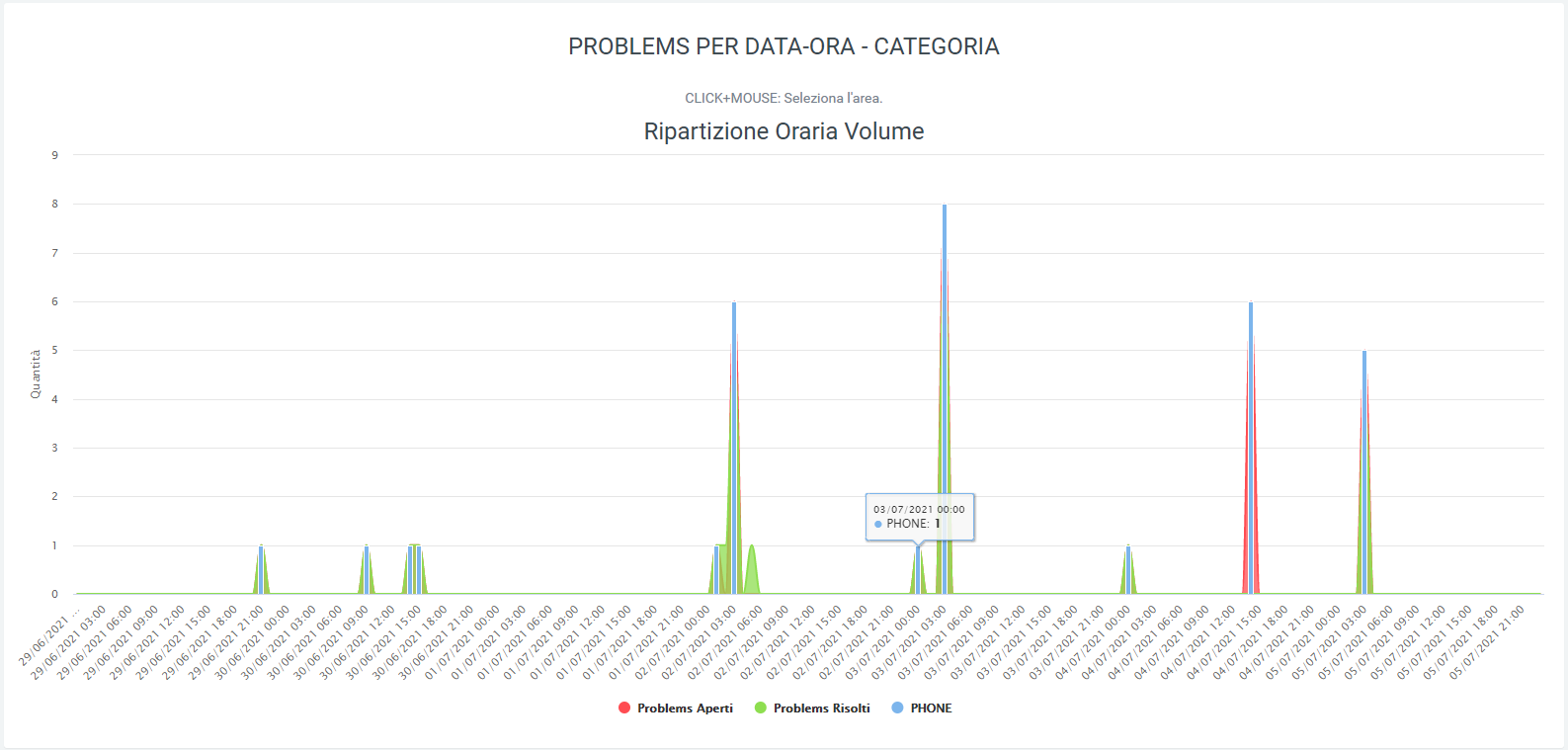
Date-time report by location
As in the previous section, it is also possible to observe the progress of problems with a daily and hourly breakdown (where each day has its own hourly breakdown), but with the only difference that it is not the categories but the locations that are displayed. Again using filters (“search” button) it is possible to include the location whose data you want to view, which is also visible in the legend.
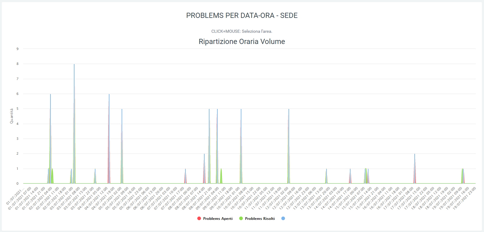
Feedback
Service Description
The Feedback allows the analysis of a customer’s call experience through the request, at the end of the call, of a value from 1 to 6 to be entered via numeric keypad.
Analysis of the values obtained can be done in the “Voip Routing > Service Report” section of the KalliopeNexus platform where, via graphs and tables, customer ratings are summarized.
Each graph shows out of the total calls, how many customers typed a particular value, indicated by the star icon. The data are also summarized by percentage in order to make the visualization clearer.
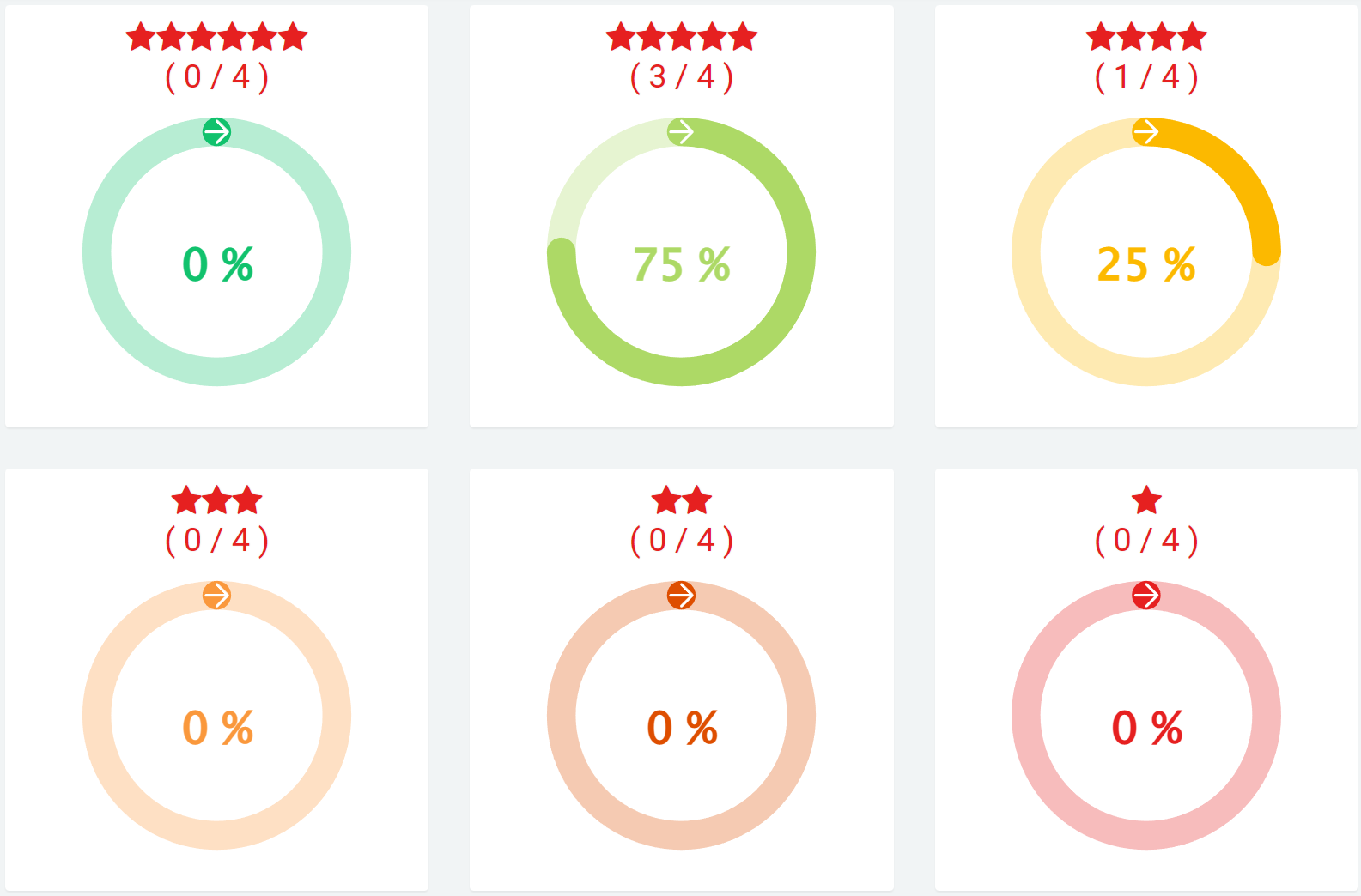
At the bottom, there is the “Feedback Detail” table, which summarizes the same data:
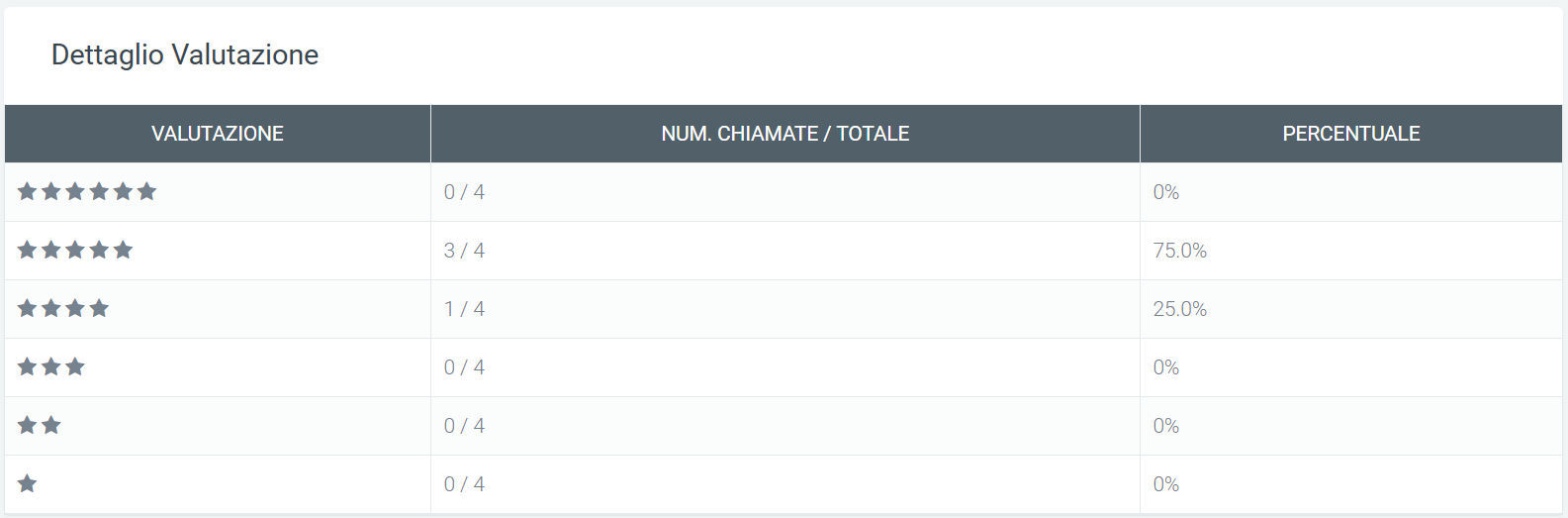
Configuration
To configure the function of the Feedback module, it is necessary to create a new dynamic routing on the Kalliope central unit. In the “Parameters” section, you need to select the audio that will contain the evaluation instructions, and as “Number of input digits” you only need to enter “1.” In the “Request Settings” section, indicate:
URL: http://aladino.nextup-lab.cloud/voip/apiInstradamento/instradamento
Tipo Request: POST
Request Content Type: application/xml
Contenuto della request:
<?xml version="1.0"?>
<parameters>
<unique_id>%UNIQUE_ID%</unique_id>
<caller>%CALLER_NUM%</caller>
<called>%DNID%</called>
<param1>%PARAM1%</param1>
<param2>%PARAM2%</param2>
<param3>%PARAM3%</param3>
<param4>%PARAM4%</param4>
<param5>%PARAM5%</param5>
<group>CS</group>
</parameters>
In the “Actions” section, you can leave the fields blank as default or configure them as needed.
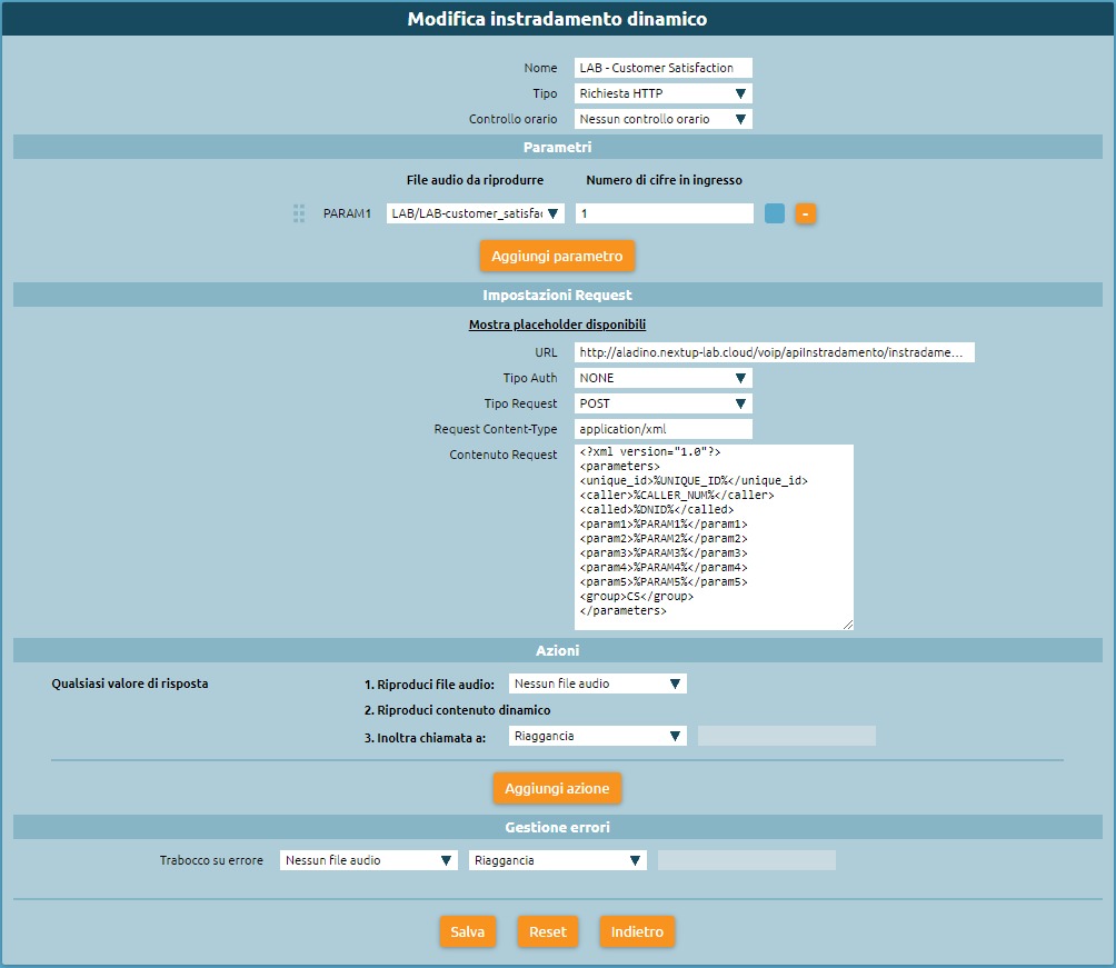
Configuration and details on Kalliope Nexus
On the Kalliope Nexus platform it will be necessary to go to the “Voip routing” section to create a new one. The configuration consists only of entering within the “group” field the parameter “CS”. The rest of the fields should be left blank. The moment the customer enters the rating from 1 to 6, it will be shown in the report, as explained in the previous section (Service Description).
In the “Voip Routing > Log” section, you can view the routing log, in which you can analyze the detail of the customer’s response. In fact, in the log, under the parameter “group” is indicated CS and, in addition to the identification of the calling and called number, the parameter “param1” indicates the rating (from 1 to 6) for each call.
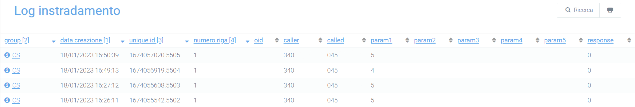
Note
In case you want to request feedback of different types from the client, and thus obtain different feedback (not just one question-assessment), you can configure multiple routings that will, however, refer to the same routing (CS). As a result, an overall assessment of all questions will be obtained in the report.